Click here to go to original post
Ou aqui
https://legionofandy.com/2015/06/19/ben-day-dots-part-3/

guy.lawley@btinternet.com
1. Introduction
2. RGB colour: Red, Green & Blue dots, on a screen near you now
3. CMYK colour: 4-colour printing with Cyan, Magenta, Yellow and blacK
4. The road to CMYK: an appallingly brief history of colour printing
5. CMYK vs. RGB: total opposites! Who knew?
6. 4-colour printing with CMYK in newspapers, comics etc.: with details on the Avengerscover shown above.
https://legionofandy.com/2015/06/19/ben-day-dots-part-3/

From Girls’ Romance 81. Art by John Romita.
Many years ago I read in a book or magazine that “The dots you see in the comic books are NOT Ben Day dots” — or words to that effect.
I wish I’d kept that piece, as it went on to explain its seemingly controversial statement. If I had it now, I could quote what it said and be done. Instead I have tried to rediscover the details behind that assertion. And while the internet has been useful, particularly in locating old books, most of my information has come — fittingly enough for such ancient and largely forgotten wisdom — from those dusty old paper pages.
Now I’m ready to tell the real story of the true Ben Day dots. Including — has this typical lovelorn DC Comics blonde got Ben Day dots on her face? The answer is a very definite “yes and no”.
I will come back to the real, historical Ben Day dots in Part 4. I know, I did promise the full gen on Ben Day dots here in Part 3. But first, I want to look at how the images we see around us today are made. Ben Day dots used to be almost as big a deal as pixels are now. They dominated their field for more than 50 years, from their beginnings in 1879. In trying to understand not only how they worked, but why they were so successful, I found it useful — and fun — to look at their modern-day equivalents.
So, I’m starting with the here and now, before working backwards into the past. This post will look at two other relevant subjects — the RGB and CMYK colour systems — before I get back to the Ben Day dots themselves, and the comic books.
COLOUR IN MANUFACTURED IMAGES
This is what Ben Day dots seem to us to be all about — colour in the mass production of images. But the Ben Day process can — or could (the past tense really is correct here) — be used to print dots of any colour you liked, including black. And while people did increasingly find uses for coloured dots, for decades, every day around the world, millions of black-and-white images using Ben Day dots were printed in comic strips, graphics, advertising art etc. These used the dots to print shades of grey.
From the 1890s, newspapers increasingly used colour as well, as weekend colour sections took off in U.S.. In the colour Sunday comic strips, the dots really came into their own, used to make a huge variety of colours. For example, yellows mixed with varying densities of blue could make a wide range of greens.
The dots below aren’t Ben Day dots from a Sunday strip, though. They are from a 1950s comic book.

But I am getting ahead of myself. Or rather, behind — in the past. I’m supposed to be working backwards, from where we are now. And where we are now is the world of:
2. RGB COLOUR — RED, GREEN & BLUE DOTS. On a screen near you now.
Nobody would call pixels a type of Ben Day dot, and quite rightly, though they are doing much the same job as their historic forebears. That is, they are creating an illusion of uninterrupted colour from a huge number of tiny dots, so close together that we don’t notice the individual elements — or at least, we can forget they are there.
Though today’s screens can show us thousands, even millions, of colours, these are all made up from only three colours of dot, Red, Green and Blue — hence the name RGB. These colours add together to make, for example yellow, which is red plus green. The white part of a screen is emitting all three colours, as seen in this diagram:
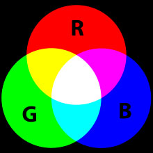
From Wikipedia
Actual pixels doing this on a real laptop screen can be seen below, photographed at 20-times magnification. (I turned the picture on its side so it looks more like the RGB diagram above):

Below are the three RGB colours in close-up, photographed at 400-times magnification from the same screen. They look as if there is too much black on the screen to make a “solid” bright colour. In reality each pixel is of course blazing with light. So what your eye sees is the colour shown in the smaller square on the right:
 =
= 
 =
= 
 =
= 
And below are the colours from the overlapping areas of the RGB diagram, also at 400X. These are known as Cyan (the pale aqua blue), Magenta (the pinky red) and straight Yellow:
On-screen cyan:
 =
= 
On-screen magenta:
 =
= 
On-screen yellow:
 =
= 
That last one above, as an example, doesn’t really look very yellow, does it? At least, not when magnified 400 times. Try looking at this detail of the yellow part of the RGB diagram (below) at 20X magnification, with its green and red components also shown. How’s that looking? (Clicking on it shows a larger version):

Are you starting to see how the illusion of yellow is created? (Getting a bit further back from the screen than usual might help.) It’s an “illusion” in that there are no yellow pixels, only red and green on a black background. Certainly looks like yellow by the time it’s been through your eye and reached your brain, though, doesn’t it?
And this is how your screen shows you white at 400X:
 =
= 
And below, photographed at 20X, is the white background behind a familiar blue “e”:

Likewise this doesn’t look very white, though you know it “really” is.
And if these enlarged images of “screen yellow” and “screen white” don’t look as if they should really work, that may not be the only thing about RGB colour which seems “wrong”, at least compared to the colour mixes we see or paint on paper.
The RGB model, so familiar on our screens, is quite different from another kind of colour mixing that we also think we know very well… the kind we learned in painting classes. What happened to the famous “three primary colours” we were told about at school?
They are not the Red-Green-Blue trio of RGB, but “The three colours, red, yellow, and blue, that can be mixed together in different ways to make any other colour,” as the Cambridge Online Dictionary says — often shown like this:

Well, those primaries may work (up to a point — see below) on paper or canvas. But these three primary colours were conceptualised by François d’Aguilon in 1613 when the colours of pigments used to make oil paints were the key factors in people’s minds. This was before full-colour printing on paper was even possible; light came from candles, not light bulbs or LEDs, and screens were things you sat behind to confess to your priest. Electricity only entered someone’s life if they were unlucky enough to be struck by lightning.
And the lit-up electric-powered screen is a very different thing from a painting or a print on paper. On a screen we see additive colour, made with transmitted / emitted light, and the three screen primaries are clearly red, blue and green. These three colours add togetherto make the various combinations — clearly shown in this photo of three spotlights shining the RGB colours onto a wall. (Possibly a little Photoshopped… but an illustration that makes its point.)

Isn’t that what we do when we mix colours with paint, though, or print with coloured ink on paper — add colours together? Strangely enough, no. What we are doing then is taking colour away — subtracting it. We are taking colours away from white.
White paper is not emitting light. It gets its whiteness from reflected light. The white reflected light is still made up of all the colours of the spectrum mixed or added together, just like the white light where those three spotlights overlap. This is seen when prisms or raindrops split white light into its component colours, and we see a spectrum or rainbow.
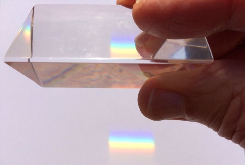
What makes colour subtraction different from addition is that paint or ink put onto white paper absorbs some of that reflected light, taking it away from the white. This is in some ways the opposite of what happens when light is emitted from a screen.
So: on a screen, colours mix in an additive process.
On paper, colours mix in a way which is called subtractive.
Which neatly brings me on to:
^^Table of Contents3. CMYK COLOUR
The computer screen may bring us most of our images, but we are still living partly in the world of paper, and probably have to print stuff out now and then. Your home or office printer is a place where you will see CMYK colour at work, as anyone who has changed its ink cartridges may have noticed. As with the RGB pixels on screen, the printer uses its own tiny dots to build up images, and a very limited number of colours — in this case not three, but four.
C, M & Y are the Cyan, Magenta and Yellow that we met a while back, where the R, G & B overlapped. K is Black. Obviously. Even if my Epson ink set calls it BK, just to be awkward:

Below is a picture of the Legion of Andy. I have printed out a paper copy to show how my Epson inkjet printer makes the image.

Paper image, enlarged (Click to enlarge. Back button or arrow on your browser to return here.):


Above: Andy’s skin at 20x and 400x.
Below: Andy’s cigarette end, ditto.


As with the pixels, I don’t think anyone would call these printer dots “Ben Day dots.” They are too irregular in shape and pattern. People tend to use the name “Ben Day dots” for neat, regularly spaced, round ones — and they are partly right (of which, more later).
So, my/your printer is using a subtractive CMYK process. And most things printed on a surface — such as paper, but also other packaging materials — will be printed using CMYK (some exceptions will be shown later).
The colour diagram or “model” of CMYK will look fairly familiar to anyone who ever mixed their own paints:
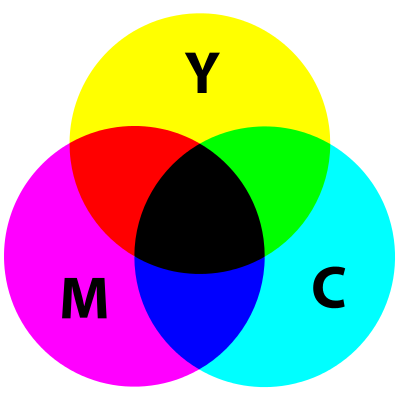
In the centre is a black area, where all the colour has been subtracted from the white light by the overlapping cyan, magenta and yellow. In real-world printing, the overlapping colours tend to make something that isn’t really good enough, and black is added to improve the final image. (Some black dots are visible on Andy’s red cigarette end, above.)
As we will see later, in the days of the real Ben Day dot, and in the comics, the black part of the image was even more important. In fact it was known as the “key”, which is where the K for black in CMYK comes from. (Some sources suggest it was called K rather than B so as not to get muddled up with B for blue. This may have been helpful in some circumstances, but since the blue is actually called cyan or C, it is less likely than the “K for key” story.)
In the CMYK system, it is cyan, magenta and yellow which are the primary colours, not blue red and yellow. These are the colours that really can be “mixed together in various ways to make [just about] any other colour,” as the dictionary had it.
4. THE ROAD TO CMYK
Pictures and words carved onto wooden blocks, inked, and printed onto paper were probably first produced in China around the year 200. Reusable “movable type” printing blocks, for printing words, were also developed there in about the year 1000 CE/AD. It was in the 1400’s that both these methods came to Europe.
In Mainz, Germany, Johannes Gutenberg had his metal movable type and printing press running by 1450—one of the key developments in human history.
Pictures printed from carved wooden blocks had arrived in Europe a few decades earlier.
Most pages were printed in black or one colour. Coloured illustrations were usually only achieved by hand colouring, which in larger editions increasingly came to involve stencils. Only a “solid” colour could be stencilled on, with no gradations. A red ink could not be broken up into dots to make pink, for example. This example below, from http://www.prepressure.com/printing/history/1800-1899, is said to be a “nineteenth century penny print” using three “spot colours”:

In the very early, experimental days of colour printing, from 1710 onwards, pioneer Jacob Christoph le Blon did use the three old primaries, red, blue and yellow, sometimes with black. He engraved three or four copper printing plates (as shown below) by hand for each print, using a mezzotint method—one of the ways engravers created grey tones in B&W prints. This allowed for gradations of colour. But his method was very expensive and time-consuming, and did not catch on.

What took colour printing forward were advances in lithography, invented around 1799 in Munich, Germany, initially using stone printing plates, then metal. The images on the printing plates were still drawn by hand, then etched into the stone or metal with acid.
There is a lot more on lithography—especially the part Ben Day dots played in its success from the 1880s onward—in Part 5 and Part 5-&-three-quarters.
In 1837, Godefroy Engelmann patented his technique of chromolithography (colour lithography) which dominated colour printing for decades to come. In the making of high end prints, for framing on the wall, several colours might be used, including two different reds, two blues, even blended shades of black, for example. Inks could be mixed to suit the job at hand.
This one, “Love or Duty“, an 1873 chromolithograph by John Baptiste Jehenne— from a painting by Gabriele Castagnola—is frankly just showing off (click to enlarge, back button/arrow to return):

By the late 1800s, relatively cheap colour lithography was being used to make large editions of greetings cards and book illustrations. This birthday card from about 1888 is a more everyday example. If click to enlarge, you may start to see the lithographic dots!

Newspapers, printing mainly words set in metal type, remained black-and white at this time. They used letterpress printing with metal plates, and cheap very absorbent paper called “newsprint.”
The rotary printing press (using cylindrical printing surfaces, not flat plates) speeded up printing from 1843.
The revolutionary web rotary press — the classic newspaper press with the vast rolls of paper being fed through continuously, and printed on both sides at once — was invented in 1870.
In 1890 the first four-colour web rotary press was built in Paris by Hippolyte Marinoni for his newspaper Le Petit Journal—another revolution. The French printer could in principle have used Ben Day at this time; the method was well-established in colour lithography, but not popular in France. In addition, it would have required new skills to adapt to letterpress printing of this kind. Marinoni chose a different method for his highly-successful colour supplement. More on this in later chapters.
In 1892, this type of press arrived in the USA. The first American newsprint weekend colour supplements were printed in Chicago in that same year, 1892—see Part 6.) The Chicago Inter Ocean newspaper used presses directly inspired by Marinoni’s, and having studied the French method, also inherited non-Ben Day methods of making colour printing plates.
At first only the big city papers, which owned their own printing presses, could afford the new technology. New York was next. From 1893, New York papers started to acquire colour rotary web presses, and within a few years the Sunday newspaper comics section was born in that city—yet another revolution! Right from the start, the Ben Day dot became an integral part of colour comic strip production.
I think this picture below is a web rotary press, circa 1940:

5. CMYK vs. RGB
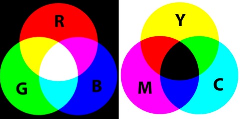
I was fairly gobsmacked when this fell into place for me. It seemed almost crazy, but on the other hand, it helps to show that the two processes really are in some ways opposite to one another.
This may also help explain something that you might have noticed in the real world; getting a coloured image on your screen to print out faithfully is not a straightforward matter. Partly, of course, this is because ink on paper lacks the brightness and vibrancy of a light-emitting screen. And in practice, process cyan, magenta and yellow are not exactly the same hues as you see on your screen. But it’s also because the computer/screen combo and the printer are using completely different colour systems, pretty much opposite to one another. In practice, some very clever software is needed to translate RGB into CMYK.
Where that translation needs to be extraordinarily good is in the world of photography, where a top-quality print is required. But it is also important when reproducing colour pictures in books, magazines, comics and newspapers — and on cereal packets etc..
Which brings me to my next section:
6. FOUR-COLOUR PRINTING WITH CMYK IN NEWSPAPERS, COMICS… etc.
Your printer is one place where you might see CMYK in action in today’s world (for the benefit of future scholars, that is the world of 2015).
Here is another. These images appear on every page of my daily newspaper:


They have been set up to show at a glance if the four printed images that make up the page — still one for each colour, just like M. le Blon in 1710 — are printing well, and are lined up (or “registered”) correctly. The set of registration marks above looks pretty good. The marks below are from a page that is slightly misregistered, with a close-up of the top of the cross. None of the four images is precisely aligned with any of the others here:


Mass-produced printing has moved on a long way since 1961, when Roy Lichtenstein started making advertisements and four-colour comics his source material. Most newspapers have colour on every page now. In those days, most daily papers were printed only in black and white. The more expensive coloured sections were confined to the weekends, mostly Sundays. In the Sunday comic strips, and in the U.S. comics, printing of this standard (seen here at 20x, an image from few years after 1961, I know) was fairly common:


CMYK is a four-colour process, and everything printed using CMYK is four-colour printing, a name which was often used in the printing and publishing business as shorthand for CMYK.
On the letters page of Boys’ Life magazine for September 1954, Vance Everett of Scotch Plains, New Jersey, wrote to the editor: “You said the Outdoor Code in the March Boys’ Life is in four colors. I counted more than four colors. Who goofed?” The editor replied: “No-one goofed. You have just learned one of the terms of the printing trade. Actually the page was printed with four different colors of ink, skilfully blended to bring out practically all the colors possible. Printers and journalists refer to full color reproduction as four color work.”
But the name “four-colour” stuck particularly to the comic books, perhaps because their crude printing, those dots! that poor registration!, made the process more obvious than the sophisticated half-tones used to reproduce photographs etc. in glossy magazines.
Dell comics published over 1,000 issues of their Dell Four Color Comics between 1939 and 1962, featuring a revolving line-up of characters including Santa Claus, Francis the Talking Mule, and the gun-toing Dick Tracy.
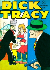
Publishers like Dell, fans of comics, and other commentators might use the name in a neutral way — e.g. “four-color fantasies” — but it is also very likely to be found in negative terms like “four-colour nightmares” from the time when comics were being persecuted in the 1950s.
Did I mention cereal packets…? My morning breakfast cereal comes in a box printed with CMYK plus 1 — the +1 is a dark green ink, known as a spot colour. This is not unusual in packaging, and is often seen on book covers and elsewhere. Here’s the cereal box registration mark and a close-up of part of the product’s logo. This shows that most of the green is still made up of blue and yellow dots. Only part of the logo uses the green ink:


These dots are one kind that people will often call Ben Day dots. “If you blow up a printed picture like this,” they will say, “you can see the Ben Day dots.” This is not true. These are halftone dots, as seen in Part 3 in black & white photos prepared for newspaper printing with a “halftone screen”. These are the modern, colour, equivalents, produced by software rather than by glass screens in a camera. Not Ben Day dots. Different animal.
By contrast, this cellophane wrapper (below) for Swizzels’ Fizzers is only printed with solid colours of black, white and pink — all ‘spot colours’ — no CMYK mixing at all, and no dots. Also still common in packaging, though much more common in days gone by.

Meanwhile, back at the the four-colour process, here’s Cap again on the cover of Avengers201, cover-dated November 1980. The printing of this comic was basically the same as it would have been in 1960. Some details were different, but surprisingly little had changed even since Cap first hit the printed page in 1941! (It was in the 1980s that changes — mostly for the better — really accelerated.)
The next eight pictures are scanned directly from four actual test printouts — “proofs” — sent to Marvel Comics’ art department from the printer for approval. (A few red marks can be seen on the black and white picture, indicating corrections needed.)
To start with, here are the four images in CMYK order:


then

then

and
 .
.


Introduction:
The Rise and Rise of Colour Lithography
As always:
- click on a picture to enlarge
- many pictures can be clicked again to enlarge more—you’ll see the + sign
- use your browser’s back button/arrow to return here
FOOTNOTES will be linked and made clickable when I can get round to it. Apologies. I just want to get this post up for now.

Detail of lithograph using Ben Day dots (The Boy’s Own Paper, 1891)
In my previous post I looked at the main methods that were used to print illustrated material up to the 1880s, when Ben Day dots came on the scene. Printing was a rapidly expanding industry throughout the 19th century in Britain, the USA and Europe, as demand for books, newspapers and magazines increased. (Not to mention art prints, stationery, forms, tickets, chits etc.) In the later part of the century the packaging and advertising of foods and other products also required more and more printing—of advertisements, labels, posters, leaflets and other promotional items.
Lithographic printing was a new arrival in the early years of the century. Invented by Alois Senefelder in the late 1790s in Munich, Germany, it became established as a regular trade in large European cities in the mid-1820s. For some purposes, especially pictorial, lithography offered real advantages in speed and economy. Michael Twyman has charted the rising numbers of printing businesses in London—letterpress, intaglio and lithographic—from just over 200 in the early 1820s to about 1500 by 1890. (1)
Twyman’s figures also show how lithography grew proportionately more rapidly than other types of printing, from small beginnings in 1822-23 to almost a third of all London printing firms by 1890. Similar booms in lithography were happening in Europe and the USA. As the 19th century went on, smaller towns started to have their own local lithographic printers.
Letterpress printing—a much longer-established method, for books, newspapers and magazines—was also thriving, mostly for black & white material. Lithography found a particular place in the printing of colour images, but was also useful for one- or two-colour items such as contracts, forms, diplomas, certificates and labels. It took a lot of business away from the old intaglio processes for printing in B&W, i.e. engraving and etching on copper and steel.
Amazing though it seems now, in the early years of the Ben Day process, the 1880s—and for some time after that—lithographic printing was almost exclusively done from heavy stone blocks. As seen in Part 4, pictures engraved on wood dominated the pages of magazines and books. For illustrations and posters, one advantage of lithography over wood engraving was size. Wood blocks were small and slow to engrave. Litho stones could be a lot larger in area, as well as faster to prepare. Of course, the larger the stone, the more cumbersome it was.


It is clear that in their first decade—before they were widely taken up by photoengravers—Ben Day’s lines and dots were very extensively used in colour lithography, itself a large and growing field.
Indeed, I will show in this post that Ben Day’s shading mediums did not just share in the success of colour lithography, but were themselves an important factor contributing to that success.
Commercial lithographic printing from stone as well as zinc did not really die out until the 1940s, at least in Britain—though its heyday is usually quoted as the 1870s to 1920s. Shading mediums, including Ben Day’s, were in constant use in commercial lithography from the early 1880s for 50 or 60 years.
This is the forgotten history of the Ben Day dot.
If Ben Day dots are remembered at all in the 21st century, it is for the printing of colour comics—a photoengraved letterpress method—or the exaggerated version of comic-book dots painted by Roy Lichtenstein.
Next time I will move on to photoengraving. This post is about the use and success of the Ben Day method in lithographic printing.
Starting with:
(i) The Importance of the Adjustable Frame
As discussed in Part 4, following the 1879 debut of his printing films, Ben Day’s next patent in 1881 was just as important for the success of his method—the “Adjustable Frame for Printing Films.”
As seen in the 1879 patent, each transparent shading sheet, with its pattern of lines or dots (shown as dotted area A in the diagram below) was fixed to its own wooden frame (B). This framed film became known as a “Ben Day screen“. For clarity, I have tinted the screen orange in the picture below, taken from Day’s 1881 patent document. The new Adjustable Frame held firmly on to the screen, and being hinged, allowed the inked screen to be lowered into position, flat down onto the surface which was to be imprinted with the Ben Day pattern.
The frame was at a suitable height to be used with a lithographic stone, as shown below. I’ve tinted the stone purple.

The great advantage provided by this mechanism was the very accurate placement of the Ben Day film on the stone.
I suspect the Adjustable Frame was inspired by—one might say derived from—a similar-looking frame which had been recently introduced in lithography. This was used to line up stones in the best possible register, when printing in two or more colours.

The picture above is taken from W.D. Richmond’s The Grammar of Lithography (3)—published in book form in 1878, the year before Ben Day’s first patent, but originating as a series of magazine articles starting in 1875. After detailing various ways of registering stone blocks by hand, Richmond has this to say about the new-fangled device:
Registering machines have also been employed by some lithographers with success, and though they are not usually on sale by dealers… they may be had to order. [The illustration] shows one of these contrivances adapted to a stone. It consists… of a frame adapted to the stone by means of set screws, which answer the double purpose of securing the frame to the stone and adjusting it in position.
The Ben Day screen was quite a different proposition. It often did not need to be positioned on the stone or drawing with any degree of perfect register. For a single application, the screen could be placed by hand, so long as the craftsman could hold it steady while rubbing down the pattern. As seen in Part 4, areas of the image which were not to be shaded were “masked off” with a paper “frisket” (as per Day’s own patent description) or, in lithographic studios, with a layer of liquid gum, painted on and allowed to dry. It was the careful positioning of this “mask” which determined the accuracy of the shaded area, not the precise placement of the Ben Day screen itself.
However, Day realised that applying his shading films more than once would be useful, to create repeated or enhanced patterns. His ingenious twist was to use a device similar to the registering machine—his Adjustable Frame—to mis-register his line and stipple patterns between applications, but by very slight amounts and under very tight control.
On Day’s new device, the adjustment screws moved the frame one thirty-second of an inch per complete turn. “By means of the pointer V and the scale on the dial W the most minute movements of the screws can be regulated and measured,” as Day said in his 1881 Letter Patent.
A 1948 book (4) reports that precise movements of 1/640 of an inch—about 4 hundredths of a millimetre—could be made, implying that the dial had 20 divisions per turn of the screw, which is credible. Day does not actually state this in 1881, and it could have been a later refinement. Clearly though the original device was already quite efficient in its adjustability. (5)
This had a very important application: after imprinting its pattern on the stone once, the Ben Day screen could be lifted off the block, re-inked, replaced in the frame, moved a fraction of an inch, then used to apply a second print of the dot or line pattern. This print would sit alongside the previous one, creating a double pattern. A third was also possible, more if needed.
In Part 4, I showed Day’s parallel line pattern being used for cross-hatching, in which a second set of lines was imprinted over the first—seen below in his own drawings from the 1879 patent. This was shown as a manual procedure.

From 1881, with the Adjustable Frame, it became clear that there was much more utility in his “printing-films” than it might at first have seemed.
Every individual film, Day had now revealed, was able to print multiple patterns.
In diagrams provided with the 1881 patent, Day shows how this could work in practice, with two simple examples. First a line pattern X is repeated at an even spacing to produce a doubly-dark line shading pattern, X’:

Then he shows us some Ben Day dots—the first time we have seen any in his own documentation—albeit not the regular grid of dots which we now know so well, but a stippled dot pattern, looking very much hand-drawn. (As we will see, this hand-drawn pattern was not simply a case of technical limitation.)
The original pattern Y1 is shown being doubled to Y2 and tripled to Y3:

Finally at Z he shows a stipple which has been re-applied up to four times, with different areas being pressed with the stylus “according to the shading of the picture or print desired.” In other words the user can to some extent draw with the dots to create a graduated shading effect.

Two notable points emerge from this:
Firstly, whereas today we think of Ben Day dots as regular round dots in a mathematically precise pattern, in their early days they were intended to look like hand-drawn stippling. Day was mimicking the kind of dots that artists and printers were already using. These might be semi-regular—perhaps laid out in curved lines—but they were recognisably marks made by hand.
Secondly, this was just what the commercial lithography industry needed at this point in its continuing development. Benjamin Day’s 1878/9 patent text may have seemed rather tentative about the use of his shading mediums in lithography, but in 1881 they were poised on the brink of major success.
I will now look at the various different ways lithographers had made images on their stones up to this point—and how Ben Day’s patterns fitted into their world.
(ii) Lithographic Shading Techniques Before (and With) Ben Day
Among the various printing techniques of the 19th century, lithography was something of a magpie and something of a chameleon. Its pioneers looked at other, long-established printing methods, worked out what they could borrow or adapt, and/or how to mimic the look of wood engravings, letterpress text, copper and steel engravings, etchings etc. When photographic printing methods took off in the latter part of the century, ways were soon found to imprint photographic images on stone.
Before 1837 though, hand-drawn black and white or two-colour work was the bread-and-butter of the lithographic printers. One of their great advantages was mixing text and images on one stone and in one print run, with text that could be more creative than that of the letterpress printers. The latter needed a set of cast metal type for every style of lettering, which had to be printed in straight rows and columns. The lithographer could potentially draw a new style of lettering for a client’s particular needs, and it could flow around the page and be integrated with images.
The Italian billhead below shows some of this, as well as a scene illustrating lithography itself. Click to enlarge, and you should be able to read the original caption which I have left in place.(6)

The basic techniques listed below could be used for:
- making a single-colour (monochrome) print—usually black ink on white paper, but not limited to that
- or for one of the stones which would be printed in coloured ink as part of a tinted print(black plus one or two colours)
- or one of the stones used for a fully-coloured lithograph. A typical colour print might use 9 colours, and so require 9 stones. Fewer stones, or more, could be used as needed.
In every case, the ink used to make the image on the stone was black—a special grease-based black ink. Once that black image had been drawn—including writing and shading if needed—the final, printable, version was “etched” chemically onto the stone. The original black greasy ink was removed. The printing ink then used with that stone could be whichever colour was required. For more detail, see Part 4.
The main techniques used in making images on the stone were:
Ink drawing directly onto smooth, polished stone
A brush or pen could be used, with the black greasy ink in a liquid form called tusche. This gave a solid line—or dot, where needed—and could be used on a smooth stone to imitate fairly closely a drawing done on paper.
“Engraving” on stone
Fine line work imitating closely the look of copper or steel engravings could be achieved. The stone was coated with a thin gum layer, then a fine point used to scrape the gum off, creating a drawing in lines and dots of exposed stone—or if the point scratched off the stone surface, actual lightly engraved stone. Lithographic ink was applied to the exposed lines on the stone, masked off from the non-image areas by the gum. The final inked image, with the gum washed off, could be etched onto the stone in the usual way. The stone then produced prints almost indistinguishable from a real metal engraving.
When wood engraving became the world’s favourite method for printing pictures (see Part 4) lithographers learned to mimic the “white lines on black” look by laying down ink on the stone, then scraping it off to create the white lines of the final image. Again the final effect was a very close copy of the wood engraving technique.
Both of these techniques were complicated and required a great deal of training and skill to execute. They would only be used for special jobs.
Shading in lithography
Generally speaking, lithographic printing, like letterpress, could print only solid areas of colour—in the case of a black & white image, no shades of grey. However, each line or area of solid colour could be very thin / small.
Small dots could be drawn with a pen, larger ones with a brush—again, on smooth stones. This kind of shading—stippling—came into its own later in the day, and will be looked at below.
The main earlier form of dot-making was…
Crayon or “chalk” drawing on rough, “grained” stone
On a rough textured or “grained” stone, a greasy black crayon—called rather misleadingly “chalk”—could be used. This gave a pleasing “natural” effect something like a drawing done with actual chalk, charcoal or soft pencil on a “toothed” paper. This was useful for shading in lithography because it was essentially a pattern of tiny dots—a fairly random distribution of dots of many sizes. Each dot on the stone could be printed from, as a small area of solid colour.
This illustration, from a 1940 book by renowned lithographer Thomas Griffits, shows some typical patterns achieved with crayon / chalk. The upper rectangles are about 40 x 35 mm on the page. (7)

And below is a very skilled example (only 20 x 50 mm in size, originally) by Charles Hullmandel, one of the pioneers of lithography, reprinted by Michael Twyman. Again, I have left his caption in place. (8)

This kind of drawing was not as straightforward as it might look. At a basic practical level, it had to be done without the slightest touch of the artist’s hand onto the stone. Due to the method used to etch the image, any tiny, unseen greasy residue from human skin would show up on the final print as an unwanted mark.
The drawing itself could easily turn blotchy and uneven, whereas an even tone or a smooth transition was usually what was required. This uneven effect is deliberately shown in the “flat chalk” example above. The others have been carefully worked using repeated strokes with the point of a sharp crayon, not a flat edge.
“Crayon or chalk work calls for a delicacy and refinement. Only the most experienced lithographic artists are capable of doing real justice to this class of work.” So wrote Henry J. Rhodes, lecturer in lithography at the Royal Technical College, Glasgow, in a book of 1914 (9). He also stressed that crayon work required great skill from “the provers, transferrers and printers”—i.e., even if the artist did his or her job well, shoddy printing techniques could easily mess it up. (I will return to “transferring” later.)
Artists like Delacroix, Goya, Manet, Whistler and Toulouse-Lautrec famously used crayon lithography for prints or posters, but an army of mainly nameless commercial artists also had to master it for their day-to-day work.
Below is a fairly commonplace lithograph from 1834, bearing the name of its publisher but, typically, not its artist—though the eagle-eyed will spot a semi-legible date and initials in the space at bottom right. This was almost certainly drawn on grained stone. Under the main image I have shown some details at different levels of enlargement. The grained, hand-drawn character of the shading can be clearly seen.
The full image is about 23 x 15.5 cm. Finer details (bottom row) each about 12 x 9 mm.

With his 1881 patent, Ben Day demonstrated that his shading technique could produce a great variety of patterns, including something rather like the random “natural” dots of chalk / crayon drawing, as seen at Y and Z in his diagrams. Also, this could be done using not only a very fine degree of control but also some creative skill or spontaneity, as the job demanded. Furthermore it might be done without employing a trained / skilled artist—potentially a significant saving in time and money.
Later on, Ben Day also produced shading tints which directly imitated areas of crayon drawing, without the need for second, third or more applications. I have selected the most crayon-like below, from Ben Day proof pages printed sometime between 1911 and 1936. (The numbers like “9 1/4 x 12 1/4” refer to the size of the Ben Day screens, in inches.)
It is likely that some or all of these same patterns were in use much earlier than that. Bamber Gascoigne, in his 1986 book How To Identify Prints, reports an early Ben Day advertisement from 1887, stating that more than a hundred varieties of screen were then available, including grained tints. (10)

Here is a direct comparison of Hullmandel’s ideal chalk shading, a real lithograph, and one of Ben Day’s patterns:

I have shown black & white examples, but crayon / chalk drawing on stone was used for a lot of early chromolithography, i.e. colour work. Godefroy Engelmann, pioneer and early patenter of colour methods (1837) used mainly crayon work.
From the very start of his endeavour, though, Day would also have been aware of another key factor—one which had already pushed lithographic image-making away from chalk drawing on rough stone and inexorably towards the use of smooth, polished stonesand a lot more of a different kind of shading: stippling.
Stippling
By the 1850s and 60s steam-powered lithographic printing presses were increasingly replacing the old, slow hand-presses. An early pioneer of the powered litho press was the Parisian, Hippolyte Marinoni. We shall be meeting him again later in the Ben Day story.
The future of commercial lithography clearly lay with the powered press.
And as a general rule, the powered presses could not handle rough stone, only smooth—mainly because they used different ink rollers from the manual machines, and did not dampen the paper between printings (11).
That meant that the future also belonged to techniques for creating images on smooth stone.
This was when stippled shading gradually started to take over from chalk/crayon work.
As Michael Twyman puts it, “Pen and ink stippling (with or without the support of mechanical tints [i.e. Ben Day patterns]) became the bread and butter technique for commercial work, and was adopted for the reproduction of popular paintings, magazine and book illustrations, greeting cards, scraps, advertising and ephemera. It remained the staple method of chromolithography until the demise of the process, and is especially obvious in trade cards and labels, where its visual characteristics often seem to have been exploited for their own sake.”
I showed examples of hand stippling on a scenic postcard in Part 4. I don’t know the date of this, but judging by the lack of regularity in pattern of the dots, most or all of the stippling looks hand-done to me:

Henry Rhodes provided this example (original image 20 x 50 mm) of various ways stippling could be done by hand, in his 1914 book:

I note that in places dots and lines are used together in this hand-drawn example. This could be done by superimposing more than one Ben Day pattern as well.
Rhodes goes on to describe “shading mediums” and how they were applied to a stone, though without mentioning Ben Day by name, and provides this example of one (54 x 50 mm):

The “festooned” or “fan-shaped” hand-stippled pattern became a firm favourite in lithographic printing. In their idealised form, the curves overlapped each other constantly, so the pattern could be extended indefinitely over a large area.
Lithographic artists, craftsmen and printers learned during their apprenticeships that, when drawing stipple, they must avoid dots in straight lines. In this they were partly imitating the copper engravers who came before them. Curves and festoons of dots were to be preferred, as giving a more “natural” look that was easier on the eye. In addition, the human hand is quite well suited to drawing a curved array of dots. You can easily try this out for yourself.
Similar forms were occasionally seen in wood engraving, amongst the generally relentless linearity, in the negative version—white dots on black. H. Pisan, engraver of Gustave Doré‘s Bible illustration Achan Stoned (c.1865) used a few curved arrays of dots on his black sky, for example:

The examples below are from various pictures printed in The Magazine of Art, 1891 & 1893. The bottom right detail shows how wood engravers also had their own version of black dot stippling, created effectively by carving cross-hatched white lines on black, leaving fragmented black lines reduced to a dotty pattern. Missing “dots”, clearly seen here, might be where the tiny remaining bits of wood simply broke off.

Ben Day and Stipple
The Ben Day shading mediums, or mechanical tints, were ideal for use on smooth stone. Indeed, the polished hard surface of lithographic limestone blocks took the pattern from a Ben Day screen better than the rougher, more absorbent surface of drawing paper. (The same advantage applied to smooth, hard zinc—i.e. metal—printing plates in later years.)
Though the early years of the Ben Day tints are not well documented, it appears that these curvaceous stippled patterns were introduced into his range from the very beginning of their commercial use, or very near it. The 1887 advertisement reported by Bamber Gascoigne offered line, stipple, grain and other patterns.
Ben Day’s first patent for an actual dot pattern, in 1900, was for just such a stipple pattern:

A close-up look at the shapes of these dots (below, enlargeable) shows that they probably originated on a specially made etched copper plate. The shape of each dot is characteristic of copper etched by acid. From the copper plate they were moulded in gelatine to create the printing surface of the Ben Day screen, as described in Day’s 1878/9 patent text (see Part 4).

The only other Ben Day dot patent I have found was for a graduated tone of the same or a similar pattern, in 1901, as seen below:

I have a catalogue of Day’s products, sold to me as 1911 vintage. The cover does have a 1911 copyright, but the booklet is designed for newer pages to be inserted. One of the interior pages is copyright 1936. (12)

In these pages 172 different screens are shown. Below I have collected, from different pages, all the 26 stipple tones. Most of them are on one page headed “Hand Stipples.” Lithographic studios would typically have kept a limited number of Ben Day screens on their shelves, perhaps ten or fewer, which they were familiar with and could use flexibly. Special orders might be put in for unusual screens where needed.

It is worth noting that several of these patterns are not flat, even tones, but graduated from light to dark, and that three of them use white dots on a black ground.
I have yet to find any definite examples of Ben Day lines in full colour lithographic illustration, though it is likely they would occur in black & white work, e.g. for shading of lettering, and it is documented that many coloured maps used Ben Day lines—more later.
The evidence shows that, in lithographic colour work, the so-called “hand stipples” were the favoured Ben Day tones. The regular grids of dots which we know from 20th century comics were a later development, giving a look more like the new “halftone” process—of which, more in a future post.
Not everyone was keen on stippling, however. In 1905 David Cumming, lecturer in lithography at the Heriot-Watt College, Edinburgh, wrote: “Hand stippling… is really an imitation of grained stone drawing, and is well adapted for machine printing. In artistic effect and softness it comes far short of grained stone work, but for commercial purposes it answers admirably…” Later in the same book, he is more judgmental: “The stipple dots, especially if visible in the stronger colours, are very offensive from an artistic point of view.”(13)
Bamber Gascoigne says of Ben Day screens: “It was argued that such textures would look natural since the originals, on which the embossing was based, had all been hand drawn. In fact they have a very mechanical look. The ordinary late 19th century lithograph, sometimes to the eye but certainly through a [magnifying] glass, will seem to have an advanced case of the measles.”
The same witticism had been applied to Roy Lichtensteins’s so-called Ben Day dots in the 1960s. Actually, any spots seen on people’s skin in old lithographs are most likely to be hand-drawn. I will show a typical example later. Nonetheless, Gascoigne’s point is not wrong—the dots on many areas of many pictures are somewhat obvious, though I would emphasise that Ben Day stippling is no more spotty than its hand-drawn counterpart.
Thomas Griffits managed to write a whole book on The Technique of Colour Printing by Lithography (1940) without once mentioning the distasteful matter of stippling, hand or mechanical. His book provided the images of chalk shading above. As Frank Pick’s introduction made clear, this was a book about lithography as art—or at least, a craft capable of producing faithful reproductions of proper art, i.e. oil or water-colour paintings.
“Now the lithographic poster is back in the streets on the ubiquitous hoarding,” wrote Pick.“The commercial printer discovered the ease with which the invention could be exploited, the cheapness by which copies of anything could be multiplied, and lithography has had to bear the unjust burdens of these sins against its honour.”
As joint pioneers of the British railway poster, now seen as a lithographic artform in its own right, perhaps Pick and Griffits both felt they were themselves sinners—or more likely, feared they were being seen as such. Possibly they sought to atone by writing stippling out of the story of lithography. (14)
Ben Day Dots in Action
(a) Simple Tints
The scholar of the Ben Day dot is concerned less with the refined artistic print, more with the commercial end of the lithographic trade. Alongside some admittedly shoddy work, a great deal of admirable image-making was done. This gold-edged peacock, for example, was printed as a label for a bale of cloth, probably in Manchester sometime in the first half of the twentieth century.

Generally, hand drawing and hand stippling would have been used for details like faces, hands, most clothing—anything which needed careful delineation and individual “modelling”. Though Ben Day was keen to stress the variations that could be achieved with his dots, in practice they were often used, as here, for flat areas of tone like backgrounds.
On this label, lines and stipples done by hand are evident on parts of the peacock and the mound he stands on, but the background is done with two colours of Ben Day, yellow and pink, sometimes overlapping to make a pale orange. Each detail shown here is about 30 x 12 mm on the label. Full image area = 4.25 x 5.25 ins or 107 x 134 mm approx.

Like the peacock, the Naranjada label shown below is probably an early 20th century production—perhaps a conscious British emulation of the famous brightly-coloured Californian fruit crate labels. The oval is 90 x 70 mm, 3.5 x 2.75 inches. Here the background clearly shows a doubling up of the blue dots in places. In addition, I think some of the orange dots on the fruit itself are done with Ben Day.

As Twyman points out, because the Ben Day stipple patterns imitated hand-drawn dots, it can be difficult or impossible to tell them apart when looking at a lithographic print—especially when hand work could be added to augment mechanical tints. Looking for precisely repeated elements in the pattern, and comparing the patterns to known examples, e.g. those in the catalogue, may help.
Another way to detect Ben Day dots might be to look for evidence of the edges of masked areas. At the stage when the Ben Day dots were imprinted onto the stone or plate with black ink, a liquid gum was painted on first, to mask off areas where the shading was not wanted. Any whole dots, or parts of dots, which were inked down over the dried gum layer would have been washed off with the “mask”.
I think this can be seen on the Naranjada orange segments, where small masked patches show as orange-yellow ovals between the darker orange dotted areas. At the edge of these areas some dots seem to have been “cut in half” where they overlapped the mask. I have tried to show this in 20x and 400x magnifications below (15). Also, in places on the orange segment, the dot pattern is overlapped on itself for a darker colour.

Hand-drawn dots, I’m fairly certain, were simply drawn on the stone without requiring any masking—thus every hand-drawn dot should show as a full round dot, with no “cut off” fragments. The handmade dots would often get smaller at the edges of shaded areas, but each dot would still be a round shape, no semicircles etc. The whole fruit seen on this label shows definite hand-stippling, in two shades of brown.
The image below is earlier, and can be dated quite precisely, as it is from an advertising insert in the April 1888 edition of The Magazine of Art (16). Image size= 125 x 195 mm, 5 x 7.75 inches approx. The black image is probably taken from a wood engraving, transferred to stone. On the red stone, the lithographer appears to have used two types of Ben Day shading, line and stipple, overlapping in places. This works quite well, as part of the shadowing accentuating the “3-D” look of the folded paper, but shows the danger of creating “Moiré”-type patterns where tints overlap. A hint of such a pattern is emerging here. More on this later.

(b) More Complex Use of Ben Day Dots
The Boy’s Own Paper, or B.O.P. as it liked to be known—launched in 1879 and surviving until 1967—provides an enduring record of trends in illustration and printing. Bound hardback volumes are available fairly cheaply. I have an example from 1890/91, complete with advertising inserts and the colour lithographs occasionally issued with this mainly black & white weekly—both often missing from such books. The majority of the illustrations are still wood engravings at this time. A very few are printed directly from line drawings by the new (ish) photoengraving process.
The first lithograph, at the front of the book, is a fold-out more than three pages in length. Readers of the B.O.P. were never treated to pictures of exotic ladies, however. The subject of this picture is the uniforms of the British cavalry—far more suitable for good Victorian boys. The two illustrations below show only the left end of the print (which is the full height of the image area, 260 mm) and part of its right end.


Below are areas of sky in close-up. (Each image approx. 40 x 40 mm.) These views reveal the complexity of the Ben Day work. Not only has a stipple pattern of large blue dots has been laid down multiple times, it is also joined by a different, tighter pattern of much smaller blue dots. Some areas which at first may look plain white or pale blue also have grey dots, in addition to the more obvious grey areas themselves.

In these other close-ups, below: the red stone was clearly off register (by a little less than 1 mm); dark Ben Day dots appear to have been used on the clothing of the soldiers, which is somewhat unusual—alternatively, they might have been drawn on Nelson paper, and transferred to stone (more on Nelson paper later); Ben Day is used extensively in background areas; complex mixing of overlapping colours makes it very difficult to see how many colours were used.

Below is Moonrise off Gravesend, a lithographed copy of an 1889 painting, which appeared with the B.O.P. of May 2nd, 1891. (Picture area c. 160 x 240 mm. The framing colour in this case was not done in metallic ink, unlike the peacock label above). This is a good example of the art of “facsimile”—the closest possible copying of an actual painting—though a commercial product like this is a far cry from the expensive, largely crayon-worked artistic prints which would have satisfied the demands of a Thomas Griffits. For the young readers of the B.O.P. though, it provided a tasty treat. For us, it also supplies ample use of Ben Day’s shading mediums for enjoyment and study.

All I would add in words to the details below is this question: would the picture look any better if some underpaid stipple artist had driven themselves insane—and possibly first blind—drawing each dot by hand? (17)

Also from my own collection comes another commercial product, like the B.O.P. aimed at a middle-income market, I would guess—though she may have been a promotional item, given away free. The calendar girl below was published in 1886 for the year ahead, 1887. Her background, outside the oval, is a slightly shiny gold, though not as sparkly as the peacock’s border, and sadly has been affected by moisture over the years (crinkled).

The image area is large—405 x 470 mm or 16 x 18.5 inches approx.—and that is with the calendar itself trimmed off. (Not by me, I hasten to add.) Imagine the weight of those stones! And how many stones—how many colours, that is—do we think were used? Perhaps a look at some close-ups will help us find out…

Having used a magnifying glass on the original print, I think there are nine colours here, as well as the gold—which makes the print absolutely typical of its kind. The colours I see are: flesh tone, dark brown, mid-brown, dark green, pale green, pale blue, mid-blue, scarlet red and a tiny bit of yellow. What looks like black is, I think, dark brown plus dark green.
At first glance, the yellow seems to have been used only on her ear-ring, which would surely have been a huge waste of the large stone used to print it. A closer look shows that the gold border is almost certainly printed over yellow, to give it more “body”. Magnified, the yellow just shows at the edges.
The background within the oval uses Ben Day patterns—dark green and mid-brown dots over a pale green ground, with multiple applications of the dots in the darker areas. On her face the pale blue (looking grey) and scarlet dots printed over the flesh tone are, I think, hand-drawn—likewise the mid-brown dots in the more shadowy areas of her skin. The details below show the blue and red dots in typical curved arrays, like the Ben Day versions, but varying in size and distribution in a way which is characteristic of hand-stippling. The brown dots under the eye have been done in a combination of large, probably brush-painted, dots with some tiny pen-stipples.

Before leaving this fine example of commercial work, let us reflect on the challenges facing its creator or creators—there was probably a team, each working on one or more of the stones. One person had to break down the image—probably an original painting—by a process of sketching and thought experiment, into a printable range of colours. An outline image was traced from the original and copied onto each of the nine stones, in a non-greasy ink, which would not become part of the printed images. (As described in Part 4.)
Then, using their skill and judgement, they drew images (and imprinted Ben Day patterns) on the stones, one for each colour, in black ink—visualising in their heads how the final coloured combination of images would look. Time and budget permitting, they may have printed proofs of some individual colours or colour combinations as they went along, to guide them further in preparing the next stones in the sequence.
As if that wasn’t hard enough, the images all had to be in the closest possible register, not to mention the technical challenges of removing gum masks without taking off any ink, “etching” each stone correctly, etc.
Given all that, is it any wonder that lithographers embraced the savings of time and effort which Ben Day’s shading mediums offered?
—
And finally…
Before leaving the subject of stippling, one last image from my own collection—just for the fun of it. It’s by Tom Browne—artist of the Johnnie Walker whisky man, and creator of the comic strip Weary Willie & Tired Tim—from The Boy’s Own Paper of 1902. The name of the company which did the lithography, Tom Browne and Co. of Nottingham, is no coincidence—it was indeed Browne’s own.

I’ll let the stippling on this one—and the drawing—speak for itself…


Writing about Nelson’s embossed dots, W.D. Richmond added: “Nevertheless, the stippled plate, by its mechanical mode of production, produces a kind of pattern that is objectionable to the practised eye, which, added to its high price, has given an impetus to paper prepared by the old method. [I.e. from an inked grained stone.]” Both of those objections would later be raised to Ben Day dots.
And, as with VHS vs. Betamax, or MP3 vs. Super Audio CD, the technically superior product is not always the one that wins the day. Twyman reports that the same author, Richmond, wrote in his later book on colour lithography (c. 1885) that patterns transferred on paper from copper plates had largely been superseded by mechanical tints, i.e. the Ben Day screens, which had “led to a great saving in labour… ” And he admitted:“The results are such as are unattainable by hand labour.” In other words, embossed or printed transfer paper may have won out over transferring patterns from stone, but was then itself largely wiped out by the next evolutionary step.
Thomas Nelson’s own lithographers probably weren’t the only team to continue using Nelson’s embossed paper into the 1890s, though. It may have been more than loyalty to the family firm—the results they got were undeniably very good. (19)
Ben Day as Successor to Transfer Paper
As noted above, the stippled pattern on gelatine film which Ben Day patented in 1900 was almost certainly created used an etched copper plate as the mould. This, along with their very similar method of use, makes it clear that the Ben Day film was a close relative of embossed transfer paper.
In fact, going back to Day’s Letter Patent which he submitted in January 1878 for his original “Improvement in Printing-Films,” he describes how his early lined films were made from lines “prepared or engraved upon wood, metal or other suitable material,” from which moulds were made (see Part 4). Because he was using hot liquid gelatine to make his films, his method had to be different from embossing patterns onto transfer paper. Otherwise the principle was very much the same.
Also, we have seen above how transfer paper was inked with a pattern in two distinct ways, before the pattern was transferred to a smooth lithographic stone:
- a patterned surface—rough stone, leather, a metal plate etched with dots or engraved with lines, set metal type—was suitably inked up, and the image of the pattern printed onto the transfer paper.
- Embossed transfer paper, on which the pattern existed as a series of small raised “pimples” for dots or ridges for lines, was inked using a lithographic chalk / crayon.
It may appear from my account above that Ben Day’s Rapid Shading Mediums were specifically designed to do some of what transfer paper did—in effect, combining the two roles described above—but to do it faster and better.
Is there any actual contemporary evidence that this was Day’s express intention?
In Part 4 I looked in some detail at Day’s own words, in the 1878 Letter Patent. I noted a persistent lack of clarity in his statements about how his product would fit into the printing methods of the time. Having looked in detail at lithographic image-making, it is worth revisiting Day’s original text.
Ben Day was clearly aware of predecessors to his own shading mediums. The very name of his patent, “Improvement in Printing-Films,” makes that clear. He also says:
“I am aware of the processes described in English patents… of 1867 and 1871; but these do not show a thin, tough, and transparent printing-film like mine, nor the process of producing the impression by the abrasive action of a stylus upon the back of the film…”
I’m certain that at least one of these “English patents” was Thomas Nelson’s, for his embossed transfer paper.
Day also noted that his films were “designed for… printing and the preparation and finishing of drawings, printing and copying surfaces, &c.” Also: “…the quick and rapid production of printing and copying surfaces for lithographic printing…” The main “printing surface” of the time was lithographic stone. The only “copying surfaces” were transfer paper and lithographic stone, as in the “mother stone” method as noted above.
Though his patent showed only lines being imprinted, he mentioned that it could be used for “…any kind of stippling, graining, hatching, lining or shading… with the utmost precision, rapidity and excellency of finish…” Unlike transfer paper, Day’s films were semi-transparent, so lithographers could see where they were putting their shading (20). Combine this with the Adjustable Frame and precision and rapidity are certainly enhanced.
Day also emphasized repeatedly how flexible his patterns were—that is, varying the pressure used when laying a pattern down could produce a darker or lighter tint (or even a wobbly or “waved” line. While this may have been possible to a slight extent with transfer paper, it did not have the rubbery, elastic surface of Day’s film, which theoretically gave the latter far more variability.
Day also notes that a piece of typeset text could be imprinted on a Ben Day film for reproduction. This baffled me at first, as I was thinking in terms of shading and tinting. Using type as shading may not seem shocking to us now, but it would have been very avant-garde in 1878. Day was of course thinking of far more conventional use of text, which many lithographers would have been copying onto stone via transfer paper as a matter of routine.
They rarely attempted a whole book or magazine’s worth of text. It was too time-consuming and the results of uncertain quality—the transfer process always degrading an image slightly. Some short children’s books were printed this way—”nursery” books with very limited amounts of text in a large size, and a lot of pictures. Otherwise, lithographed pictures and letterpress text were separately printed, and the pages combined at the binding stage. Day may have felt his more direct method of imprinting text would offer a useful advantage here. In practice, it probably didn’t—at least, I haven’t seen any accounts of it being used this way.
Discussing how difficult making lined shading or cross hatching is “either in drawing or engraving by hand in the usual manner” Day claims that his new method can achieve “in one hour’s time… an amount of work that would require a month’s labor if executed in the usual manner.” This seems like an exaggeration, but if “the usual manner” included the original engraving of a lined or cross hatched copper plate, from which transfer paper was to be printed, it might be about right. If the lithographer had his prepared metal plate on hand for regular use… perhaps not. Equally, Day might have been comparing a lithograph made using his lined film with a copper or steel engraving done from scratch, or a similar engraving on stone, in which case a month was again perhaps not too far off the mark.
Day’s text repeatedly stressed the savings in time and labour offered by his new method, and, exaggerations aside, he clearly had a point.
A lithographer used to preparing new transfer papers for every job—either printed from a metal plate or rough stone etc., or crayoned onto embossed paper—would have immediately seen the advantages of Day’s system. For example, inking a Ben Day film with a roller was a lot easier than carefully drawing an area of even tone on an embossed paper with a lithographic crayon. And, unlike a piece of transfer paper—used once then discarded—each Ben Day film could be inked, used, re-inked, used again if need be, in doubling up or tripling the pattern—and the ink was then washed off the screen and it was put back on the shelf for next time.
If only Ben Day had been more explicit about all this in his original patent, instead of dropping vague hints… how many weeks of painstaking research might have been avoided? Others have noted that patent texts are sometime written with just enough detail to ensure a patent is granted, but not so much that all one’s secrets are given away. It may even be that Day’s repeated emphasis on the “artistic and decorative purposes” of his films was something of a smokescreen, meant to hide their true primary utility for printers.
The arrival in 1881 of the Adjustable Frame, as noted above, gave Day’s films further major advantages. And it appears that from then on, the printing business took them up in a very big way.
Ben Day as Success Story
Michael Twyman states, in his History of Chromolithography, that English patents for the Ben Day method were taken out in 1881 and 1882. He also shows an American Ben Day advertisement from 1891 stating that the system was “Patented in the US, Canada, Great Britain, France, Germany and Belgium.” The photo below of a Ben Day screen is also from his book. It shows instructions printed in English, Italian, Spanish, French, German and what I am fairly certain is Russian.

In British publications of the 1880s and 90s, it is common to find colour lithographs—with Ben Day dots clearly on view—which had been printed in Germany and Holland. This does not necessarily mean that the whole book or magazine was printed abroad. The bulk of the pages may have been printed by letterpress closer to home.
However, there must have been some reluctance to use the new mechanical tints, in some cases on a national level. Twyman shows evidence that, in 1889 at least, French lithographers were not keen on Ben Day, preferring to continue with hand methods.
I would love to know more about how Day marketed his “printing-films” to the printing business, especially in the early years. I haven’t been able to find any contemporary sources for this. But there is little doubt that the Ben Day system was very successful, significantly changing the industry—indeed, contributing to its continued growth in a fairly major way. How do we know this?
Accounts from Twyman and Gascoine tell us that Ben Day shading was highly prevalent in the last ten or fifteen years of the 19th century, and into the 20th.
I have found a few pieces of more contemporary evidence, the earliest so far being a short piece in an early “Penrose Annual,” then called The Process Year Book for 1898. Subtitled “A Review of the Graphic Arts” this book, aimed at the printing trade—specifically those using photoengraving—was published in London, England. The anonymous writer was probably editor William Gamble. The article was headed Day’s Shading Mediums. The author is clearly well aware of the different ways Day’s films are being used. Leaving out a couple of sentences about photoengraving, which I will return to next time, he says:
“We have pleasure in again drawing attention to this excellent invention, the advantages of which are by no means so well known as they ought to be. [His remarks aimed mostly at photo-engravers, not lithographers.] These “mediums”… with either lines, dots, grains, stipples or other tints in relief on the printing side… This side, having previously been inked, and the film having been placed by means of the regulating apparatus on the stone, is pressed with a stylus… the pressure printing the tint on the drawing.
By moving the film a trifle to one side, by means of the dials on the apparatus, thus throwing it out of register, the colour of the tint is increased by re-tinting and thickening the lines or dots, etc., etc. A variety of effects can be obtained also by combining two or more styles of tints.”
The article concludes with some revealing discussion of Ben Day’s expanding repertoire:
“Although there are already over one hundred tints from which the artist can select, Mr Day is always on the look-out for new effects and ideas, and in this way not only keeps his clients well up to date in the way of novelties, but is yearly making his shading mediums a more valuable adjunct to the studio.”
The next piece, written fourteen years later, is more explicit about the prevalence Day’s mediums have gained by that time in the trade. It is from an article on chromolithography in the London Times newspaper, from September 1912.
“The artist proceeds to draw, by hand, each separate colour… The actual draughtsmanship may be in lines, small dots, or on grained stone, in addition to areas of solid. The ink used is always the same black, fatty matter. The disuse of grained stone commenced before 1880, and in its place the artist dotted or stippled on the stone, in a mechanical evenness…
After 1885 the hand stippling was largely replaced by mechanical stippling. [My emphasis in each case.] The latter is done by means of semi-transparent films manufactured with a grained, dotted or lined surface, upon which transfer ink may be rolled… to be rubbed down onto the stone. The best example of these is the Ben Day film.
Their introduction has been a great boon to both the printing trade and the public. They have saved labour and time, and can be employed for lithographic drawing, and designs for photographic and letterpress production. They have largely cheapened the publication of works by chromo-lithography.”
By “cheapened” the Times doubtless meant “made more economical” rather than “demeaned, degraded or devalued” as we might use the term. Critics of the “chromo” on artistic grounds might have agreed with the modern dictionary on that point though.
My third piece of evidence comes from British magazine The Artist, March to July 1941. (21)
Printer W. O. Page set out to explain colour lithography to his readers, in a series of articles called Lithography—Modern Methods. Three things are noteworthy about this.
Firstly, as late as 1941, Page’s article was sub-headed with the words: “…lithography constitutes one of the most important of present day commercial methods of reproduction in colour.” I found this somewhat surprising, and I suspect even at the time some of his readers must have been thinking, “Oh, really?” Process colour—printing using halftones and photoengraved metal plates—was taking an increasing share of the commercial printing market by then. Nonetheless, there is evidence that UK servicemen in 1946 were being trained in lithography for the post-war world—not perhaps the wisest of career choices (22). Cumming’s Handbook of Lithography was reprinted in 1946 in an edition “For the use of H.M. Forces—not for resale.” (23)
Secondly, in Part III, May 1941, Page says:
…each colour is drawn on polished stones, and the artist is greatly assisted by films called “mediums.” The best films come from America and are called ‘Day’s medium’ after the man who invented them.
Below is the selection of patterns he showed in his article, presumably reflecting the patterns which he himself—and perhaps lithographers in general—found most useful. The top two are shown overlaid with themselves in different ways. Most are “hand-stipple” or grained patterns. Even at this late date, Page chooses no regular grids of dots in the “halftone” manner, which were being widely used by the photoengraving opposition—of which, more next time.

Thirdly, Page advises his readers that a more affordable alternative to Ben Day mediums is available, made by a company called Penrose. Could this be the same Penrose who published the 1898 Process Year Book, which so effusively praised the Ben Day mediums?
Why, yes, it could. As well as publishing the Year Book, this London-based company’s core business was the supply of chemicals, printing plates and camera equipment to the photoengraving industry. One factor which helped Day’s competition is the fact that the Ben Day machines and shading sheets were not sold to their end-users, but leased, at some considerable expense. Penrose’s machines and films were sold directly, Page tells us, not leased.
Michael Twyman says that Penrose licensed the use of Ben Day machines from Day’s own company, though I suspect this was only until Day’s patents ran out. Evidently Penrose saw a money-making opportunity in marketing—possibly undercutting—the world’s number one in the shading medium business. Clearly the arrival of cheaper competition can be taken as a sign that the Ben Day company was enjoying a high degree of success. I know of at least one other competitor, and Twyman discusses others. I might discuss these in a future post.
While the Ben Day leasing system may have had advantages, for example when a machine broke down or screens were torn—assuming the contract included repairs or replacement—it was costly, which meant that only businesses of a significant size could afford to use the system.
Ben Day meets Alfred, Lord Tennyson
Having recently read Michael Twyman’s excellent History of Chromolithography, I cannot resist re-presenting from that book one final example of Ben Day dots in action. Again, I have left the original caption intact.
For now this is a relatively low-resolution reproduction using the British Library’s scanning system (which generally has been an excellent recent innovation, I must add). I will replace it with a better copy if and when possible.
This is a portrait of Alfred, Lord Tennyson, done completely in Ben Day tints, printed in the magazine The British Lithographer in 1893. This was surely a promotional gimmick, and not something that would often have been attempted. Ben Day patterns were usually integrated into lithographs which used a variety of colouring and shading techniques. But what a splendid gimmick it was—a tribute to the Ben Day method which deserves to endure, and a fitting image with which to close my piece.

Concluding Remarks
In summing up, I will quote David Cumming again, from 1905. After discussing the huge increase in speed of lithographic printing brought about by the powered press, he continues: “It will thus be easily seen that the production of lithographic work is now enormous compared to what it was previous to the year 1870.” Cumming was also reflecting on how important transfer paper was in this revolution.
I would add that the addition of Ben Day tints to the lithographer’s repertoire, from the 1880s onward, completed a triumvirate of technical factors significantly contributing to its ongoing expansion.
I do not discount the importance of photo-lithographic techniques, zinc plates or offset printing, but these innovations came to prominence later, and are outside the scope of this article.
Of course, if there was not also a great demand from the population for printed matter, especially in colour, no amount of technical proficiency could have driven such an increase in capacity. The stories of Victorian and Edwardian art prints, book and magazine illustrations, sheet music, theatre and railway posters, maps, labels for cigar boxes & fruit crates, postcards, greeting cards, advertising material, “scrap” & other ephemera etc. have been told elsewhere, and placed in their socio-cultural context by others.
If the true importance of lithography in these stories has arguably been underplayed, at least authors like Graham Hudson and especially Michael Twyman have in recent years redressed that imbalance.
To some extent that has included discussion of the importance of the Ben Day dot, but about this there is also still a great deal of misunderstanding and misinformation abroad. I hope I have started to fill an important gap at least in the material available online.
And if there is one take-home message from this post, it is probably this:
Ben Day dots aren’t just about comic books and Roy Lichtenstein. Remember also the years of the stone-printed lithograph…
…and:
—respect to the stipple!
Next time:
Photoengraving, metal printing plates, letterpress on newsprint and finally…
….the comics!
Text and original images copyright © The Legion Of Andy 2016
~~~
FOOTNOTES
(1) Michael Twyman seems to have made the study of lithography his lifetime’s work. I may never have embarked on this post at all if I’d seen these two books of his earlier, as he almost says it all. The number of times I quote his work speaks for itself. Luckily I was forced to find out a bunch of stuff for myself too, so I’ve been able to add a bit here and there.
Breaking The Mould: the first hundred years of lithography (London, The British Library, 2001)
A history of chromolithography : printed colour for all (London, The British Library, 2013)
There is also this indispensable item:
The encyclopedia of ephemera : a guide to the fragmentary documents of everyday life for the collector, curator and historian, by Maurice Rickards ; edited and completed by Michael Twyman. (London, British Library, 2000).
(2) As lithography entered the 20th century, zinc plates were increasingly used. Eventually offset lithography evolved, in which the image prints onto the paper from a rubber surface, after being “offset” onto the rubber from a metal plate. Nowadays most printed paper material is produced by offset litho. It only gradually achieved this dominance. Older readers will remember “the inkies” still prevalent in the 1970s and 80s—newspapers and magazines printed on newsprint by the letterpress method—whose ink so readily came off on your fingers. Now many books are printed directly by digital presses… perhaps offset litho is on the slippery slope to oblivion dock…?
(3) The Grammar of Lithography: a practical guide for the artist and printer, by W.D. Richmond (London, Wyman & Son, 1878). Originally published as a series of magazine articles in The Printing Times and Lithographer, from 1875.
(4) Modern Photoengraving, by Louis Flader and J.S. Mertle, Chicago/Cincinnati USA, (Modern Photoengraving Publishers, 1948).
(5) Twyman reports that later Ben Day advertising claimed that adjustments as small as 1,000th of an inch—or 0.025 mm—were possible.
(6) From a photograph in The Design and Printing of Ephemera in Britain and America 1720-1920, by Graham Hudson (London / Delaware, USA, The British Library / Oak Knoll Press, 2008)
(7) The Technique of Colour Printing by Lithography, by Thomas Griffits (London, Faber and Faber Ltd, 1940)
(8) From a photo in Twyman, Breaking the Mould (see above). Inevitably, and unavoidably, halftone dots from the printed photo will intrude on any attempt to appreciate fully the detail of the dots here.
(9) The Art of Lithography, by Henry J. Rhodes (London, Scott, Greenwood & Son, 1914; revised second edition 1924).
(10) How To Identify Prints, by Bamber Gascoigne (London, Thames and Hudson, 1986; second edition 2004.) And yes, it is the same Bamber Gascoigne who famously presented University Challenge on British TV. How many Bamber Gascoignes did you think there might be?
(11) Michael Twyman has researched this in depth (as he has all areas of the lithography story). Leather rollers put the ink onto the stone before each print onto paper. The new rollers had to be smooth, for speedier inking, and so as to be easy to clean. They used the outer surface of the leather, stripped of all hair, glazed to a smooth shiny surface. They were too smooth and too fast to ink the tiny dots of the chalk drawing on rough stone. The old manual rollers had used “nap” leather, the fuzzier inner surface of the skin. In addition the early powered presses probably didn’t use high enough pressure.
(12) Ben Day catalogues may be hard to date, but they are even harder to find. Michael Twyman reports that “A catalogue from 1901 listed in St Brides Library has not been seen since at least 1939.” Alas this historic library of printing recently closed for lack of funds, though The St Brides Foundation is still open for now. If you have a few spare million, please consider helping them out. http://www.sbf.org.uk/
(13) Handbook of Lithography, by David Cumming (London, A. & C. Black Ltd, 1905, revised 1919 and 1932, reprinted 1946.)
(14) Thomas Griffits (see note 7, above) worked, as lithographer, on Vanity Fair’s famous Spy lithographs, and many railway posters. The introduction to his book was by Frank Pick, a senior administrator of London’s railways who designed much of the look of the London Underground, and is credited with much of the success of its celebrated posters. https://en.wikipedia.org/wiki/Frank_Pick
(15) The USB microscope which I use takes pictures at 20 times and 400 times magnification. I do not mean to imply that the image I am putting on the screen is 20x or 400x the size of the original print. That will vary according to the size you view it on your screen anyway. The numbers are just meant to indicate the level of magnification used in getting the images.
(16) The Magazine of Art (London, Cassell & Company Ltd, 1878 to 1904) is a treasure trove of wood engravings, etchings etc., occasionally available at reasonable prices as unbound copies and bound volumes.
(17) To which you may be inclined to reply, “At least they might have still had a job, if Ben Day hadn’t put them out of work.” The flipside of “progress” in the post-industrial-revolution world, and a problem which we haven’t yet seen the end of.
(18) That Miss Brunner… such a potty-mouth. Apologies to the great Chris Welch for messing with his lovely lettering. Hunter Tremayne wrote the script. Blame him.
(19) The idea of transfer paper lived on in many forms, including Letraset dry transfer tones and lettering, and the “transfer”—pictures of people, animals etc. which children in the 1970s and 80s were given to rub down onto printed cardboard scenes. It is also the distant ancestor of the tattoo that came with my Avengers Assemble Candy Sticks the other day. Instructions: place backing paper and tattoo on hand picture side down, wet back of tattoo with water, press down 20 seconds then peel away paper.

Two words of warning: generally, I’m very fond of candy sticks (or “sweet cigarettes” as they were known in a more guilty age) but these were, disappointingly, quite disgusting. Secondly, I wouldn’t try putting the tattoo on your laptop lid. Didn’t work at all well. Stick to skin use, as per instructions.
(20) I know I said there was a kind of transfer paper that was quite transparent, but this was not suitable for general use. The process that made it see-through also made it second-rate at actual transferring. It was OK when you needed to copy out a letter or a signature.
(21) I am particularly indebted to comics historian Andy Bleck for the discovery of this series of articles.
(22) Indeed, Michael Twyman thinks that the end of World War 2 in 1945 itself provided an incentive for a general retooling of the printing business and spelled the end for chromolithography.
(23) I may or may not have bought a copy myself. I’m not admitting anything, Colonel.
THE MOST IMPORTANT COLOUR PRINTING TECHNIQUE YOU’VE NEVER HEARD OF: RESIN GRAIN CHROMOTYPOGRAPHY.
a.k.a Relief Aquatint
or,
BEN DAY DOTS, PART 5-&-A HALF—a predecessor to Ben Day in colour letterpress
Previously on The History of Ben Day Dots:
- Part 1: Roy Lichtenstein , The Man Who Didn’t Paint Ben Day Dots
- Part 2: More on Roy; Halftone and Polke Dots, etc.
- Part 3: Four Colour Comics, RGB Dots On Your Screen etc.
- Part 4: Ben Day Dots: Origins and Pre-history; 19th Century Picture-printing
- Part 5: Ben Day Dots in Lithography, 1880 – 1940
- Part 5-&-three-quarters: Ben Day in a litho’d kids’ magazine from 1885—anticipating the look of comic books—an ancestor?
- Part 6— 1890s: Ben Day in the original Sunday Comics
- Part 6.1 —Ben Day dots in their prime, on 1930s Tarzan Sunday pages
- Part 6.2—Registration—as in, getting the colours lined up right—or not
- Part 7—Ben Day Dots 1933 to 1937—the birth of the comic book
- Part 8 — 1930s to 1950s: The “Golden Age” of Comics — exit Ben Day, enter Craftint
- Part 9a — 1950 & 60s: The “Silver Age” of Comics, Part 1
- Part 9b — 1950 & 60s: The “Silver Age” of Comics, Part 2
guy.lawley@btinternet.com
Contents:
Introduction: what’s it all about?
(1) Three French Comic Strips in Colour, 1886 to 1888
- En Chasse, by Flamberge
- Chien et Chat, by Eugene Courboin
- Comment On Fait un Chef D’Oeuvre, by Caran D’Ache
(2) The Colours of Chef D’Oeuvre
(3) Relief Aquatint, or Resin Grain Tinting
- Introducing the Method
- Relief Aquatint, Gillotage and Ben Day Dots
- Use in The Illustrated London News and The Graphic
(4) The Original Aquatint Method (Intaglio)
- Aquatint and Other Intaglio Methods Compared
- Grey Tones in Aquatint
- Comparison with Mezzotint
- Spirit Ground Aquatint
- Dust Ground Aquatint
(5) Hybrid Forms
- The Baxter Print: Aquatint plus Colour from Wood Blocks
- William Dickes and the Invention of Relief Aquatint
- Lady Di and Spanker: the Chromotypograph
- French Comic Strips: Chromotypographs or Colour Line Blocks?
- A Negative View
- French Comic Strips: Spirit Ground or Dust ground?
Coming Attractions: what’s next?
Introduction
Elsewhere on this blog I am running a series on the history of Ben Day dots.
In Part 6 I will be looking at how Ben Day dots were used on metal printing plates, in letterpress printing—including the comic strips which started in U.S. newspapers in the mid-1890s.
In this post I will show some rarely-seen early colour comics, and discuss the kind of dots they used—they’re not the Ben Day kind. Along with the Nelson transfer paper used in lithographic printing (discussed in Part 5) these dots were an important predecessor of Ben Day, in this case on metal plates in letterpress printing of colour pages.
In doing the blog, I have looked at colour printing in the 19th century in some detail. During my researches—a.k.a. spending sprees—I have found several comic strips in both colour and black-and-white which as far as I can tell have rarely, if ever, appeared online or in the literature. I present three of these today—coloured pages from French magazines of 1886, 1887 and 1888. The Caran D’Ache strip is online at one site, but its visibility may not be very high. If either of the others is online and I’ve missed it, please let me know.
A good many comic strips have of course been found which predate the supposed origin of the medium in October 1896—the month of Richard F. Outcault’s The Yellow Kid and his New Phonograph.
Many of them, like my three French strips below, are “silent”—that is, they have no text either in captions beneath the pictures or inside the picture area. Others have captions under some or all of the pictures.
As well as the pleasure of simply discovering and reading these strips, and putting them online for a wider audience, I also want to use them as examples of the printing techniques of the time.
By the late 1880s, the French were regularly using the novel photomechanical process(see Ben Day dots Part 4 for details) in magazine illustration. British and US magazines still relied heavily on wood-engraving for their black-and-white pictures.
A black-and-white drawing printed by photomechanical means was known as a “line block.”
France got a head start because of a fundamental advance made by Parisian Firmin Gillotin 1848 (or 1850; accounts differ). He discovered how to etch a detailed image onto a metal printing plate using transfer paper—“Gillotage“. This was similar to a well-established method in lithography—see Part 5. Gillot’s key invention was the new—and very complex—method needed to achieve a deep enough acid etch on the metal plate (or “block”) for relief (letterpress) printing.
From about 1876, his son Charles extended the method, using photography to transfer the image to the metal—the photomechanical process or “photo-engraving.” This became the basis of all letterpress printing of pictures, including comics, for the next century and more. (For a detailed account see: http://archive.printeresting.org/2014/10/06/gillotage-the-lost-history-of-an-influential-technique/)
By 1886 “process” work included not only line blocks, but also early letterpress printing of black-and-white photographs, using halftone screens to break the photographic image into printable dots. (See Ben Day dots Part 2.) But there was no colour printing using halftone plates yet.
For the comic strips I’m showing here, a black plate—or line block—was made from the original B&W artwork by the photomechanical process, and colour plates prepared by a variety of means, all essentially still manual.
A key thing for me about these strips is the way the magazines’ engravers used various kinds of lines and dots for colour, but not Ben Day lines or dots. In theory, they could have done. Lithographers, after all, had been using Ben Day on their stone printing blocks since the early 1880s (see Ben Day Dots Part 5). At least in many countries, they had.
Historian of print Michael Twyman reports evidence that French lithographers used little or no Ben Day. It is likely that they saw mechanical tints as looking “unnatural” or “unartistic,” as did some contemporary British writers on the subject.
Some lithographers re-trained as metal plate-makers, others passed on relevant skills within the trade (as did wood engravers) as letterpress made its inexorable advance. The evidence of the published illustrations suggest that, in France, the lithographers’ prejudice against Ben Day tints was also passed on.
There may have been technical reasons as well. A lot of French colour illustrations in letterpress used a black-and-white halftone as the key plate, tinted by several colour plates. Ben Day tints, with their regular patterns, might have clashed with the halftone dots of the black, producing Moiré patterns. Instead, hand-drawn dots and lines were favoured.
By the time the comics arrived in the New York newspaper Sunday sections of the mid 1890s—printed by letterpress, of course—Ben Day dots were there to help colour them. Someone somewhere had made the leap from lithography, and learnt to put Ben Day dots onto metal plates.
I don’t know yet who, where or when that was. I’m still trying to find out. Any help gratefully received!
I will look in more detail at how these French comic strip images were printed later in this post.
Firstly though, the pages of comics, in chronological order of publication.
^^Table of Contents
(1) THREE FRENCH COMIC STRIPS IN COLOUR, 1886 TO 1888
(i) EN CHASSE (On the Hunt) by Flamberge, 1886
From PARIS ILLUSTRÉ, 1st December 1886.
This issue of Paris Illustré listed two editors on its front cover, and more prominently: Charles Gillot, Directeur. In later years it would list as “Editeurs” the company Boussod, Valadon et Cie (see below).
All the black-and-white line illos inside the magazine are co-credited to “Gillot Sc” meaning that he (or his company) did the engraving—in this case photomechanical engraving. Crediting the engraver was a custom left over from the days of copper intaglio printmaking and wood engraving—both done by hand, of course. In these photomechanical times it would soon fade out. None of the colour pages in this issue, including Flamberge’s strip, had engraver’s credits.
2 pages. Original image size = approx. 24 x 32 cm (9.5 x 13 inches.). Page size 33 x 44.5 cm, (13 x 18 ins.).
As always, clicking on an image should take you to a full-sized version. Use the back button of your browser to return here.

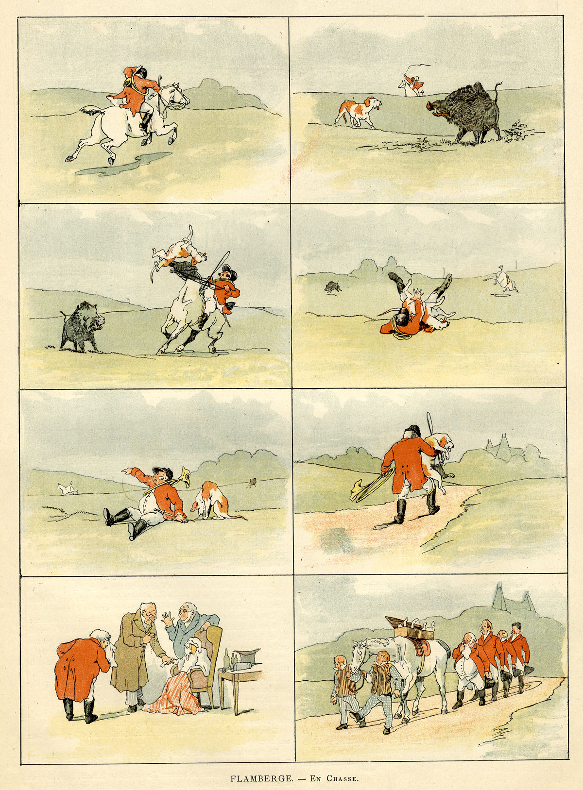
Admirers of Randolph Caldecott‘s earlier illustrated narratives in The Graphic might detect an influence here. Caldecott’s stories were always very wordy, though. Here the pictures do all the work. Except for one task… I find it curious that Flamberge doesn’t show the boar actually tossing the dog into the air. Perhaps he was too squeamish—or thought his readers were.
^^Table of Contents
(ii) CHIEN ET CHAT (Dog & Cat) by Eugene Courboin, 1887
From LA REVUE ILLUSTRÉE, a bi-monthly magazine, which ran from 1885 – 1912. Evidently it prided itself on its high quality photographs and photo-mechanical process illustrations.
These are undated, disbound pages, sold to me as 1887, which is credible. Probably published between January and May as I couldn’t find the strip in the June to December pages available on Gallica, the online archive of the Bibliothèque national de France. (An amazing resource, by the way.)
See also: La Premiere Barbe (The First Shave) from later that year, also by Courboin, at Gallica: http://gallica.bnf.fr/ark:/12148/bpt6k200153j/f72.item.r
4 pages. Image size approx. 18 x 24 cm (7 x 9.5 inches). Page 23.5 x 32 cm (9.5 x 13 ins)


In this case there is a credit at the end of the strip: “Typ. Draeger et Lesieur.” I suspect this means that the “typogravure” for the strip was done by a company called Draeger et Lesieur. This would have included the colour separations and the engraving of the colour printing plates.
(iii) COMMENT ON FAIT UN CHEF-D’OEUVRE (How to Create a Masterpiece) by Caran D’Ache, December 1888
From FIGARO ILLUSTRÉ
Figaro Illustré started as the lavish annual supplement of the daily newspaper le Figaro. This Caran D’Ache strip is from the edition for 1888 – 1889, cover-dated 1st December 1888.
In April 1890, Figaro Illustré became a monthly, continuing directly on from the weekly Paris Illustré—where En Chasse appeared—which published its last issue on March 29th. Paris Illustré was at that time being produced by the same editorial team as the Figaroannual, at Boussod, Valadon et Cie.
Boussod, Valadon et Cie was the successor to Goupil et Cie, a massive firm of art dealers and printers. They had earlier invented the first commercially viable form of photogravure printing, and very successfully sold “Goupil-gravure” prints of artworks—cleverly cross-promoting their art dealership as they did so. The famous Vincent van Gogh was a partner in Goupil et Cie from 1861 to 1872. Later his nephew Theo also worked for them, as did his other nephew, also called Vincent Van Gogh—before he went off to become a not very successful painter.
The artist at work was a frequent source of fun for Caran D’Ache, and here he also gets an early dig in at contemporary art. He would not be the last cartoonist to extract some similarly cynical fun from the subject.
1 page. Image size approx. 25.5 x 32 cm (10 x 13 ins). Page size 32 x 42.5 cm (13 x 17 ins).

^^Table of Contents
(2) THE COLOURS OF CHEF D’OEUVRE
In the U.S.A. at this time the colour pages of Puck and Judge magazines used lithographic printing (see Ben Day dots part 4) but French strips like these did not—though they and other colour pages from French periodicals are often described (and sold) as lithographs.
All three strips shown here were printed by the letterpress method, from metal plates, on which the image areas—the solid colours, the lines and dots—stood out “in relief” above the non-image areas. As mentioned above, the black image in all three cases is made photomechanically from the original drawing.
Colour-wise, the Caran D’Ache strip looks very different from the other two, though. Details are shown below. Each square is approximately 2cm on the original page.
Firstly, the yellow background is not solid colour, but a grained tint of yellow. This is not easy to see in its original form, so I have tweaked the hue to make the yellow into red. Clicking for a larger view will also help in seeing this.
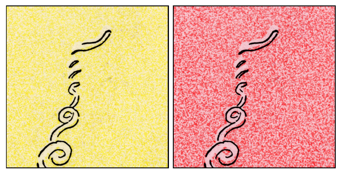
A tint like this could have been made in several ways. A Ben Day pattern could have been laid down on the plate—as I showed in Part 4, Day made tints which imitated the grain of lithographic stone. However, as noted above, it looks as if this generation of French engravers was avoiding the Ben Day method.
A relief tint plate could have been prepared in a number of ways, with the pattern pre-etched all over it, and the parts needed to print white simply routed or chiselled off. Bamber Gascoigne in his book How To Identify Prints points out that molten stereotype metal could be used to make a relief copy of many different patterns, his example being sandpaper. This pretty much provided an instant printing plate with a pattern ready to use. Other writers back in the 1890s suggested such surfaces as leather, wood and even lace.
Perhaps, in the city where Firmin Gillot had invented gillotage, transfer paper would have been used to carry the pattern from a roughened limestone block to the metal plate. (Ben Day’s method was in effect a massive improvement on this previous, much clumsier, way of doing it.) Masking fluid or a cut-out paper “frisket” could have been used to prevent the white areas of the image getting the tint.
I will come back to this question.
I note that the dog in panel 6 has lost its yellow colour. Whichever method was used to tint the background, I suspect the dog was masked off by mistake along with the puddle of paint it’s standing in.

As well as the yellow, there are a red, a blue and a separate flesh/pink colour, as seen below:

The red and blue dots and lines have an obviously hand-drawn look. They were probably drawn directly onto the metal plates—again, pretty much exactly as a lithographer would have done it. Alternatively, the drawing could have been done on transfer paper, then transferred onto the metal. I think this is unlikely. It would have added a redundant extra stage to the process, and compromised the quality of the dots and lines—such as they have.
Either way, one plate would have been used for each colour, and the ink used on the printing plate would have been black in every case. The craftsman or woman making the plates would have to estimate what the final colour was going to look like.
Apart from the flesh tone, this colouring is closely approaching the four-colour method which I looked at in Part 3. It seemed to take a long time for the trade to work out how to make flesh tones from red, yellow and occasional blue tints. Then again, using crude hand-drawn dots as these guys were doing, one can see why they wouldn’t try it yet. Another reason why they really should have embraced the reliable tints of Benjamin Day.
And while I’m on the flesh colour… it is worth taking another look at this pink colour used on the faces (and the pale orange paint pots). This tint has a very different look from the hand drawn dots of red and blue. Again it looks as if a grained pattern has been transferred to the plate, perhaps. Or it could have been done a different way, as in the other two strips. I will come back to this question.
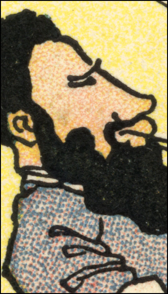
(3) RELIEF AQUATINT, OR RESIN GRAIN TINTING
(i) Introducing the method
The details from En Chasse and Chien et Chat, below, clearly show the presence of much finer dotted tints. The pattern of the dots is pleasingly random, not “mechanical-looking”—and it was achieved by an ingenious method which has received very little attention from historians of colour printing. This was the old aquatint intaglio technique turned into a relief method for letterpress. It was an important process—certainly in Britain and Europe—for about half a century, and deserves some wider exposure now.
Detail from En Chasse showing colour tints: Panel 9, original size 12 x 8 cm, 4.5 x 3 inches approx. (Click to enlarge)

The technique is sometimes referred to as Resin Grain Line Engraving (e.g. a single page advertisement in Penrose’s Annual, 1908-9, with no accompanying text), or Resin-Grain Chromotypography (in The Ilford Manual of Process Work by L.P. Clerc (English edition 1924, translated from the French) which gives it a fairly detailed one-page account. I can guarantee that googling either of those two phrases will get you nowhere—except possibly, now, straight back here.
It can also be called Relief Aquatint. (Googling that will also get you nowhere fast.)
It was the first method specifically created to make printed tints from metal relief plates in the 19th century.
It arrived about 30 years before Ben Day tints, which were patented in 1879. And, though Day had predicted they might be used on metal relief plates, Ben Day dots were confined to lithographic printing for the first few years of their existence, and took several years to penetrate the world of letterpress.
We know that Day’s dots did end up in letterpress in a big way—in the comics and elsewhere—but this important predecessor produced a huge number of colour pages before Ben Day tints started to take over. Resin grain was still being advertised in Penrose’s Annual for 1908 as a commercially available method, and may have offered a useful alternative to those who still didn’t trust the “mechanical” tints.
Yet resin grain tinting / relief aquatint remains something of a forgotten secret.
Bamber Gascoigne talks about it very briefly in his excellent How To Identify Prints (in section 42a, under the heading Chromotypographs—i.e. colour prints using variable tones from metal relief plates, pre-photoengraving—see below). He mentions:
…the simple device of etching the surface of the block through a traditional aquatint ground. The aquatint pattern can often be seen in relief colour work of the nineteenth century, showing up as a network of fine white lines…
The method was in fact far from simple or obvious, and the pattern is very different from the one seen in ordinary (intaglio) aquatint prints, as I will show later. In fact there are two distinct variations as well. You are more likely to perceive it as a grainy pattern of dots than a network of fine white lines, it seems to me.
He refers again to “direct aquatinting” in his section on Prepared Tints, 63a. That’s about it, and it is one of the few printing methods used over the centuries which his generally comprehensive book does not actually illustrate. (There is a pretty good note on Ben Day dots, for example, and a clear illustration.)
Another authoritative book, William Ivins Jr‘s How Prints Look does not mention resin grain / relief aquatint at all.
One can see why this kind of printing flies below the radar of art historians. It was after all used mainly in popular periodicals, and unlike other commercial methods there is no recorded use of it by a high art practitioner like Goya, Toulouse-Lautrec or Picasso.
In his Colour Printing and Colour Printers of 1910—reprinted in 1983 as it had not been bettered, and still worth reading today—R.M. Burch refers to the method a few times, his most useful description being “tone plates… etched by a modification of the aquatint method, adapted to surface printing.”
Printer / publisher James Shirley Hodson is the only author to write about it at length, AFAIK, in his book An Historical and Practical Guide to Art Illustration. I will have more to say about Hodson another day—and about his son, Samuel J. Hodson, who reportedly took on The Graphic‘s early colour printing from about 1875. Using resin grain tints, of course.
Now for a closer look at the process in action. These squares from En Chasse are again about 2 cm across on the original page:

The resin grain is very evident. Lines in white, crossing the dotted tint, have been achieved by engraving onto the etched plate with a tool borrowed from the wood engravers, the multi-pointed graver or “shooter,” cutting what looks like six lines at a time here. The pale blue shadows, the dust kicked up by the horse and the shape of the clouds hint at the painterly shapes which can be made with this method.
Details from Chien et Chat:

In this strip there is less painterly detail, and the choice of flesh tone is on the grey side, and very pale. Registration of the red plate is unfortunate—a regular bane of colour printing.
Overall these two strips show the delicacy of colour which could be achieved with very fine dots of relief aquatint / resin grain. Sometimes much coarser dot patterns are used. I hope to post some more examples soon.
^^Table of Contents
(ii) Relief Aquatint, Gillotage and Ben Day Dots
The inventor of relief aquatint was reportedly a printer in London, England, named William Dickes—more on him later—though George Leighton was another very early user. It probably originated in the late 1840s, roughly contemporary with Firmin Gillot’s experiments with transfer paper in Paris.
Gillot’s invention of what he called paneiconographie—soon to be known as gillotage—changed the world of printing forever. At least, it did when his son Charles brought in the photographic element, and created photoengraving.
The original method involved a drawing, in black ink on transfer paper, being transferred to a metal printing plate, in that same black ink, then etched on. The result was a relief plate ready to print the drawing in black-and-white (or other monochrome). The original drawing could have been done directly on the paper or in reverse on a lithographic stone. (See Part 4).
As I will show later in this post, in order for his relief aquatint process to work, William Dickes had to find a way to achieve a much deeper etch on the metal plate than was previously done with traditional aquatint. This was fundamentally the same problem which Firmin Gillot had to solve to make his method work. In both cases the deep etch was the game-changer, though the two men found different solutions to the problem, suiting their different needs.
The parallel development of these two processes may previously have escaped notice. It would be fascinating to know whether Dickes and Gillot ever communicated. I throw this notion out as a gift to anyone looking for a new topic in 19th century printing to study.
There is also one more fundamental link between relief aquatint, gillotage and Ben Daydots. As I have said, relief aquatint was probably the main tinting/colour printing method for many years. Before Ben Day could take over this function, someone had to figure out how to get Ben Day patterns onto metal. As we will see in Part 6, this required the same etching technique used in gillotage—though it may have come via the emerging field of photoengraving.
Gillot père patented his method in 1850 (or thereabouts). Gillot fils was in business as a photoengraver by 1876. Printers could have borrowed the Gillot etching method and applied it to Ben Day patterns, etching them onto metal plates, far earlier than they (apparently) did. Perhaps earlier use of Ben Day on metal will emerge, but for now, it is intriguing to speculate about why the delay occurred.
It may simply have come down to the fact that the French didn’t use Ben Day dots.
This also brings me back to a question posed earlier—was transfer paper / gillotage used to put colour tints onto letterpress pages?
One great difficulty with the accounts of gillotage that I’ve seen is that they all leap quickly to the “sexy” bit—photoengraving (just as discussions of photoengraving leap forward to halftones, largely ignoring line blocks). Charles Gillot, as I understand it, first set up as a commercial photoengraver in 1876. But there were almost thirty years when gillotage in its original, transfer-paper-based form was at work in Paris.
What kind of work was done with that early version? Was it all black-and-white or monochrome? How much did it involve dots / lines / other forms of prepared or mechanical tint? With scanty available evidence, it is hard to say. Again, more room for further study here.
There is one area of gillotage by transfer paper which remains visible today—the illustration of French humour magazines. This is generally seen in black-and-white, using no prepared or mechanical tints, but exploiting the “chalk” or “crayon” texture achieved by drawing on rough lithographic stone or grained paper (see Part 4).
The famous weekly Le Charivari, for example, published one large lithographic illustration every issue up til 1870 (according to A. Hyatt Mayor in Prints & People). Switching to gillotage in that year allowed all four pages of the magazine to be printed by letterpress, cutting costs. Many other magazines in France also reportedtly used gillotage in the same way. Pages torn from them are sometimes marketed as “gillotypes.”
The results, says Mayor, were cruder than litho, but evidently acceptable for the purpose of printing satirical cartoons. He reports that Le Charivari‘s great cartoonist Honoré Daumier, eyesight failing and paid a pittance, had already simplified his lithographic style to the point where it could switch to gillotage without suffering too badly.
The Daumier image below is not my scan. I have borrowed it from Simon at Books and Boots .
The caption translates as “Appalled at the heritage.” It’s about the disastrous Prussian siege of Paris in 1870 – 71.
 E
E
As Mayor alliteratively asserts, “The gillotype granulates the greys in a grit that disintegrates any drawing short of heroic.”
I don’t know if Daumier drew on stone or grained paper. Paper is more likely simply due to the convenience of it, compared to a chunk of heavy limestone. Either way, his image was transferred from paper to metal printing plate, then etched. Detail in the “chalk” shading would be coarsened considerably in the final printed result.
The close-up below is slightly more revealing of the texture thus created. Until I can scan some of these gillotypes myself, I cannot compare this pattern directly with the relief aquatint pattern. They are not dissimilar at first sight.

So far, the evidence suggests that gillotage had its own built-in grain or “random dot” pattern, but this was only used for monochrome work.
If I discover anything further, I will let you know.
^^Table of Contents
(iii) Use in The Illustrated London News and The Graphic
It is clear that the Parisian printing world had embraced resin grain tinting in a big way by the late 1880s. The technique probably spread from England. In 1855 The Illustrated London News (ILN) became the first weekly to start printing semi-regular colour pictures (often in Christmas and summer supplements) and by all accounts it was an immediate success. Curiously its great rival, The Graphic, did not follow suit until 1873.
Relief aquatint / resin grain chromotypography was used by them both, though the ILN reportedly switched to lithographs for its colour prints from the late 1880s, while The Graphic continued with letterpress, at least until 1899.)
Here’s the cover of that first Christmas ILN, with some 2cm square details.
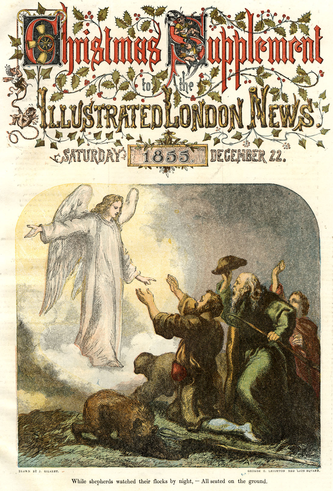

Bamber Gascoigne notes in another essential book, Milestones in Colour Printing 1457 to 1859 (1997) how revolutionary this was. He also says that the huge colour pages (c. 28 x 39 cm, 11 x 15.5 inches) were only possible because of printer George Leighton‘s use of “relief blocks”—i.e. metal plates, and relief letterpress printing.
What Mr Gascoigne doesn’t explain is that Leighton was using the relief aquatint method for many of his colour tints—possibly not all the colours, though. At least initially, Leighton used a hybrid technique. The key plates (in black or dark brown) were still made from engraved wood blocks. Some of the colours probably were also.
^^Table of Contents
(4) THE ORIGINAL AQUATINT METHOD (INTAGLIO)
(a) Aquatint and Other Intaglio Methods Compared
I will cover the basics of how actual aquatint prints were made, before moving on to the relief version.
The original, intaglio, aquatint method was well established in artistic and commercial printing long before the 1880s. It was invented around 1720, and used for fine art and devotional prints, commercial prints and book illustration.
Aquatint used acid etching of a metal plate to make an intaglio printing surface. As with engraving or line/stipple etching, ink was held on the printing plate in troughs and/or pits lower than the plate’s surface, and wiped clean from the surface itself. Areas of the plate left smooth, un-lowered, and clean of ink printed as white. Using black ink, the troughs and pits printed as black lines or stippled dots in an engraving or etching, or grey tones of various shades in an aquatint.
This undated print of Caerfily Castle (sic) was printed by aquatint on white paper, probably to go in a book (from which it was removed long ago—not by me). The ink is black, but a brownish kind of black, and looks browner in scanned images. The image is approx. 13 x 19cm, 5 x 7.5 inches.
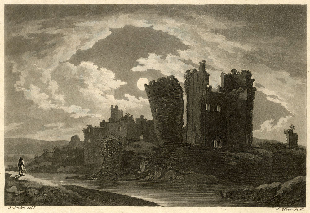
In an intaglio metal engraving, lines are essentially black. The illusion of grey is created by “optical blending”—fine lines, very close together, are seen as grey. This 1820 copper engraving of Antonio Canova (image size c. 16 x 20 cm, 6 x 8 inches) might create Moiré patterns on your screen (try it at different zooms) or might show nice grey tones:

Close up, Antonio looks like this—no grey:
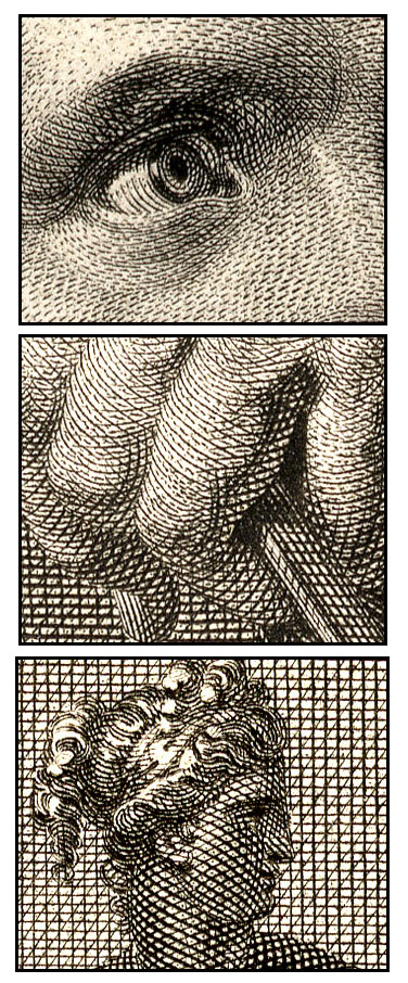
Robert Walpole, below, is from 1801. He is a so-called stipple engraving, and many of his dots were etched with acid rather than engraved. Original image size: 9 x 12 cm, 3.5 x 5.45 inches.
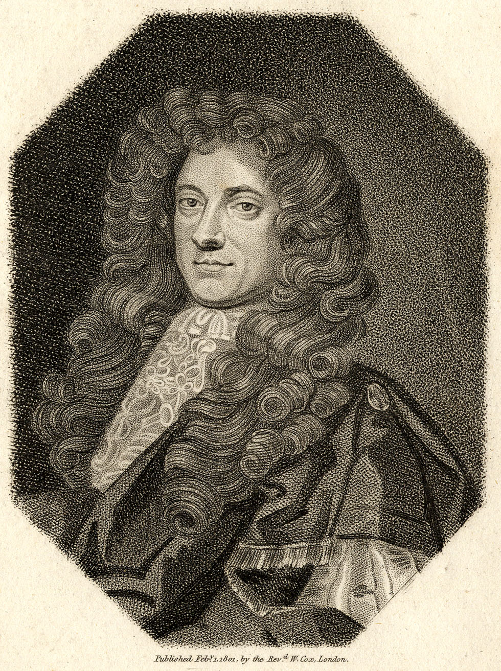
In “stipple engravings” and etchings, etched dots can be quite shallow on the metal—giving a softer, grey appearance, as seen on the face and hair. The etched lines are fairly full-on black. The background dots are larger, blacker and may have been bashed into the metal with a tool like a “mace head” or “mattoir.”

(b) Grey Tones in Intaglio Aquatint
Aquatint creates its grey tones in quite a different way.
Firstly, it produces a fine mesh pattern, and to some extent, the paler the grey area in a print, the thinner the lines in the mesh. With more white paper showing between the lines, a paler grey is to be expected.
In an aquatint, though, unlike an engraving or etching, these lines are actually printed not in black, but in many shades of genuine grey. Or at least, the particles of black pigment are far too small to see, as in a photographic print. And the shade of this grey can be carefully controlled over large areas, which with ordinary etched dots is not feasible.
The details below show these grey tones in the Caerfily Castle print. Each square is approx. 2cm across in the original image. (I turned these images into greyscale, as some unfixable colour variations crept in during scanning.)

A closer view of a 1 cm square shows the grey effect more clearly:
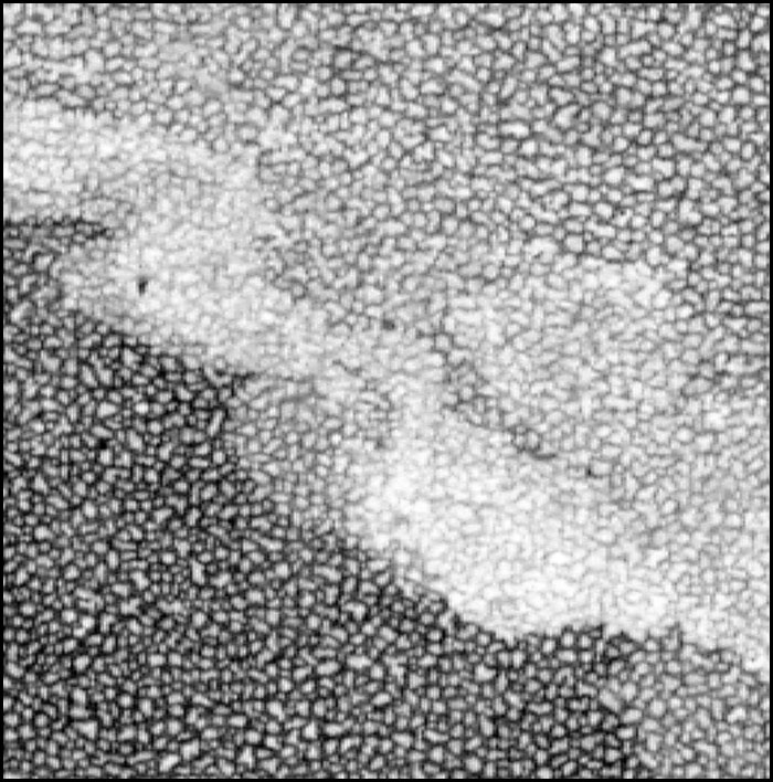
And here are some microscope views of different tints:
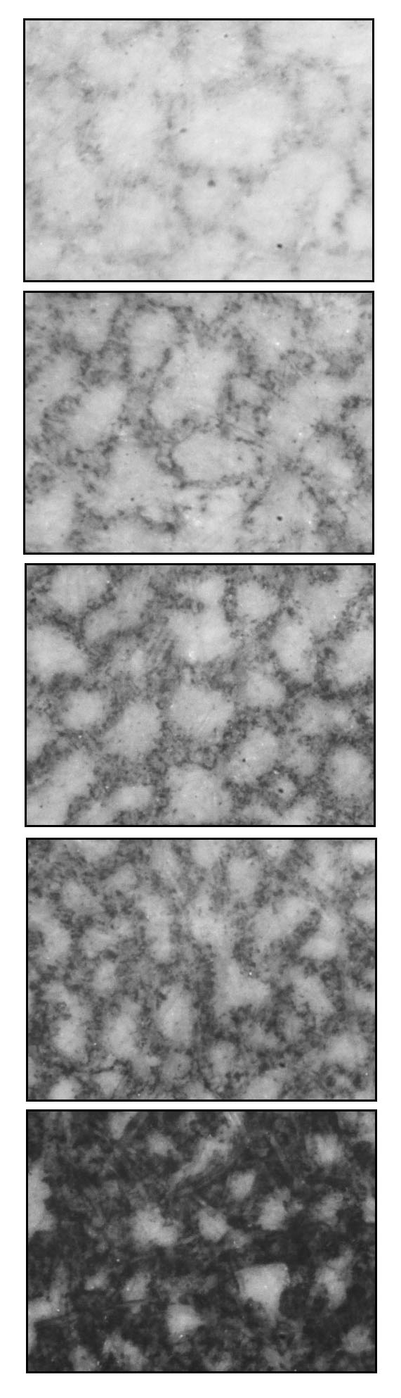
(c) Comparison with Mezzotint
Aquatint shares this property with another type of intaglio print, the mezzotint. Mezzotint was a finer process, capable of amazing shading, but also much slower and more expensive. It was only used for high-end luxury items.
I don’t know who this guy is, but his undated and trimmed mezzotint portrait is about 18 x 24 cm, 7x 9.5 inches.

These details are 2 cm squares:
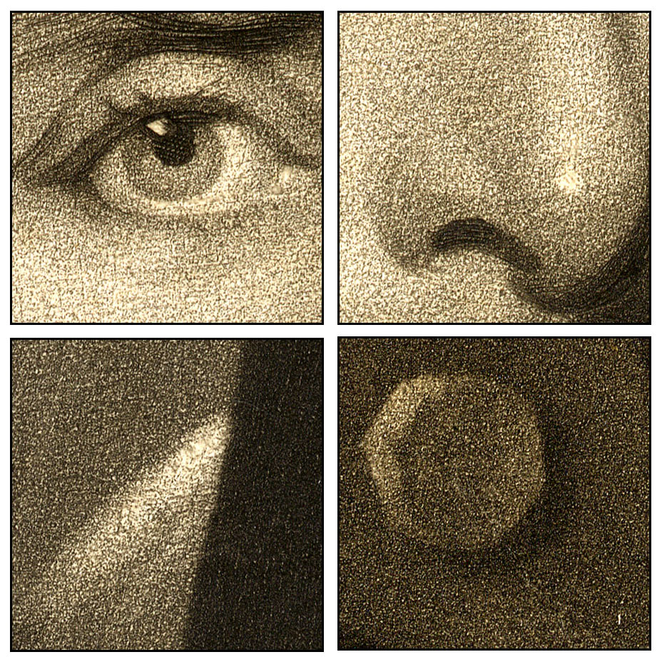
Meanwhile, back at aquatint…
^^Table of Contents
(d) Spirit Ground Aquatint
How was this grey printing achieved in aquatint with black ink?
The plate was acid-etched through a spotty “ground” and the ground could be made by two different methods.
My example, Caerfily Castle, used the “wet” or “spirit ground” version.
This used resin dissolved in a mixture of water and alcohol to make the ground. A layer of this solution was allowed to dry onto the plate, leaving patches of resin behind, dried and stuck onto the metal, in a reticulated pattern.
Each patch of resin now formed an “island” (my word for it) on the plate. The plate now had thousands of these irregularly shaped dots of resin on it, with what I call “channels” in between them, where the metal was still exposed.
The picture was either drawn onto this ground, or traced from the original, or imprinted by transfer paper.
The first stage in creating the drawing on the metal was to paint over, with an acid-resistant varnish, all the areas which needed to print as white. These parts of the plate would remain untouched by the next stage in the process.
Nitric acid (known as aqua fortis) was used to etch the plate. Each one of the resin “islands” would form a tiny acid resist, protecting that area of metal surface. But the “channels” between the islands would be eaten away just a little by the aid, i.e. etched down by a small amount. This shallow etch would form the palest grey tone of the print. Each island would be a white dot in the grey.
The shallow channels would not hold much ink, and it was thinly spread, which is how it was able to print as a grey. At this stage, the white dots were also of quite large size, representing the full size of the islands. Thus etch number one produces a very pale grey tone—Grey Number One.
The acid was washed off with water. The waterproof resin islands of the ground remained in place. So did the original areas of varnish which had been painted on, protecting the white areas of the picture from the acid etch.
Now a second etch was going to be done, but first those areas which needed to print as Grey Number One needed to be protected from the acid. A second painting-on of varnish was therefore done, extending the varnish protection to those areas of the picture as well.
The second etch deepened the channels. Perhaps each island now started to shrink slightly, as the acid undermined the resin layer. Now the unvarnished parts of the plate would print with a darker grey, Grey Number Two.
The microscopic detail of Caerfily Castle below shows a transition between a pale grey and a much darker etch.

A number of further varnishings and etches were done, each “biting” a little deeper. Eventually the acid really undermined the resin, and channels got wider as they got deeper, until the islands had been eaten away almost completely.
The grey got darker as the channels held more ink, becoming blacker when printed, and at the same time the white dots between the lines got smaller. The last etch produced areas of metal which would print almost black.
As well as aquatinting, which produced no outlines, lines—and indeed dots—could be engraved or etched onto the metal as well. The print above shows some outlines on the buildings and shading on the figure, for example, which look as if they have been etched on.
This was very laborious process. Caerfily Castle must have had at least six, possibly seven etches. I show six magnified squares below, each 1cm wide, in progressively darker greys—and here you can see the brownish tinge. I think there are two pale greys in the top square (and the bottom square has some etched black lines on it).

^^Table of Contents
(e) Dust Ground Aquatint
In the “dry” or “dust ground” method, a powdered resin was dusted directly onto the metal printing plate. The powder could be quite coarse or very fine depending on the final appearance required.
The resin had to be melted onto the plate by heating the metal, then cooled before it had spread out too far and filled in the “channels”. Some of the tiny pools of liquid made by particles of resin would merge together in any case.
Once the ground had been made, the process was the same as the wet method.
The appearances when printed were quite different. Bamber Gascoigne shows the two in How To Identify Prints—spirit ground above, dust ground below:
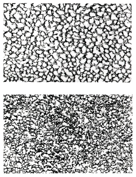
Once all the varnish and resin remnants had been cleaned off with solvent, the plate was ready for intaglio printing. A printing press using very high pressure was needed to force the paper into the channels, grooves and pits of the metal plate. The same press could not be used for relief printing, which used lower pressure and different methods.
^^Table of Contents
(5) HYBRID FORMS
(i) The Baxter Print—Aquatint plus Colour from Wood Blocks
The relief aquatint process evolved because printers were looking for ways to improve on the colour printing methods of George Baxter, in particular. (The Charles Knight / Stephen Sly team was another important antecedent , but will be discussed another time.)
George Baxter patented his method of colour printing in 1835. Though he was building on the work of many previous colour printers, Baxter did effectively create a new technique and set a new standard in naturalistic colour printing. Also, he brought colour printing back into a world which, prior to the rise of chromolithography, was accustomed to seeing to prints only in black-and-white, or coloured by hand—pretty crudely, and often by child labour.
He also started a new movement which, in Britain at least, produced thousands of coloured pictures in the form of prints, book and magazine illustrations, and (a speciality of Baxter’s) smaller items like needle box covers. It also produced many followers, imitators and much evolution of his techniques.
Baxter’s method used a detailed intaglio print as the key image. In most cases this carried all the information needed for a “reading” of the image, and the colours he added were effectively decoration. His ambition was to create a facsimile of a painted picture (and he was always keen to stress that he printed in “oil colours.”) At his best he approached his goal.
His intaglio key print was most often an aquatint, usually with stipple and line etching on the plate as well. He sometimes used copper or steel engraved plates for this stage (and his patent covered use of a lithographed key, though he may never have used one in a published print).
Colours were added by any number of wood-engraved plates, occasionally over twenty, more often around ten. (Later he used some engraved metal plates for colour, but he is best known for his wood-engraved colours.)
Below I show a small Baxter print of Abbeville in northern France. This is only 5.5 x 7.5 cm, or just over 2 inches wide by about 3 inches tall. I have a fairly dark print of the key plate on its own—it is aquatinted and line-etched, very finely, and printed in black. It may have been printed much later than the colour version.
The coloured print (1847) was done very delicately. The key plate was printed lighter than it was on my monochrome print. (Some grey marks in the blue sky on my colour print are smudges, I’m afraid. You can see where Baxter put his bits of grey cloud.)

Below is another Baxter print scanned by me—The Third Day He Rose Again (1854). This is a large piece by Baxter’s standards, at about 17 x 21 cm (6.5 x 8 inches) and a more ambitious work than Abbeville.
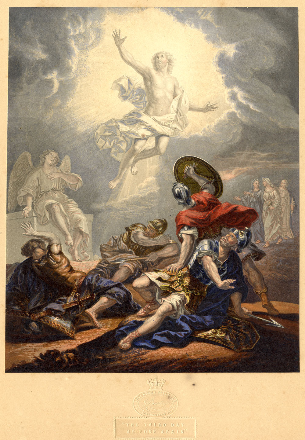
The square details below are just over 1.3 cm or half an inch. Again intaglio aquatint, and stipple & line etching, are apparent on the key plate. Much of the wood-engraved colour is overprinted onto grey areas of the key image, but some is clearly printed over white areas left open on the key.

In 1849 George Baxter was able to renew his patent for another five years, arguing that he needed more time to make some profit out of it. He never really did, and died in debt. But, as advised in the patent court by the judge, Lord Brougham (more of him another time), he started selling licenses to other printers to use the method. For their money they also got lessons in how the Baxter print was done.
One of his licensees was a lithographer and wood engraver called William Dickes. Below is one of his Baxter prints, including the standard Baxter-style intaglio aquatint grey key, from Charles “Water Babies” Kingsley’s non-fiction book Glaucus; or, The Wonders of the Shore.
Original image size 8.5 x 14 cm, 3.5 x 5.5 inches.
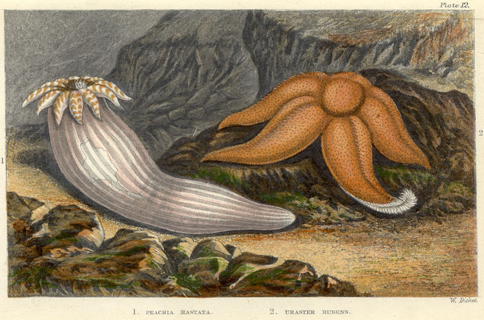
Details, 1 cm square originally:

^^Table of Contents
(ii) William Dickes and the Invention of Relief Aquatint
Dickes did a lot of Baxter prints, but was keen to find ways of working more quickly.
He realised that the intaglio key plate was a major stumbling block. It had to be done on a hand press, separate from the wood-engraved (relief) colours. Also, there were various technical reasons why printing over the intaglio key was not helpful for registering the colours accurately.
And, as Dickes knew, the future belonged to those who could print colour on the new steam presses. He was looking for a method whose elements were all in relief.
A standard intaglio aquatint plate cannot simply be used to print in relief. The channels between the islands are too shallow.
Black (or whichever colour ink is used) should print only from the raised surface parts of a relief plate. If an aquatint plate were inked as for relief, the shallow grooves would partly or wholly fill up with ink. Whereas they should remain empty, and so print white, they would partly or wholly print black. The result would be an awful mess. I’d bet Dickes and many others had tried it!
Etching the channels more deeply was possible, but of course this also undermined the resin islands more. You couldn’t get much of a range of tones.
In any case, even if the grooves were somehow made deep enough, relief-printing an aquatint plate which had been made for intaglio would produce a negative image. The smooth surface parts would print black, whereas they should be white. The parts supposed to be the palest grey would print as the darkest, and so on.
As explained in The Colour Prints of William Dickes, by Alfred Docker (1924) Dickes solved both problems. He found a method which produced a deeper etch, using what I presume was a tougher ground, made of “resin, Burgundy pitch and gum.” Dickes apparently learned this method from “an old aquatinter” called Hunt who had devised it himself. It was laid using the wet, spirit ground technique.
And secondly, Dickes worked his etchings in the reverse order from intaglio platemaking. He protected his black (or solid colour) areas, not his white ones, from the first etch; his darkest grey (or darkest colour tint) from the second etch, not the palest one—and so on.
Eventually he etched his palest tint, leaving only tiny “colour” islands and wide “white” channels, then cut away metal from the parts which needed to print white.
Dickes called his method Chromographic printing and exhibited at London’s Great Exhibition of 1851, alongside George Baxter. The catalogue described Dickes as “the Inventor and Producer” of his method of “printing in oil colours from raised surfaces.” But Dickes never patented his process.
The printed result lacked the delicacy of the intaglio aquatint. Relief aquatint made marks on the paper from raised dots, not sunken grooves. Like other relief methods, and most lithography, each chromographic mark could only be black (or solid colour).
Unlike the intaglio version, then, no actual grey (or tint of a colour) was possible with this method. Tints had to be created solely from optical blending of a pattern of irregular dots.
Also, since the plate was to be used in relief, unlike the intaglio version, you could no longer etch or engrave lines onto it.
Perhaps for these reasons, having solved the intaglio problem, Dickes did not simply follow the Baxter style. He often abandoned the aquatint grey key, and adapted his new aquatint relief method for use as coloured plates instead.
Overall, the Chromograph method was fit for purpose. After perfecting it on his hand printing presses, Dickes was eventually able to print mechanically.
^^Table of Contents
(iii) Lady Di and Spanker: The Chromotypograph
Below is one of Dickes’ less ambitious plates. He did a lot of this kind of cheap commercial material, but also a good deal of more accomplished work. I hope to show some of it another time. I chose this picture because the dots are very obvious.
This is an illustration from Moral Tales, by popular children’s author Maria Edgeworth(undated, but published between 1865 and 1873; 9 x 13 cm, 3.5 x 5 inches). It’s a good thing we know the tales are moral, or we might have thought that Lady Di thrashing Spanker sounded a bit kinky.
(Eric Hayman has pointed out that ‘spanker’ was a word used to describe a fast horse, one that was likely to win a race; the same word which gave us the term ‘to move at a spanking pace.’ The OED confirms this; ‘A horse which travels quickly and smartly; a fast-going horse.’ Thanks, Eric! As you say… nothing kinky about this at all.)

The characteristic pattern of Dickes’ relief aquatint can be seen below.

Like a Baxter print, this was a hybrid technique. The key was printed in a very dark brown, almost certainly from a wood-engraved block. (These are very sharp lines, and it is just possible they were engraved in relief on metal, but this would have been an extra expense, and is less likely.)
Some of the colour is done in lines also suggesting a wood block—e.g the orangey brown seen at top left in the square below, and I think the same colour, over blue, at bottom left. It also appears in the grass.

It is very obvious that, like the chromolithographers, Dickes was using many colours and not attempting to combine three primaries to make all his hues. However, you are probably thinking he might have made his green out of blue and yellow, which was a favourite trick of colour printers of all persuasions. The detail below, taken from the bottom edge of the image, gives the game away. The yellow and blue inks show themselves quite clearly here. Elsewhere, the yellow might be taken for a yellowy green.
Dickes’ own name for his technique, the Chromograph, never really stuck, even within his own workshop. But a very similar 19th century name for this kind of hybrid print has survived—the Chromotypograph. Or rather, the name chromotypograph covers a number of different types of print, of which Lady Di and Spanker is but one variation.
Bamber Gascoigne in How to Identify Prints is of the opinion that this old-fashioned word is worth holding on to. I agree; it is analogous to chromolithograph (printed from stone) and chromoxylograph (printed from wood) and defines the distinctive properties of this type of print.
If one wished to explain to an eBay seller, for example, or the British Museum, that they have mislabeled some of their prints as chromolithographs, how useful to be able to say, “They are in fact chromotypographs.” (As enny fule kno.)
Mr Gascoigne says:
…the term chromotypograph (implying colour printed from raised metal, as type is) was used for a wide variety of colour prints which made use, partly or exclusively, of metal relief blocks… such prints may include colours engraved on wood… or they may be entirely composed of the more random tones made possible by etched metal blocks.
This is where he also notes that various tones can be transferred to metal plates (a.k.a. blocks) by transfer paper (gillotage) and he has noted elsewhere the alternative method of casting textures like sandpaper in stereotype metal, which could also be part of a chromotypographic process.
The key thing here is that there is no “line block” yet, i.e. no photomechanical process is involved in a chromotyopograph—at least as defined here.
The early colour pages in the Illustrated London News and The Graphic were certainly chromotypographs. There is evidence that some later pages in The Graphic used line blocks—photoengraved plates—as their key plates. I will come back to this another time.
^^Table of Contents
(iv) 19th Century French Comic Strips: Chromotypographs or Colour Line Blocks?
The French comic strips I showed above are another hybrid form—their blacks come from line blocks (photoengraved plates) and their colours are the resin grain / relief aquatint type. Because they have a photomechanical element, they don’t really fit the above definition of a chromotypograph.
Bamber Gascoigne has another definition which almost fits, the Colour Line Block. This is where we meet, at last, the world of the comic strip, since a colour line block is a black photoengraved image coloured by mechanical tints (such as Ben Day dots).
But the tints in our French strips are hand-originated, not mechanical.
Can Mr Gascoigne help here?
The term chromotypograph could be extended, he says, to include all colour prints from metal blocks where no halftone screen has been used.
Our French strips would then fit the definition. And so would a Sunday newspaper comic strip from The Yellow Kid onwards. But hold on…
… as Mr Gascoigne continues:
However, there is a clear distinction to the eye between the nineteenth-century version where the blocks were prepared by hand with a wide range of delicate textures and its twentieth century successor, familiar mainly from comic strips and advertisements, where the colours are in mechanical tints. In this book the former are referred to as chromotypographs and the latter are called colour line blocks.
We are allowed to use the term chromotypograph for our French strips, then, since despite using line blocks (and despite being comic strips!) they use hand-originated tints.
Phew! Glad I cleared that one up.
^^Table of Contents
(v) A Negative View
Before leaving Dickes, one final thing. If a relief aquatint is effectively a negative version of an intaglio aquatint, you are probably wondering, “How do William Dickes’ tints compare with a negative image of an ordinary intaglio aquatint?”
I’m glad you asked that question, because here is one I prepared earlier. It shows in close-up part of Caerfily Castle, then a B&W negative version of that, then some Dickes’ paler blue sky tint from the above, turned into B&W:

Allowing for slight differences in technique, I reckon this is close enough for rock’n’roll. It’s not just for fun either. It’s proof of concept for one final investigation:
^^Table of Contents
(vi) French Comic Strips: Spirit Ground or Dust Ground?
We know that Dickes used a spirit ground method for his relief aquatint, because Docker tells us in his book. In the other 1924 book quoted above, The Ilford Manual of Process Work, L.P. Clerc tells us that Resin Grain Chromotypography was at that time done by the dry, or “dust ground” method.
Which of these two did the French comic strip engravers use in the late 1880s?
My only current source for enlarged images of dust ground aquatint patterns is Bamber Gascoine in How To Identify Prints. I have therefore taken the middle tint of the three he shows in his book, and turned it into a negative image (below). I compare it with two patterns from the strips which clearly used resin grain tints, En Chasse and Chien et Chat.
This shows fairly close similarity of pattern. Certainly the spirit ground pattern at the bottom—a negative image of the Caerfily Castle tint again—is not very similar. Its dots are too rounded and regular. I conclude that these engravers used the dust ground method.

How they overcame the difficulties of deep etching remains a mystery. Dickes, as I said, needed to use his wet method derived from Mr Hunt. I must assume that the later resin grain tinters had some way of improving on the old intaglio aquatint dust ground etch.
Finally, to return to that yellow background tint from the Caran D’Ache strip, which I turned into red so it was easier to see:
Comparing that, in black, to Gascoigne’s palest dust ground tint in negative form:

Again, allowing for slight differences in scale and technique, it looks as if that strip too used some resin grain / relief aquatint tinting, as well as its hand-drawn dots and lines.
And that is where my story comes to an end… for now.
Text and original images copyright © The Legion of Andy 2016
legionofandy@btinternet.com
Coming attractions:
^^Table of Contents
I will take this further in future posts.
I will look at the history of colour printing in relief—going back to the 1400s—with:
- more chromotypographs!
- chromoxylographs!
- and more detail on important printers like George Baxter, Charles Knight, Stephen Sly, Edmund Evans and Benjamin Fawcett than you will find anywhere else online (or most other places).
Another post will present some picture narratives from The Illustrated London News and The Graphic, including some borderline comic strips, and some out-and-out sure things.
Next time though:
The early adventures of Ben Day in the world of letterpress.
Wid dis guy…

…and dese guys.

A PROTO COMIC BOOK FROM 1885: THE LITTLE-ONE’S OWN COLOURED PICTURE PAPER
BEN DAY DOTS, Part 5-&-Three-Quarters
A New Find That Looks Very Much Like a “Missing Link” Between Lithographic Printing and Letterpress Comics
See also:
- Part 1—Roy Lichtenstein etc.
- Part 2—Halftone dots, Polke dots, More Roy
- Part 3—Four-colour comic book dots / CMYK & RGB dots on screens
- Part 4—Pre-history, Origins & Ben Day in the 19th century
- Part 5—Ben Day in lithography
- Part 5.5—A forgotten Ben Day predecessor in letterpress
- Part 6— 1890s: Ben Day in the original Sunday Comics
- Part 6.1 —Ben Day dots in their prime, on 1930s Tarzan Sunday pages
- Part 6.2—Registration—as in, getting the colours lined up right—or not
- Part 7—Ben Day Dots 1933 to 1937—the birth of the comic book
- Part 8 — 1930s to 1950s: The “Golden Age” of Comics — exit Ben Day, enter Craftint
- Part 9a — 1950 & 60s: The “Silver Age” of Comics, Part 1
- Part 9b — 1950 & 60s: The “Silver Age” of Comics, Part 2
guy.lawley@btinternet.com

Contents
(1) Introduction
(2) Front Covers
(3) Inside Pages—Proto-Comic Strips?
- (i) What the Little One’s [sic] Can Do
- (ii) Sharing the Burden
- (iii) Dolly’s Portrait
- (iv) Do You Like Butter?
(4) Further Reflections
- (i) Proto-Comic or Pre-Comic?
- (ii) Back Covers
(5) The Little One’s Own Coloured Picture Paper—a cheap magazine of the 1880s
- (i) As a publication
- (ii) As an innovative lithographic product
- (iii) As illustration for children:
- (a) Previously… hand colouring
- (b) After that… wood-engraved colour printing—chromoxylography
- (c) Lithography in the age of steam—Ben Day dots & four coloured pages for a penny
(6) Ben Day tints in the Little-One’s Own Coloured Picture Paper
- (i) Blue stippled dots
- (ii) Red dots in an almost-familiar pattern
- (iii) Complex colour mixes
- (iv) Emulating wood engraving
- (v) Moving towards four-colour printing
1. Introduction
In Part 5 of my History of Ben Day Dots, I detailed the arrival of Day’s “mechanical tints” in the nineteenth century world of lithographic colour printing (or chromolithography).
That world included many heavily illustrated children’s books which were verging on graphic narrative or comic strip continuity. (Though many of these were also printed by other means, including a lot of chromoxylography or coloured wood engraving—as we shall see later.)
The reason for squeezing in another post before Part 6 of my History is to discuss a newly acquired children’s magazine from 1885, which looks very much like a “missing link”between chromolithographic printing and Ben Day in the letterpress comics.
Benjamin Henry Day Junior patented his new method in 1879. Ace historian of print Michael Twyman reckons the Ben Day tints were probably used in Britain from about 1883.
A few days ago a copy of George Newnes’s rare and elusive 1890s magazine The Millionarrived in the post. I was very excited about this, as it is key to my researches into early use of Ben Day in letterpress. (More on all that in Part 6).
From the same seller I had also bought two copies of a children’s magazine from 1885, which I thought might be slightly interesting. I hoped they might just have some Ben Daytints in them if I was lucky, but really, I had no great expectations. I thought they were probably too early—most likely they would be full of hand-stippling.
One glance at them told the tale, though. Only two or three years after Ben Day came to the UK, The Little-One’s Own Coloured Picture Paper—snappy title, isn’t it?—was clearly an early adopter.
It’s positively crawling with Ben Day!
As I hope you can see if you click on the picture to enlarge it, and possibly click again for full-full-size. (Use the browser’s back button to return here.)

If you have read Part 5, you will have no hesitation in identifying the festoons of dots in the blue sky on No.29 (below left) as the very popular Ben Day stipple style, or the tints in the second panel below as Ben’s less famous lines—nevertheless much used, especially on maps.

I will show more full pages and detailed views later.
Another thing that was really striking about The Little-One’s Own is how much it resembles a 20th century comic book.
At roughly 17.5 x 23.5 cm (7.5 x 9.5 inches) it is a little smaller. And each issue is very thin by comparison. My copy of no. 29 has just two folded sheets for 8 pages—very possibly at least one sheet is missing. No. 32 may be complete—it has 3 sheets, 12 pages. Each copy has 4 coloured pages, the rest black and white and text-heavy, with a few simple B&W illos here and there.
Interestingly, it carries no advertising. All profitability must have come from its sale price alone.
It is the coloured pages which are of course most exciting. At first glance, with their pulp paper and fairly obvious Ben Day, they could be four-colour comics—albeit a characteristically British version, without the glossy covers we associate with the standard U.S comic book. (See Part 3 for details of four-colour printing.)
A closer look shows that they were not actually four-colour, but used a flesh-coloured ink and a grey one as well, as will be seen below.
Not only did the package resemble a comic, but both issues had some pages which come very close to being comic strips. As you will see, a couple of them probably qualify as proto-comics. Which I would argue makes The LOOCPP at least a borderline proto comic book.
According to this history of publisher Dean & Sonhttp://www.vintagepopupbooks.com/Dean_Son_Publishers_History_s/1853.htm#axzz3zJsLhfGLThe Little-One’s Own Coloured Picture Paper was announced as the first lithographically printed magazine. Dean & Son were also pioneers of pop-up and movable books for children, which is presumably how they had honed their lithographic skills.
According to the British Library The Little-One’s Own Coloured Picture Paper as such ran from May 1885 to 1892, when it changed its name to The Little One’s Own before morphing into Dean’s Magazine from 1893.
^^Table of Contents
2. Front Covers
The front of no. 29 (November 14th 1885) is shown above.
(If you are puzzled by the assertion that Tom and Bess are “beating up recruits,” they are playing at being a recruiting team for one of the armed forces. As such they are drawing attention to themselves by beating the drum and playing the bugle, as also heard in the expression “beating the retreat.”)
Below I show the strip of text which runs along the spines of both covers. There were no staples or stitching in the weekly paper, I suspect, but there are stitching holes in these copies because they have been removed form a bound volume.
There has been a lot of wear to the spines as well, but on a full-sized view I hope you will be able to make out details like the dates, and the price—one penny.


The cover of no. 32, below, has a two-panel structure that makes it almost a comic strip in itself. Some might argue that it unequivocally is, though the action between the panels is quite disjointed. The goat in panel 1 is not wearing any of its harness gear, for example, let alone actually attached to the carriage. An awful lot goes on “between the panels” here.

^^Table of Contents
3. Inside pages—Proto-Comic Strips?
(i) What The Little One’s Can Do
No 29, unpaginated, but seems to be 4th page

This page might be considered suitable for children’s moral and behavioural improvement, but surely even in 1885 the “grocer’s apostrophe” (or is that “grocers’ apostrophe”?) disqualified it as grammatical education.
Anyway, as a possible piece of graphic narrative it must be considered at best borderline. The five illustrations may at first glance appear to be to be laid out to be read from left to right, then down the page, as a comic strip. In a sense they do carry a story, but they are not really in continuity—rather, they show activities separated in time, space and personnel.
Eventually we see that the pictures are linked by the suggestions made to the Little Ones in the letter from Frankie’s Mamma, though placing this at the end of the sequence seems perverse to me.
Perhaps child readers were expected to read through the whole page again having appreciated that the pictures are not just a series of editorial admonitions, but friendly advice from this august personage.
I suggest that What The Little One’s Can Do, rather than a true comic strip, instead shows a type of page design widespread in British periodicals of the period, possibly originating in The Illustrated London News. The images are linked by a shared subject matter and a continuity of theme, established in a separate piece of text, but do not have a true narrative continuity.
However, once the format of such an illustrated page had become a routine part of the periodical world, it was a relatively small step for editors, journalists, writers and artists to introduce a narrative element.
^^Table of Contents
No 29, unpaginated, 5th page in my ?incomplete copy. If it was originally a 12-page issue when complete, this would be the 9th page.

Sharing the Burden is more like an actual graphic narrative. Its action can be followed through the numbered panels, with the sparse captions filling in almost enough information to make it fully comprehensible (especially if you know that a faggot is a bundle of sticks bound together for burning on a domestic fire).
But it definitely has a sense that some information is missing. The caption to panel 1 is hardly a great scene setter. From panel 2 onwards, with its reference to “the” faggot rather than “a” faggot, I got the feeling I the missing preceding page may have had some more text relating to this story.
Panel 4, too, is decidedly odd in itself. Who is this lady who helps Dick? In panel 5 we learn her name, but nothing else. And what has happened to the faggot? And Granny—is she part of this story any more?
The answer came when I turned the page. The little text story which accompanies these pictures fills in the gaps.

The text stands alone as a story. The illustrations, on the other hand—though almost constituting a narrative—are found to fall short without these extra words.
Victorian children might have been more accustomed to finding linked text on a separate page than we are. Certainly their parents were. The Illustrated London News and The Graphic, in common with most contemporary books, routinely had images quite far removed from the text which explicated them. Clearly this was not ideal, but was understood by readers as a convention of the time.
Many readers probably even understood that it was consequence of the limited technology available for printing text and images, and the differing conditions of “make-ready” etc required. To some extent, both lithography and letterpress (with wood engravings) were capable of presenting image and text together. But the methods of production still encouraged separation.
One side of a sheet of paper tended to be run through a press with cylinders set up for pictures, while the other side went through the same or a separate press, with a cylinder set up for type / text. Having coloured images intensified this constraint—they required several passes through a press—and having only a few such pages per issue, a strong inclination to maximise the area taken up by attractive colour was understandable.
Again though, in this particular case, having the text come after the images seems clumsy. If, like my copy of no.29, there really were four B&W pages in the middle of no. 32., the text of Sharing the Burden would have been better placed on the page facing its illustrations. Perhaps those four text pages really weren’t there after all. Some issues of The Little-One’s Own might have been thinner than others.
At any rate, Sharing the Burden in my opinion reveals itself to be another case of a not-quite comic strip.
^^Table of Contents
No. 32, Dec 5th 1885, unpaginated, probably 4th page

Decidedly odd, this one. The individual pictures are not numbered and nor do they follow an obvious left-to-right / top-to-bottom layout.
However, there is a narrative sequence of sorts, at least running through the main picture, the one at top right, and the one below that. The girl Kitty is seen sketching her doll on a chalk-board, looking out of the window, then walking outside without her doll.
These actions are again explained more fully in the short poem which, this time, appears on the same page as the illustrations. And again, the text is really needed to make full sense of the picture sequence.

In particular, we see the drawing Kitty made (with its various faults) at bottom right, but we would not understand its place in the story without the text. Even it was placed in the picture sequence as the second picture, it really would not explain itself fully without some verbal assistance.
Finally, what place does the sleeping cat have in the narrative?
Good question.
So, to sum up, Dolly’s Portrait is not a satisfactory example of an actual comic strip, though with its text on the same page and a partially sequential graphic narrative, it is perhaps our closest yet.
^^Table of Contents
No.32, apparent 9th page.

This page is perhaps the most at-a-glance obviously not an actual narrative, but a set of three disconnected illustrations. It will not surprise you by now to learn that, over the page, another short poem is to be found:

And again, once the text is read, the pictures assume their full meaning; without the separate text, they cannot be said to constitute an actual graphic narrative or comic strip.
^^Table of Contents
4. Further Reflections
I don’t know whether we have a clear definition of a proto-comic, or proto-comic strip. My Concise Oxford English Dictionary says that the prefix proto- can mean “original, primitive, first”—or, quite differently, “anterior, relating to a precursor,” meaning something that came before.
As precursors to actual comic strips, I would accept the title “proto-comic” for all four of the above pages.
As primitive or early examples of actual comic strips, as explained above, I don’t think any of the four really makes the grade.
The same dictionary defines the prefix “pre-” as meaning “before (in time, place, order, degree or importance)” of which only “before (in time)” need concern us now.
The second dictionary meaning of “proto-” is evidently pretty much the same as “pre-” which would make a “proto-comic strip” the same thing as a “pre-comic strip.”
Perhaps though, the fact that proto- can also mean “original, primitive, first” implies that the term should be reserved for those sequences of pictures which come really, really close to being actual comic strips.
Which could mean that Sharing the Burden and Dolly’s Portrait are both pre-comics (or pre-comic strips) and proto-comics (or proto-comic strips) while What the Little One’s Can Doand Do You Like Butter? are pre-comics but not proto-comics.
Arguably.
Equally, can we call The Little One’s Own Coloured Picture Paper itself a pre-comic (or a pre-comic book) or a proto-comic (or proto-comic book)… or both?
I’d like to know what the wider community thinks, if you’d like to let me know.
^^Table of Contents
Both my copies have a brief version of one of Christ’s parables in text on their inside back cover—with kid-friendly explanation—and a rather good illustration of the same parable in colour on the back, drawn by Richard André.
No. 29: The Parable of the Barren Fig Tree:

No.32: The Parable of the Unjust Steward

Two interesting points about these: firstly, illustrator André, a rogue and a ne’er-do-well, was by this time on his third different name, following various scandals. You can read some details here (recommended!) and see some more of his pictures. Perhaps by 1885 he was a reformed soul. Perhaps New Testament imagery just paid well. I couldn’t possibly speculate.
Secondly: nothing remotely like a comic strip here. Obviously enough.
^^Table of Contents
5. The Little-One’s Own Coloured Picture Paper—a cheap magazine of the 1880s
The Little One’s Own Coloured Picture Paper (LOOCPP) was published by Dean and Son, a secular publisher. However it was very much in the tradition of previous cheap, mass market publications by the Society for Promoting Christian Knowledge or SPCK (The Saturday Magazine, 1832 to 44) and the Religious Tract Society (The Boy’s Own Paper, 1879 to 1967). These were aimed at encouraging reading and instilling good Christian virtues. There was also a strong trend of using plenty of illustrations, to make these papers attractive. The LOOCPP may have been the first, or one of the first, penny weeklies aimed at very young children.
Charles Knight‘s penny magazine for adults—imaginatively named The Penny Magazine— launched in 1832, with as many black and white pictures as Knight’s wood-engravers could produce on a weekly schedule. It was great success, and from the point of view of the Society for Promoting Christian Knowledge, a dangerous one, because Knight’s organisation was the cheekily-named Society for the Promotion of Useful Knowledge. TheSPUK, an upstart rival to the SPCK, was robustly non-religious.
The SPUK was started by Lord Brougham and his pals. We met him in Part 5-and-a-half as the presiding judge at George Baxter‘s patent hearing, advising Baxter to issue licences for his colour printing process—another great contribution to the new media of the 19th century.
The SPCK launched its own Saturday Magazine a few months after the SPUK’s Penny Magazine, and many others followed, some Bible-orientated, others more secular. The competition to supply the increasingly literate population with something to read in their increasing leisure time was on. Souls may have been at stake, but so were pounds shillings, pence—indeed, whole new publishing empires.
(ii) As an innovative lithographic product
Throughout the Victorian age (the 1830s to 1900, approx.) increasing demand allied to waves of new technology, arriving at an unprecedented pace, made it cheaper and cheaper to mass-produce printed matter. In particular, coloured images became ever more affordable. Also, printed coloured pictures increasingly came to replace hand-coloured ones.
In children’s illustration, where the highest quality of printing was not crucial to success, and colourful simplicity was acceptable, the future sometimes arrived a little earlier.
As noted above, The Little One’s Own Coloured Picture Paper is said to have been the first lithographed weekly magazine. We have seen that it contained four coloured pages every week. It represents not only a step forward in children’s papers, but also a technological and an economic feat of some note. Adult weeklies like The Illustrated London News and The Graphic—printed by letterpress, not lithography—only had coloured pages in occasional special editions.
As seen in Part 5, steam-powered lithographic printing had made the economically viable production of large print-runs possible. Ben Day tints had played their part in this, by speeding up production compared with the previous hand-drawn or transfer-paper methods. The LOOCPP was made possible by these advances.
Whether its pages were printed by the old stone method or the new zinc plates I do not know. Dean and Sons might have used the newer method, which was certainly available. Martin Hardie in English Coloured Books (1906) reports that Walter Crane drew children’s books on zinc litho plates from 1885 to 1891, for example. In the USA zinc had been used for a decade or more by some companies.
Many writers of and on the period remark that cheaper, faster lithographic printing was displacing the previously preferred high-quality colour printing method of wood-engraving, which I will briefly discuss below.
(iii) As illustration for children
(a) Previously… Hand Colouring
The 1840s had seen a new wave of British children’s books, less dull and didactic than previous generations, which according to Hardie had been full of “depressing moralities and melancholy instruction.” Now offering fairy tales and fun alphabets, these new books had illustrations printed as wood engravings in black, then hand-coloured—often by child labour.
Sir Henry Cole, first director of the Victoria & Albert Museum, was the pioneering publisher of these Home Treasury editions under the pseudonym Felix Summerly. Printing was by Charles Whittingham at the famed Chiswick Press. The edition below was illustrated by T. Webster. It cost two shillings and sixpence coloured, one shilling in black & white. A shilling, let us remember, was in those days 12 pennies. This book had four coloured illustrations for a cost of 30 pennies.

(b) After that… Wood-Engraved Colour Printing—Chromoxylography
The next wave of innovation came in the 1860s, and owes much to the colour printer Edmund Evans. He had worked on a wide range of adult books since the early 1850s, initiating for example the popular “yellow-back” covers for cheap paperback books.
Evans is always referred to as a wood engraver, and it is true that he revived and developed the craft of chromoxylography—printing in colour from a number of engraved wooden blocks. In this he followed on from George Baxter, but leaving out Baxter’s patented aquatinted key image (see Part Five-and-a-half).
(What is not generally known is that Evans often printed some of his colours by the relief aquatint method (also see Part Five-and-a-half) with metal plates in combination with his wood blocks. Some of his supposed chromoxylographs are really chromotypographs (ditto). I will return to Evans another day, and to the only printer who both beat Evans on quality and printed solely from wood—the astonishing Yorkshireman, Benjamin Fawcett.)
As in the Home Treasury series, Edmund Evans in his children’s books used a wood-engraved key image printed in black. He did not colour by hand though. He printed in colour using a number of other relief blocks—mostly wood—one for each colour. Early on he experimented with limited colours, including four-colour printing, but his best and best-known work is done with a wider range of at least six colours. E.g., like many other colour printers of his time, he used a flesh colour, not only for skin, but also as a colour for mixing—to create oranges and browns, for example.
Edmund Evans’s greatest hits in the children’s field were books by Walter Crane and later Kate Greenaway. Greenaway in particular was a massive overnight success once she teamed up with Evans on the 1879 book Under The Window, and was widely copied. So too was Evans’s publishing model, that of the “toy book.”
These hardback books had up to forty, or even sixty, pages. Some pages would have full-page, full-colour images, some perhaps just text or smaller illustrations, some pages might have illos with limited colour. Typically the books cost one shilling—12 pennies. High production costs were offset by huge prints runs, in the tens or hundreds of thousands.
Below: From Under The Window by Kate Greenaway, 1879—click to enlarge, click a second time if possible for full size, back button to return here:

A few points, seen best in the details below:

- Pretty much all colour tinting is done using lines, as with the “grey” tones of black-and-white wood engraving—as seen here in the Illustrated London News:

- The dots in the sky might at first look like Ben Day dots, but a closer look reveals the typical marks of fine wood engraving—”white” cross-hatching done by hand, but with the aid of a line ruling machine.
- White lines and cross-hatching clearly seen on grass, trees and houses
- Note too that Evans has used not only blue dots in the sky but also yellow dots, to attempt a close colour match with Greenaway’s original water-colour painting.
- Flesh colour used for orange shading on the bonnet, and on house roofs.
- Evans has used a pale green ink, rather than mix his green from blue and yellow.
- His dark green is not another ink, though, but green and blue mixed.
- Finally some spottiness in the blue on the bonnet is not a sign of any special tinting, I think, but an effect sometimes seen with a “solid” colour, where tiny particles or patches of darker ink gather.
(c) Lithography in the age of steam—Ben Day dots, and four coloured pages for a penny
Greenaway’s style in particular, and those of her imitators, created the illustrational climate broadly prevalent when The Little-One’s Own Coloured Picture Paper was born in 1885.
Dean and Sons would have wanted something close to that “look” for their new paper.
In books, colour pages may have been printed by chromotypography, chromoxylography or the increasingly cheap and fast chromolithography. The kind of letterpress printing used in the 1890s for Sunday newspaper colour sections and comic strips simply didn’t exist yet.
Lithography was Dean & Son’s choice for a weekly publication.
Whereas a wood engraver could produce a few dozen pages a year for a small number of books, Dean & Son’s speedy new lithographic printing allowed them to offer four coloured pages every week. The quality may not have matched up to Evans’s productions, or the best pages found in other books, but it didn’t have to. It was good enough for a weekly paper costing one penny.
Arguably it was considerably better, and better value, than the hand-coloured books we saw above, in which four pages of colour were had for 30 pennies.
^^Table of Contents
(6) Ben Day Tints in The Little-One’s Own Coloured Picture Paper
I could fill 47.6% of the internet with details about these colours, but I will confine myself to a few key points.
Plus one plea for help.
Starting simple: those who followed the Ben Day stipple pattern story in Part 5 will (as in the sky close-up at the beginning of this post) recognise the pattern used in the sky and on the snow in the one-inch (2.5cm) squares below.
(Click once or twice to enlarge, back button to return here.)
As also seen in Part 5, one of the strong points of the Ben Day system has been brought into play—the Ben Day screen has been applied twice or three times to “multiply” the dot pattern and darken the tint. In addition the screen has been pressed more or less firmly in different places to produce smaller or larger dots. (These were usages which Benjamin Day discussed in his patent documents—see Parts 4 & 5—anticipating what lithographers would do with his screens in practice.)
Unlike the Greenaway sky seen above, though, this is a simple blue, with no nuances of colour. In itself this epitomises the move towards a simpler approach—a trend which will eventually bring us to four-colour comic strips.
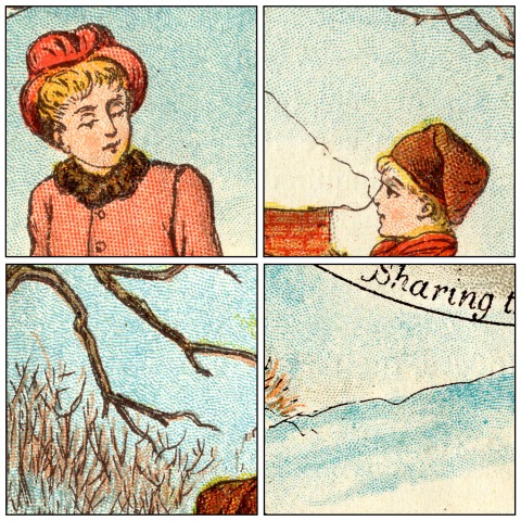 ^^Table of Contents

(ii) Red dots in an almost-familiar pattern—but not quite
I have chosen the next four details to show a pattern used in the scarlet/red dots. At first I thought this was a first sighting of the regular “square” grid of dots, mathematically precise and resembling a halftone screen pattern, which was to dominate comic book printing decades later.
However looking closely at the woman’s coat, and the applying a ruler to the screen, convinced me that these dots are in fact on a very gentle curve, both vertically and horizontally, not set in a square grid.

This is puzzling. Full disclosure here: this pattern does not appear in my 1911-dated Ben Day catalogue, though a number of line patterns with very similar curvature do.
So—was it an early Ben Day pattern which was later abandoned? Was it in fact not a Ben day pattern at all but some other kind of mechanical tint—perhaps a Nelson transfer paper (see Part 5)? I think it is unlikely that they would have mixed the two technologies, but not impossible.
Anyone who can shed light on this, do please let me know. You can reach me here:
legionofandy@btinternet.com
Meanwhile, though I have noted a trend towards simplicity, many of the squares above do show quite sophisticated colour mixes. For example, on both the floor and the quilt we see an orange made up from solid flesh tone, some yellow, and red dots.
In general, in the transition to letterpress printing on newsprint—e.g. the early comic strips, ten years later—a simpler set of tints and mixes was employed. Later comics used only four colours—cyan/blue, magenta/red, yellow and black (CMYK—see Part 3.) In four-colour work, orange would be made from various tints of red and yellow only.
Later on, too, comics strips mostly had regular grid dot patterns, not stipples. However the comics did not immediately adopt a unified four-colour printing scheme, nor did they abandon stippled dots for regular grids of dots straight away.
The relative sophistication of a letterpress comic strip like Little Nemo is often praised, and rightly so. I will look at Nemo in a later post. For now, we can see that a comparable degree of sophistication is achieved by these earlier lithographic artists.
The four squares below (from the front of no.29) show the use of hand-stippling on the faces, and red dots added to the landscape by hand in the third square. The flesh coloured ink is used a lot, including in brownish green, as is the grey ink. Both hand-stippling and the flesh & grey coloured inks were luxuries which the comics had to do without.
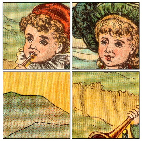 ^^Table of Contents

Lines are used extensively in the colouring of the LOOCPP, often with cross-hatching. I’m certain this was a deliberate attempt to emulate—up to a point—the look of wood engraving, i.e. the kind of colouring seen in Edmund Evans /Kate Greenaway page shown above.
As with the doubling-up of dot patterns, as I remarked in Part 4, Benjamin Day appeared to be implying in his patent notes of 1878—though less directly this time—that his tints might be used to create a look similar to wood engraving. Parallel lines are the signature note of wood engraving’s shading methodology.
Day also noted that cross-hatching could be achieved much more easily with his mechanical tints than it could in wood engraving. Indeed, white lines crossing each other are easily done in wood engraving, whereas black (or coloured) cross-hatching can be only be engraved using time-consuming trickery—the diamond shapes between the lines must be engraved out.
Not so with Ben Day lines. Two or even three sets could easily be laid down directly on top of each other at any angle(s) required. By this I mean lines on one stone, for one colour of ink. For example, a pale blue might be made from one set of tint lines, a darker blue by crossing a second set of lines over it. Both sets of lines would be laid down on the same stone and printed at the same time.
The mixing of colours by crossing flesh-colour lines over blue lines, for example, is also seen here. In that case, the lines were laid down on two separate stones, of course, and printed one over the other.
(v) Moving towards four-colour printing
If Day anticipated colour printers using his tints so extensively, he did not give it away in his patent text, however. His mention of colour use was very minimal, perhaps guarded—was he really not seeing beyond black-and-white, or was he saying as little as possible, not wanting to “give the game away”?
Below is another quartet of colour mixes, this time from the back of no. 29. As you will have noticed, unlike Edmund Evans, who used a green ink, these guys are mixing yellow and blue for their greens. As noted before, this was a favourite trick, saving one printing plate or stone, one whole run of paper though the press, and the cost of the green ink.
The cost—in time, effort and expertise—of designing and making the yellow and blue patterns as required was of course to be factored in. Overall it must have worked out as a money-saving exercise.
This was the kind of economic consideration which eventually led to standardised four-colour printing, of course—a topic for another day.

^^Table of Contents
(7) Concluding remarks
In terms of its colour printing, if nothing else, The Little-One’s Own Coloured Picture Paperis certainly an interesting publication.
Comparing it to the contemporary “gold standard” of children’s book illustration, like the Edmund Evans / Kate Greenaway team, is instructive. The LOOCPP is an example of what lithographic steam-powered printing could supply at a fraction of the cost of Evans’s books. It would perhaps, even at the time, have been seen as one more danger sign for the chromoxylographers, who must have known that their days were numbered.
In that sense it is a pointer to the future of cheap colour printing, even though with hindsight we know that before long, lithographic printing of this sort would in turn be priced out by letterpress.
The coming of photomechanical halftone reproduction—in B&W from the early 1890s, in colour from the early 1900s—would play a big part in this, and this is the story which gets all the glory.
But for decades, especially at the cheaper end of the commercial market, there would be a golden age for cheap letterpress printing from “line blocks”—printing plates without expensive halftones—with Ben Day tints at the very heart of it.
This was particularly notable in colour printing, as I will discuss next time, in Part 6. And within cheap colour letterpress printing, the comic strip and the comic book have a special place—with Ben Day tints at the very heart of that too.
The Little-One’s Own Coloured Picture Paper, with its extensive use of Ben Day tints, and the “comic book” look of the artwork, even in its size and format, also provides a pointer to the future in one specific way—it looks uncannily like a comic book.
In calling it a “missing link” between chromolithography and comics I am not necessarily suggesting that the colour separators, engravers and printers of the actual letterpress comics of the 1890s specifically used the LOOCPP as a model for their methods—though they could have done.
I am not aware of similar publications in the USA or elsewhere which might have played a similar role. Additionally, while the pamphlet-like comic book came to Britain a good deal sooner, in the USA there were several decades when the Sunday sections, not the pamphlet, were the home of the comic strip. If the LOOCPP had any direct bearing on the evolution of the comic book, it is much more likely that it was in the UK.
The story of similar publications in Europe and elsewhere, if any, is something I hope to hear from others.
Alternatively, the LOOCPP may be more like those archaeological finds of ancient species of pre-human which actually died out, rather than proving to be true “missing links” on the evolutionary pathway from primate to Homo sapiens—a side branch on the tree of life.
There is no doubt that it shows what could be done with Ben Day in limited colours, in a mass-market penny paper, with a very similar look and feel to a primitive comic book—perhaps indeed a pre-comic or a proto-comic.
At the very least, I would award The Little-One’s Own Coloured Picture Paper an honourable mention.
~~~
Text and original images copyright © The Legion of Andy 2016
How the original Ben Day dots got into the original American comics
See also:
- Part 1—Roy Lichtenstein etc.
- Part 2—Halftone dots, Polke dots, More Roy
- Part 3—Four-colour comic book dots / CMYK & RGB dots on screens
- Part 4—Pre-history, Origins & Ben Day in the 19th century
- Part 5—Ben Day in lithography
- Part 5.5—A forgotten Ben Day predecessor in letterpress
- Part 5.75—A Lithographic Protocomic (?) from 1885
- Part 6.1 —Ben Day dots in their prime, on 1930s Tarzan Sunday pages
- Part 6.2—Registration—as in, getting the colours lined up right—or not
- Part 7—Ben Day Dots 1933 to 1937—the birth of the comic book
- Part 8 — 1930s to 1950s: The “Golden Age” of Comics — exit Ben Day, enter Craftint
- Part 9a — 1950 & 60s: The “Silver Age” of Comics, Part 1
- Part 9b — 1950 & 60s: The “Silver Age” of Comics, Part 2
guy.lawley@btinternet.com

Many images can be clicked to enlarge. Use the back arrow or button on your browser to return to this page.
CONTENTS OF PART 6:
Introduction:
(a) What has gone before
(b) And now for something completely new… the Sunday Funnies
(c) Comic strips, comic books, Ben Day dots and benday dots
PREAMBLE no.1: The Forgotten History of Letterpress
PREAMBLE no.2: A Brief History of the Metal Relief Printing Plate
PREAMBLE no.3: Hommage à Gillot
Photoengraving a “Line Block”—No Ben Day yet, but this is key…
Adding a Grey Ben Day tint to a B&W Line Block… it’s a start
Ben Daying the Negative
A Ben Day Man in Action… a historic short film
BEN DAY IN COLOUR
Preamble—what did Benjamin Day say about photoengraving and colour…?
Why Weren’t the French the First to do Ben Day in Colour Letterpress? The Tinted Halftone
The First Colour Supplements — Transferred Tint Chromotypography
BEN DAY IN COLOUR LETTERPRESS… at last! How It Was Done
Adding Solid Colours
Colour Separation — the (Very) Basics
Did the Sunday Funnies use Ben Day from the Start? — Yes and No.
Yellow Kid, Red Dots, Blue Lines—examples of early Sunday Comics Ben Day
Letterpress, Ben Day & the Comics—Made for Each Other… but Ben also has a finer, glossier future
The Outroduction — coming attractions
INTRODUCTION
All pictures should be clickable to enlarge, often twice on a PC for full size. Back button to return to text.
In previous posts I have looked at:—
So-called “Ben Day dots” (or rather, “benday dots”) in the paintings of Roy Lichtenstein, and in the 1960s comic books which he used as source material…
 …and the origins of the real Ben Day dots, including inventor Benjamin Henry Day Junior’s original patent of 1879:

…and the first wave of success for Ben Day dots—and Day’s less famous lines—in coloured lithographic printing from the 1880s onwards. This English penny magazine for children, for example, is from the cheaper end of the lithographic market, in 1885. It was the first weekly paper in the U.K. to have regular colour pages, and remained a rare example. In the U.S.A. humour magazines Puck and Judge published lavish colour pages weekly, also lithographically.
Close-up views show the Ben Day dots and lines used to make pale and mixed colours:

^^Table of Contents
(b) …AND NOW FOR SOMETHING COMPLETELY NEW—THE SUNDAY FUNNIES
Now it is time to watch Ben Day and his “mechanical tints” extend their domain from lithography to new territory in letterpress printing—the kind of printing used for the text pages of most books, newspapers and magazines.
Wood-engraved illustrations previously dominated this field, as seen in Part 4—mostly in black & white. This was essentially done by hand, with the aid of ruling machines. By the 1880s, wood engravers had become very skilled at reproducing photographs, paintings and line drawings. They could make a variety of “greys” for shading pictures, using lines and dots, as seen below in this advertisement from the Illustrated London News, 1886 (image size 20 x 12.5 cm, 8 x 5 inches. Details approx. 5cm square.):

During the 1880s and early 1890s, direct photo-mechanical engraving of illustrations, onto metal relief printing plates, was gradually replacing wood-engraving. This was still almost exclusively a black & white technology.
Then in the 1890s, something completely new arrived in the letterpress pages of American newspapers—the weekly, usually Sunday, colour section. Very soon the Sunday section became home to another lasting innovation, later hailed as a new American art form: the comic strip.
Or, to be more precise, the weekly continuing comic strip, a.k.a. the Sunday Funnies.
Early U.S. Sunday strips included The Yellow Kid, Happy Hooligan, The Katzenjammer Kidsand Little Nemo, as seen below. And it looks as if Ben Day dots were pretty much in there from the start. (I’ll fact-check that assertion later.)
These three details are from 1897, 1902 and 1907. Click to enlarge, and the dots should be easy to see. Not hugely different from the lithographic details shown above, are they?

^^Table of Contents
(c) COMIC STRIPS, COMIC BOOKS, BEN DAY DOTS & BENDAY DOTS
We are still a long way from the war and romance comics which directly inspired Roy Lichtenstein some 60 years later. But it is a fact that the 1890s Sunday strips and the 1960s comic books were printed by very similar letterpress techniques. Printing presses advanced in many ways, but essentially used the same methods for almost a century.
The amazing John Adcock at Yesterday’s Papers has reproduced a magazine article from 1940 showing the production and printing of a full page comic strip (George McManus’s Bringing Up Father). A sequence of photos shows several stages, including a Ben Day screen at work, and details of the letterpress printing process on a four-colour rotary web printing press—unmissable!

I will show much more detail on the Ben Day method, as used in letterpress, below.
The classic American comic book of the 60s was in pamphlet form, typically 32 pages plus covers, and about 18 x 26 cm (7 x 10 inches) in size. This format originated in the 1930s, though back then the page count was typically 64 (see Part 7—The Birth of the Comic Book).
As today’s birds descended from dinosaurs, so the comic book’s early ancestors were much larger beasts. The early Sunday sections had full-sized broadsheet newspaper pages, about 41 x 56 cm (16 x 22 inches). Below is a Sunday from 1902—a “jam” page by Frederick Opper, Rudolph Dirks and “Bunny” Schultze—shown with DC comics’ All American Men of War no. 89, dated February 1962. This isn’t Roy L’s copy of All American, but he certainly owned one at the time.

The comic books had glossy covers which the Sunday sections lacked, but otherwise their paper, the methods used to print them, and the way their colours were created on the pagewere not very different.
They both used colour techniques previously established by the lithographers of the 1880s—paler tints and colour mixes created using those familiar patterns of tiny dots and thin lines. And yes, the end result looked very similar to the 1885 lithographic printing shown above, though the “relief” printing of letterpress was actually quite different from the “planographic” printing of lithography.
Also, increasingly, there were influences from the technology of the halftone screen—in particular, colour halftone printing, creating a full-colour image from three or four halftone-screened printing plates. The main contribution from this technology was the geometrical regularity of its dots.

This prompted a gradual farewell to the “pseudo-hand-made” look of stippled Ben Day dot patterns. These had previously been preferred as more “artistic,” less “mechanical.” (Perhaps also less likely to make Moiré patterns when one set of dots was printed over another—I’ll be coming back to that.)
The stipples would never completely disappear from the repertoire, but in the early Sunday comics shown above, more regular dots grids can already be seen, alongside stippled dots.
As for the lines… they would also stick around, but—as a future post will discuss—the U.S. comic books gave up on lines completely after a watershed moment in 1954, using only standardised, regular, dot patterns from then on—as in this 1964 example. Note that the dots are in a “square” grid. Lines of dots can be seen at 90 degrees to each other. I’ll be coming back to this, too.

In the 1960s Roy Lichtenstein—and everyone in the comics business at the time—called these “benday dots”.
In a later post, I will chart how the true Ben Day tints of the 1890s became the “benday dots” of the 1960s—a more complicated journey than you might think—but that is a story for another day.
This time I will take the story as far as the original Sunday comics.
I will demonstrate in detail how a Ben Day tint was put onto a metal printing plate as part of the letterpress process—for both black & white and colour printing.
^^Table of Contents
PREAMBLE no.1: THE FORGOTTEN HISTORY OF LETTERPRESS
In the 21st century you can read some confused and confusing material about letterpress. Here’s an online example from 2012:
Following a revival that took place in the 1990’s, led by many design schools introducing the teaching of letterpress, the previously specialist and expensive form of printing has become widely used once again.
This site shows many attractive examples of contemporary artistic letterpress:


But “specialist and expensive” is an odd way to talk about the process which was used to produce nearly all books, newspapers, pulp magazines and comics for hundreds of years.
When I was a teenager in 1970s England, I read a daily newspaper whose ink—black only—came off on my fingers, and the New Musical Express every week, ditto. Both were printed by letterpress. Letterpress was only finally edged out by its longstanding rival, offset litho, in the 1970s and 80s.
Clare Humphries took these photos, below, of what is said to be the last letterpress edition of the UK newspaper The Guardian, and its stereotype plate, at the newly reopened St Bride Foundation Library (in March 2016—http://www.sbf.org.uk/). This paper was published in June 1987, and after that it was offset litho all the way.

From the 1620s to the 1980s, it had been letterpress that gave us newspapers and a lot more besides. Evidently this is, for many people, the forgotten history of letterpress printing.
Letterpress was generalised and cheap for most of its lifetime—the very opposite of “specialist and expensive”! Though having fallen out of mass commercial use, by the 1990s it seems that is what it had become.
LETTERPRESS BEFORE BEN DAY
- The technology started around 1450 when Gutenberg used movable metal type to print books for the first time.
- In the 1880s, referring to the “letterpress” in a magazine would be talking about the written material, i.e. the text—e.g. “Some good illustrations sadly let down by poor quality letterpress.”
- Soon after that, the name letterpress was applied to the printing process itself.
- Letterpress printing uses raised printing surfaces which get inked by rollers, then print the ink onto paper.
- The raised areas are said to be “in relief,” standing up above the non-inked areas.
- This contrasts with (intaglio) engravings and etchings, where ink is held in grooves and pits, lower than the surface of the printing plate
- and lithography with its planographic (flat) surface.
- The diagram below shows a lithographic stone, an engraved intaglio metal plate and a wooden relief block. In fact by 1890, very little printing was being done directly from wooden blocks. Blocks were engraved on wood, then copied in metal by stereotyping or electrotyping before printing.
- The next big advance in letterpress was the invention of the metal relief plate suitable for mass production printing—not a metal copy of a wood block, but a whole new thing.This is so fundamentally important that I will take a couple of brief diversions from my main narrative to discuss it.

^^Table of Contents
PREAMBLE no.2: A BRIEF HISTORY OF THE METAL RELIEF PRINTING PLATE
By the early 1890s, photomechanical or “process” printing had arrived in the commercial market. This was the introduction of the metal relief plate, often still called a “block,” to mass production.
Previous use of metal plates in relief for illustrations had been very limited. In the 1450s a short-lived trend started in Europe for metalcut religious prints—like woodcuts, but engraved on metal. Hand engraving of metal was even more laborious and slow than wood engraving. It was never an option for mass commercial printing.
In this example of the dotted metalcut style—St Francis receiving the stigmata, artist unknown—from around 1475, white dots on a black background have been created by punching hundreds of small holes in the metal. © Trustees of the British Museum

Over the centuries, there were other short-lived attempts at metal-relief printing. I will look at these in more detail another time. Here’s a summary:
- Elisha Kirkall tried out direct engraving of metal plates, but it was not a lasting success. Metal-engraved illustrations probably by Kirkall for Aesop’s Fables (1722) inspired Thomas Bewick‘s new art of wood engraving in the 1790s , though, so Kirkall may have had a major indirect legacy.
- In the 1780s, William Blake, trained as an intaglio engraver of copper plate, needed a faster cheaper way to print his own illustrations with written text, called “illuminated books”. Blake borrowed the acid etching technique from intaglio etchers, reversed it, and invented the hand-drawn, relief-etched metal plate. He could only print one at a time, by hand. His etch was too shallow to produce a large number of prints quickly. Hardly anyone else took up this highly personal method.
- Another Brit, Edinburgh printer W.H. Lizars—an accomplished wood engraver and lithographer—also tried out relief-etched metal plates, around 1819. Reportedly his etch was also on the shallow side, needing hand-work to deepen his grooves. He may only have done one published frontispiece in one book this way.
- Charles Knight, publisher of The Penny Magazine, bringer of edutainment to the masses, patented a new colour printing method in 1838. He called it “Illuminated Printing” which surely must have been a nod to Blake. Knight printed four colours one after the other onto the same sheet of paper, from four metal relief printing plates arranged on one adapted hand press. He anticipated both 4-colour printing and its “wet ink-on-wet ink” component, but his method was slow and cumbersome and could not be adapted to mass production. He soon gave up.
- He sold his machines and his method in 1841, to Stephen Sly, who failed to make lasting commercial headway with it. Sly illustrated a few books, and started a subscription series of prints which soon failed. His etched metal plates used solid colours only, no line or dot tints. This tiger is probably his best colour work. It was the frontispiece to a Charles Knight book, The Pictorial Museum of Animated Nature, c. 1850. And yes, Sly had gone beyond the restrictive four plates / four colours.

- After George Baxter sold licences to use his patent method of colour printing in 1849(see Part 5-&-a-half), some of his licensees might have used engraved metal plates—rather than engraved wood blocks—for some or all of their colours, and possibly their key images. I have seen a claim that Joseph Kronheim and William Dickes used only metal plates for some of their work, but I’m not sure if this is true.
- William Dickes seems to have invented aquatint in relief—using the “wet” or “spirit ground” aquatint method—for his colour plates in the late 1840s (Part 5-&-a-half). This was a metal relief method, and it was successful, widely used, and lasting—but only used for colour plates. The key image in these prints was usually a black & white wood engraving.
- Printer George Leighton took up relief aquatint enthusiastically. It got him the job of colour printer (from 1855) and later publisher of the Illustrated London News.
- When The Graphic took up the same type of colour printing regularly from the 1870s, they used London-based printer Samuel Hodson.
- By the later 1880s, though, there is evidence that The Graphic had shifted colour printing to Paris, where the “dry” or “dust ground” relief aquatint method was now used, called resin grain chromotypography.
- Though many of the key plates in The Graphic‘s colour prints continued to be wood-engraved, by the late 1880s and 1890s they were also using the new photomechanical process.
Dickes, Leighton and their successors put relief metal plates for colours firmly on the map. But as noted, most of their black key plates, and most black and white illustration, was still printed from wood engravings.
Until Firmin and Charles Gillot.
^^Table of Contents
PREAMBLE no.3: HOMMAGE À GILLOT
Before the photomechanical process, a photograph or drawing could be printed onto the surface of a wood block, but in order to be printed in a magazine, the wood block had to be engraved by hand—a process which took a number of days, and only indirectlyreproduced an artist’s work. The original artist of a drawing had to watch other hands shape the final look of the printed picture.
Now, thanks to the inventions of Firmin Gillot and his son Charles in Paris, images could be acid-etched onto a metal printing plate directly, in relief, then printed alongside text.
Firmin Gillot solved the problem of getting a deep enough acid etch for this purpose.
I’ll mention how he did it later, and where Charles fits in. The Gillots’ revolutionary achievements underlie all the letterpress printing of pictures in newspapers, books, magazines and comics right through until the 1980s.
Gillot père was celebrated in 1948 with this centenary medallion, by the successor to his old company. The “cliché typographique” mentioned here is essentially the etched relief metal printing plate. Firmin is not being accused of inventing a tired old trope.
Medallion size 6.5 x 9 cm, 2.5 x 3.2 inches approx. Front and back shown together.

Photomechanical process work very soon became known simply as “process.” The name photoengraving also stuck, and stuck for longer—despite the fact that it is in fact a photo-etching process—probably because it was replacing wood engraving.
Thanks to the Gillots, by the early 1890s, three types of image could now be printed in the mass media, in print runs of several thousand or tens of thousands, without needing the extra stage of wood engraving:
- A black & white “line drawing”—which could also use dots, and of course areas of solid black
- A grey-toned drawing, in ink wash or pencil for example—using the technology of the halftone screen (though this added considerable expense, and additionally needed smooth, costly paper)
- A black & white photograph, also via halftone screening—which could be a photo of a coloured painting
^^Table of Contents
PHOTOENGRAVING A LINE BLOCK—NO BEN DAY YET, BUT THIS IS KEY…
Starting with a simple example: a black & white (B&W) image of a line drawing. I’ll bring on the Ben Day dots very soon. First I’m looking at the making of a photoengraved printing plate without Ben Day, since the dots were added by the engraver during this process.
Ben Day could be applied to paper or drawing board, but in practice, it very rarely was. For technical reasons, much better results were obtained by adding the dots directly to the metal printing plate. The Ben Day dots used in newspaper and magazine advertising and illustration, and in the comics, were pretty much always done this way. (I will note one major exception below.)
Firstly then, the B&W photomechanical or “process” line block itself.
A process line block was defined as a printing plate with any artwork which didn’t need a halftone screen—because there were no grey tones in the original artwork which needed breaking up into dots for printing. (See Part 2 for halftone screens.)
In Part 4 I showed how an image is etched onto a metal plate from a photographic negative. I’m going to show this again now.
This time, I’m using a George McManus daily strip—Bringing Up Father, admittedly not from the 1890s, but from 1933—as an example. There were no daily strips in the 1890s, but similar things were being done with Ben Day on black & white illustrations. Later on, once the daily strips were established, they used a lot of Ben Day. It’s a fun way to show the process at work.
This is what the original artwork looks like, after 80-plus years of yellowing over time. Note: no dots.

For simplicity’s sake—and because it isn’t really that simple!—I’m going to look at the photoengraving of just one panel. In real life, the photoengraving team would do the whole strip in one go, of course. In fact they might do several strips and/or other illos, ads etc. on one large printing plate for economy, and cut it up afterwards (see Part 4).
Here’s my single panel. It shows Jiggs, one of the stars of this long-running strip (alongside wife Maggie).

Following just this one image through the process, then: after the completed artwork has arrived at the engraving workshop, a camera operative photographs the picture—not making a positive print on photographic paper, but a negative on transparent collodion. At this stage, it is reduced in size from the larger original art to the size needed to print in the newspaper.
Before the negative is laid flat on a printing plate, it must be turned upside down, so it is left-right flipped, or mirror-imaged. The image on the printing plate has to be like that, so that it will print the right way round. Here is the flipped negative:

Now, to get the image onto the metal printing plate, strong light is shone through the negative. “White” areas seen on the negative above—black on the original artwork—are in fact not white but transparent. They let light through. The black areas block all light.
There is a light-sensitive coating on the metal plate—generally, in the early days, a layer of bichromatized albumen (made from egg whites). Before exposure to light, this coating can be washed off the plate easily with water. Where the light hits it, the coating goes hard, will no longer dissolve in water, and sticks firmly to the metal plate. Crucially, it also becomes resistant to acid.
As seen at line 4 in the diagram below, the “white” areas from the negative image—the blacks of the Jiggs picture—now exist as hardened areas of coating, firmly stuck to the metal. But this coating is not easy to see in this state, so the whole plate is now “rolled up” with special black ink from a roller. This is similar to the ink used in drawing on lithographic stones, and very different from printing ink.
The parts of the albumen layer which have not been hardened—corresponding to the white areas of the picture—are now washed off, along with the ink which lies on those parts. The remaining, light-hardened, areas now form an “acid resist” on the metal, in the shape of the line drawing—and it’s been blackened with ink, so is clearly visible.
The ink sticking to the hardened albumen also strengthens its acid-resistant properties.
The acid resist looks just like the original drawing, but mirror-imaged:

It is essentially flat though, and so is no use for printing multiple copies. The image needs to be brought into relief. Black lines and other black areas need to stand up from the surface, or rather the areas required to print white need to be made lower.
When the metal is etched with acid, the white areas on our stained image above are eaten away. They end up lower than the surface of the metal, so won’t take any ink when the image is printed, so will print white.
The black lines are acid-resistant, and remain at their original level. After etching, they are now “in relief” and will take ink from a roller, and print black.
The diagram below sums this up, in a simplified cross-sectional way.

Note that only the first, shallow etch is possible using the original acid-resist (line 5). A number of further etches are needed, to get the “white” areas deep enough—usually three or four. To do this, the acid-resist needs to be strengthened by brushing on, and melting into place, a powdered resin—such as the famous “dragon’s blood”(Part 4)—between etches (line 6, above). If this is not done, or not done carefully, these areas will be “undercut” by the acid, as it eats sideways into the metal as well as downwards.
This process of protecting the edges of the image with resin was the genius move made by Firmin Gillot somewhere around 1848. This was how he achieved a deep enough etch for relief printing, which had not been possible before.
His images were imprinted on the metal not from photographic negatives, but from transfer paper using modified lithographic ink—a process taken directly from lithography (Part 5). That took him to somewhere approximately the same as line 4, above, and he then etched the metal in much the same way.
The photographic element was the genius addition of his son Charles—said to have made his first successful photo-engraved print in 1869, and to have offered a commercial service in Paris from 1876. It looks as if Firmin (1820 – 1872) lived just long enough to see photomechanical engraving get off the ground.
NB: The photomechanical process may not be as time-consuming as making a wood engraving, but it still takes several hours to complete—and requires the hands of a skilled craftsperson.
At the end of this process, the image is on the metal printing plate “in relief”. It is now bare metal. All the black ink and resin that once stuck to its lines has been cleaned off. If its raised-up parts were once again “rolled up” with black ink it would look like:
Just the same as the acid-resist image above. But the difference is, it is now ready to print. It would produce this image on paper:

Para simplificar, e porque não é tão simples assim!, vamos dar uma olhada na fotogravura de apenas um painel. Na vida real, a equipe de fotogravura faria toda a tira de uma só vez, é claro. Na verdade, eles podem fazer várias tiras e/ou outros illos, anúncios etc. em uma grande placa de impressão por economia e cortá-la depois (consulte a Parte 4).
Aqui está o meu único painel. Mostra Jiggs, uma das estrelas desta tira de longa duração (ao lado da esposa Maggie).
1
Seguindo apenas esta imagem ao longo do processo, então: depois que a obra de arte concluída chega à oficina de gravura, um operador de câmera fotografa a imagem, não fazendo uma impressão positiva em papel fotográfico, mas um negativo em colódio transparente. Nesse estágio, o tamanho é reduzido da arte original maior para o tamanho necessário para imprimir no jornal.
Antes que o negativo seja colocado em uma chapa de impressão, ele deve ser virado de cabeça para baixo, para que seja virado da esquerda para a direita ou com imagem espelhada. A imagem na placa de impressão tem que ser assim, para que ela seja impressa da maneira correta. Aqui está o negativo invertido:
2
Agora, para colocar a imagem na placa de impressão de metal, uma luz forte é emitida através do negativo. As áreas “brancas” vistas no negativo acima, pretas na arte original, na verdade não são brancas, mas transparentes. Eles deixam a luz passar. As áreas pretas bloqueiam toda a luz.
Há um revestimento sensível à luz na placa de metal, geralmente, nos primeiros dias desse processo, usava-se uma camada de albúmen bicromatizado (feito de clara de ovo). Antes da exposição à luz, este revestimento pode ser lavado facilmente com água. Onde a luz atinge, o revestimento endurece, não se dissolve mais na água e adere firmemente à placa de metal. Fundamentalmente, também se torna resistente ao ácido.
Conforme visto na linha 4 do diagrama abaixo, as áreas "brancas" da imagem negativa, os pretos da imagem de Jiggs, agora existem como áreas endurecidas de revestimento, firmemente presas ao metal. Mas esse revestimento não é fácil de ver nesse estado, então toda a placa é agora "entintada com um rolo" com tinta preta especial. Essa é semelhante à tinta usada no desenho em pedras litográficas e muito diferente da tinta de impressão.
As partes da camada de albumina que não foram endurecidas, correspondentes às áreas brancas da imagem, agora são lavadas, juntamente com a tinta que está sobre essas partes. As áreas restantes, endurecidas pela luz, agora formam uma camada "resistente ao ácido" no metal, na forma do desenho (line drawing), e foi escurecido com tinta, então está claramente visível.
A tinta aderente ao albúmen endurecido também fortalece suas propriedades de resistência a ácidos.
A resistência ao ácido se parece com o desenho original, mas com uma imagem espelhada:
3
No entanto, é essencialmente plano e, portanto, não serve para imprimir várias cópias. A imagem precisa ser trazida em relevo. Linhas pretas e outras áreas pretas precisam se destacar da superfície, ou melhor, as áreas necessárias para imprimir em branco precisam ficar mais baixas.
Quando o metal é gravado com ácido, as áreas brancas em nossa imagem manchada acima são corroídas. Eles ficam mais baixos que a superfície do metal, então não pegam nenhuma tinta quando a imagem é impressa, dessa forma imprimirá em branco.
As linhas pretas são resistentes aos ácidos e permanecem em seu nível original. Após a gravação, eles agora estão "em relevo" e pegam tinta de um rolo e imprimem em preto.
O diagrama abaixo resume isso de forma simplificada em corte transversal.
4
Observe que apenas o primeiro ataque superficial é possível usando a camada de ácido-resistente original (linha 5). São necessárias vários ataquem com ácido adicionais para obter as áreas “brancas” suficientemente profundas, geralmente três ou quatro. Para fazer isso, a resistência ao ácido precisa ser reforçada escovando e derretendo no lugar uma resina em pó, como o famoso “sangue de dragão” (Parte 4), entre as corrosões (linha 6, acima). Se isso não for feito, ou não for feito com cuidado, essas áreas serão “cortadas” pelo ácido, pois ele corrói lateralmente o metal e também para baixo.
Esse processo de proteger as bordas da imagem com resina foi a jogada genial feita por Firmin Gillot por volta de 1848. Foi assim que ele conseguiu uma gravura suficientemente profunda para impressão em relevo, o que não era possível antes.
Suas imagens foram impressas no metal não a partir de negativos fotográficos, mas de papel de transferência usando tinta litográfica modificada, um processo obtido diretamente da litografia (Parte 5). Isso o levou a algum lugar aproximadamente igual à linha 4, acima, e ele então gravou o metal da mesma maneira.
O elemento fotográfico foi a adição genial de seu filho Charles, que disse ter feito sua primeira fotogravura bem-sucedida em 1869 e oferecido um serviço comercial em Paris a partir de 1876. Parece que Firmin (1820 - 1872) viveu apenas tempo suficiente para ver a gravura fotomecânica decolar.
NB: O processo fotomecânico pode não ser tão demorado quanto fazer uma gravura em madeira (woodcarving), mas ainda leva várias horas para ser concluído e requer as mãos de um artesão qualificado.
Ao final desse processo, a imagem fica na chapa metálica de impressão “em relevo”. Agora é metal nu. Toda a tinta preta e resina que uma vez grudaram em suas linhas foram limpas. Se as partes levantadas forem novamente "entintadas com o rolo" com tinta preta, ficaria assim:
Job done!
Here’s what a real zinc plate one looks like, from a much later Popeye comic:

Thanks to Firmin and Charles Gillot, illustrators could see their work go from art board to printed paper without other hands—the wood engravers—imposing their own style on it.
But, on the plus side, the wood engravers had often added a wide range of shading to their work, using lines and dots to create textures and shades of grey—as shown in my introduction. Some of these could of course be drawn by hand—and McManus or his assistant have done some linear shading in the background here—but Ben Day tinting was a very popular method of putting some grey into B&W line block work.
Let’s see how it was done.
^^Table of Contents
ADDING A GREY BEN DAY TINT TO A B&W LINE BLOCK
On the image below, I am imagining that McManus, or an assistant, has used a blue pencil to show the engraver where to put an area of tint. (His best-known assistant, Zeke Zekley, didn’t join him until 1935—two years after this panel was drawn.) In real life, or on eBay, you will see plenty of B&W artwork marked up like this. (And yes, it’s true that Jiggs’s waistcoat was generally tinted with a pattern of plaid squares, not a grey tint—but this is just a hypothetical example!)
My Photoshop version looks more like marker than coloured pencil, but you will get the idea. The blue doesn’t have to be very carefully done—it’s just a guide. The engraver will understand where the tint is wanted.

This pale blue was called “non-reproducing” or “non-repro” for short— it would not be picked up at all when a photographic negative was made of the artwork. The negative would look just like it did before, and be flipped for transferring to the printing plate just as before:
But we don’t want it printed just the same. We want Jiggs’s waistcoat to have a Ben Day tint. How does the engraver do that?
First he or she takes the process as far as step 4 in my diagram above. The plate is inked, parts of the coating which have not been light-hardened are washed off. There is an acid-resistant, inked image of Jiggs on the metal, again looking like this:
Now the engraver refers to the original artwork, with its blue-pencilled area. He or she paints the parts of the printing plate which do not need to be tinted with a liquid gum called gamboge. Traditionally this is coloured yellow. It dries quickly into a thin rubbery layer, which is semi-transparent. The printing plate is now masked, and looks like this:

The engraver probably knows which Ben Day tint George McManus wants. The engraving workshop would have used a limited range of basic tints, and comics characters often had the same look almost every day. If something special was needed, or if this was a one-off job, details would be written in the borders of the artwork or attached to it.
You may remember from my previous look at Ben Day tints in lithography (Part 4) how the next step is done. It’s very similar in photoengraving. Here’s a reminder (Figs. 20 to 22 from Dalgin, 1946):
The engraver has a number of screens on a rack waiting to be used. The screen is a wooden frame with a semi-transparent sheet of gelatine & celluloid stretched on it. The underside of this sheet has the Ben Day dots (or lines) moulded onto it as tiny raised “pimples” (or ridges) in relief.

The engraver inks the underside of the screen with a roller, using a thick greasy black ink which is similar to that used by lithographers on their stones or zinc plates. Only the tops of the “pimples” get inked. The screen now has thousands of tiny dots, in wet black ink, all over it.

In the picture below, on a simple job like our imagined Jiggs panel, the engraver lays the screen down on the metal plate manually. Alternatively, especially for a more complicated job, the screen could be held in an adjustable frame. Again, this is something I previously looked at in lithographic work (see Part 5).
Rubbing down on the back of the screen transfers inked dots onto the metal. In real life the screen with ink on it is still partially transparent, as only the dots are black with ink. The engraver can still see the image on the metal.

However, he or she does not have to be too precise in rubbing down the tint, as the areas which do not need dots have been masked off with gamboge.
The result of this step might look something like this:

Or, in close-up:

And when the gamboge—which is soluble in water—is washed off, it takes with it the dots which have “gone over the lines” onto the mask. Greasy black dots remain on the metal only where they are wanted. The plate now looks like this:

It is now ready for etching. It has two sets of acid-resistant areas:
- the original black line drawing, created by light hardening the light-sensitive coating of the metal
- lots of tiny dots made of greasy black ink from the Ben Day screen, added by hand.
Once etched, my printing plate will have a pattern of dots, standing out in relief, no longer actually black of course, but each one a little metal hillock. All traces of the original Ben Day ink, sensitised coating and resin will have been cleaned off the plate. Each hillock will become black again when printing ink is rolled onto its top, ready to print onto paper.*
When printed, the composite image will now look like this:

Or in close-up again:

George McManus’s artwork is ready to be printed in the newspapers*, exactly as he intended it—with added Ben Day dots.
(*At least, it’s ready once it has been mounted on wood to bring it to “type height,” placed among the other cuts on the complete page, “matted” or “stereotyped,” and remade as a curved printing surface ready for the cylinders of the rotary web printing press… but that is a story for another post.)
Here’s another example, and this is a real one—thanks to Les Daniels and Chip Kidd in their beautiful book Batman: The Complete History (2004). It’s credited to Bob Kane, which means that we might not know who actually drew it, but there is one person we can say certainly didn’t draw it—Bob Kane.
Firstly the 1943 daily strip as published (click to enlarge):

And close-ups of two panels from the original art and the printed copy:

(Curiously, someone went to great lengths to remove Kane’s signature from the right hand panel. Made a right mess of that top right hand corner while they were at it—must have seemed a price worth paying.)
^^Table of Contents
I noted above that Ben Day tints were nearly always laid down on the printing plate, but there was one major exception to the rule. This is it: tints of black could also be placed on the white areas of the negative.
When printed, the tint would appear as a white pattern on the black area of the image.
Every Ben Day tint on the photoengraver’s shelf therefore was potentially two tints.
In the example below, I have Ben Dayed the shaded area behind Jiggs on the negative—best seen at the bottom right corner of the negative—and I show how that would print:

Making white dots on black like this was a common device in the preparation of newspaper and magazine small ads, in particular.
^^Table of Contents
Finally in this section on B&W, here’s a great film of printing plates being photoengraved in a New York engraving workshop, probably in the 1950s. The first part is about a halftone plate being made from a photograph—really interesting in its own right. Starting at about 21 minutes and 12 seconds you can watch a segment titled BENDAY about a B&W single-panel gag cartoon having Ben Day dots put onto it.
If the film isn’t working here, you can see it at the original page—scroll down ’til you find The Art and Technique of Photoengraving. Lots of other good stuff to see too!
http://printingfilms.com/#preserving-the-visual-history-of-the-printed-word
Or have a look at some screenshots (click to enlarge etc.). Note this gentleman is using the adjustable frame to hold his Ben Day screen. (Or it might be a benday screen, of course.) In the final panel, impossible to see clearly, he is using a small roller to press down on the screen.
^^Table of Contents
BEN DAY IN COLOUR
In a daily newspaper, comic strips would normally be printed in black on white paper, though sometimes the paper was another colour—pink or a green, for example.
And of course the image on the printing plate could be printed in any colour the printer wanted. Which starts to suggest how the Ben Day tints were used in colour work…
What I have shown above has laid down most of the basic elements of the method used for coloured Ben Day work. It’s almost time to look at the details—after two brief detours:
First: when he patented his new method in 1878-79, Benjamin Day Jnr was evidently aware that the world of lithographic printing was ready to make use of it (see Part 4 & Part 5). However, his patent text makes very little mention of either photoengraving or colour printing—though there are hints that he understood more than he was letting on about how his tints might be used in these fields.
As mentioned, Charles Gillot had been photoengraving for French publishers since 1876—but it’s is fair to say that the use of “process” was still barely taking off in Ben Day’s launch year of 1879. For most publishers it was still not an option, and if it was, the results were far from perfect, and looked down on by many artists.
In Paris they were perfecting the technique ahead of everyone else. Which prompts a question, and Detour No. 2:
^^Table of Contents
WHY WEREN’T THE FRENCH THE FIRST TO DO BEN DAY IN COLOUR LETTERPRESS? — THE TINTED HALFTONE.
I have asserted that the cheap lithographic colour printing used for The Little-One’s Own Coloured Picture Paper in 1885 was a forerunner of later comic strip printing. In claiming this, I do not need to assume that early pioneers of Ben Day in letterpress had actually seen copies of The Little-One’s own Coloured Picture Paper.
I do assume that they would have been aware of what was being achieved with cheap lithography, using a limited range of colours, and using mechanical tints (particularly Ben Day).
At some point, someone somewhere realised that something very similar could be done by etching Ben Day dots onto metal relief plates, which started nothing short of a new printing revolution.
For me, there are two big questions about this: why didn’t the revolution start in or shortly after 1885? Between London and Paris, all the necessary ingredients were in place. And the second question is, why didn’t it start in Paris? Why was it delayed almost ten years, until the mid-90s in New York?
I’ll attempt an explanation now, based on what I know. Any more expert opinions gratefully received (via legionofandy@btinternet.com)
As discussed above, France was where the earliest breakthroughs were made in photoengraving. And, as seen in Part 5-&-a-half, early strides were made in Paris with comic strips and process line blocks in the later 1880s. British weekly The Graphic was getting a lot of its process work done in Paris, including the colour pages for its special editions—including proto-comic strips.
I’ve said that process work was almost exclusively black & white at this time, but Charles Gillot and others also pioneered the use of tinted letterpress halftone illustrations. These were common in the colour pages of French magazines years before the Sunday sections arrived in the U.S.A., and even more years before actual full colour mass printing of halftones was possible.
In the tinted halftone a black halftone key plate was made, often photographed from a painting. Paintings were good photographic subjects—they tended to stay pretty still. Things that moved around, like people, were still a problem—cameras needed long exposures to make their negatives. The era of the “snapshot” was still a long way off.
The B&W halftone image did most of the work in a tinted halftone, with a number of other relief metal plates adding colour. Colour tints may have been done with the resin grain / relief aquatint process described in part 5-&-a-half, or were often drawn by hand. This involved a lot of hand-stippling / line-drawing. The lithographers of Britain and the U.S. had substituted the much faster Ben Day tints for much of that hand work. And Ben Day would have been faster than resin grain, too.
The tinted halftone process was not unlike the production of a chromolithograph. (Indeed, by this time the technology existed to do the same thing lithographically.) Many chromolithographers must have moved over to letterpress work, or passed their skills on to those who did it. Why were Ben Day dots not part of that legacy?
Let’s look at a tinted halftone illustration in detail.
Paris Illustré was a weekly magazine, each page 30 x 41 cm in size, 12 x 16 inches—about A3 or tabloid newspaper size—half the size of a broadsheet page like those of the early Sunday sections. It had a colour cover and two interior pages in colour—every week. As noted last time, Charles Gillot had been the “directeur” of this paper.
This picture below is called École Buissonière—a buisson is a bush or undergrowth, “école buissonière” means playing truant / hooky. It’s pun! It’s the best example I have of a hand-tinted halftone. (Also: a charming celebration of the innocence of childhood? Borderline child pornography? It’s so hard to tell with the Victorians.)
It’s a reproduction of a painting (clearly proper art, then; none of yer smut) printed in the issue of March 15th 1890. Image size 28 x 22 cm, c. 11 x 9 inches:

Close-ups show:
- halftone black dots
- hand-drawn dots and lines used to tint the B&W halftone image
- use of only three colours, already very close to the standard cyan, magenta and yellow of later CMYK printing
- no flesh-coloured ink, but magenta and yellow used for the skin. This also points the way forward. Many printers, before and after 1890, cut costs by using no green ink, but as noted before, flesh-coloured ink for faces and hands was more difficult to let go of. This is not hard to understand—faces in particular are such focal points in a picture. Artists and publishers would want them to look good. These guys were confident they could do without it.

But these French colourists / engravers, at the forefront of colour printing technology, did not yet make the leap of adding Ben Day tints to their repertoire. As previously discussed (Part 5-&-a-half) there is evidence that French lithographers avoided Ben Day tints in favour of hand stippling—and this may also have applied to letterpress. It is assumed that this was on aesthetic grounds.
As I have noted previously, it is possible that the French also tried Ben Day on their tinted halftones, and got too many Moiré patterns—the unwanted shapes that occur when you impose one set of regular dots or lines on another, as seen here (from esko.com):

Or below, as made by me. In my examples, I have tried to show what can happen if you print blue and black dots of the same pattern over each other—but the registration slips in a fairly “real-life” fashion. One the left, by the width of one line of dots (one tenth of an inch at original size)—on the right, by an angle of 2 degrees. I hope you can see banding—vertical lines—on the left, and a Moiré pattern on the right.

Hand drawing of dots was one way of avoiding this effect, but in the long run it was not going to survive. Printers had to find other ways to overcome—or minimise—these problems, especially once they were printing 3- and 4-colour halftone images. And they did, as we will see another time.
The French of the 1880s could have used Ben Day tints for their comic strips, where there were no black halftones to produce the unwanted patterns seen above. Similar Moiré effects could still happen with overlapping coloured dots on coloured dots, though, not just colours on black. Nonetheless, British and American lithographers had been overlapping coloured Ben Day dots for some years. As we saw in the Little-One’s Own, 1885, they could get good results from this fast, cheap method.
But, as we saw in part 5-&-a-half, for whatever reasons, the French also avoided Ben Day tints in their comics. This panel from a strip by Caran D’Ache (1888) uses hand-drawn red and blue tints, with yellow and flesh supplied by the resin grain method.

^^Table of Contents
THE FIRST COLOUR SUPPLEMENTS — TRANSFERRED TINT CHROMOTYPOGRAPHY
The transferred tint method is the next thing which delayed the arrival of Ben Day into letterpress colour.
From 1890 Paris was the first city to have a major daily newspaper, Le Petit Journal, with a weekly colour supplement—printed by letterpress on newsprint, on a brand new type of printing press—publisher / engineer Hippolyte Marinoni‘s revolutionary colour newsprint rotary press.
Marinoni is the third Parisian hero of this post—like the Gillots, largely forgotten today. He previously made the first successful steam-powered lithographic cylinder press in about 1869, but Richard Hoe bought the U.S. licence and rebranded it as a Hoe Press. Hoe got all the credit for that advance.
Marinoni and his son-in-law also made the first press capable of printing four colours on newsprint in one press run, which made possible the coloured Sunday supplement—which gave us the comics. Also, it defined the early Sunday supplements as a four-colour phenomenon.
But, importantly for my story, Marinoni’s Petit Journal colour pages didn’t use Ben Day tints. They didn’t use hand tinting or resin grain either, but a different method which I will look at in detail another time—chromotypography by transferred tints.
L.P. Clerc, a French printer himself, in the Ilford Manual of Process Work, 1926, says that the resin grain method “is not very adaptable to high speed rotary printing such as is used for the colour supplements of several daily papers.” So Le Petit Journal, faced with an entirely new way of printing, perhaps had a choice between Ben Day tints and this other method.
Transferred tint chromotypography used transfer paper to take up inked patterns—mainly lines—from engraved copper sheets, and transfer the inked pattern to the printing plate. I described essentially the same process, as used in lithography, in part 5. As I said then, Ben Day was faster than this method, had other advantages, and largely supplanted it in lithography. Why did Le Petit Journal‘s engravers choose the less advanced technique?
Perhaps it was simply that longstanding French distrust of Ben Day—which also meant that the relevant expertise just wasn’t there in Paris. Parisian printers may have been comfortable with transfer paper methods, having perhaps used Firmin Gillot’s original Gillotage since the 1850s. Marinoni’s team probably knew the tint transfer method from other work they had done. Quite possibly it was also cheaper than Ben Day.
Whatever their reasons, Le Petit Journal‘s choice seems to have influenced other early adopters of newsprint letterpress colour printing—in Britain and the U.S.A..
In London, George Newnes, of Strand magazine fame, bought two Marinoni colour presses, and printed a new weekly called The Million on them (1892 to 1894). The front cover of its first issue is the only page of The Million where I have seen Ben Day tints. For most its run The Million didn’t use Ben Day, but transferred tints. It seems that Newnes and his team followed the established French model—though they may have tried out Ben Day, and not liked it.

The Chicago Inter-Ocean newspaper launched the first Sunday colour section in the USA later in 1892, before any of the New York papers—my thanks to Richard Samuel West for the scan of its first issue, above. Richard writes about this historic achievement here: http://john-adcock.blogspot.co.uk/2012/11/americas-first-color-newspaper.html
The Inter Ocean used presses modelled closely after the French type. Proprietor H. H. Kohlsaat apparently tried to import a Marinoni press, but ran afoul of some U.S. patent laws. He had his engineer Walter Scott build a close copy.
You can guess what’s coming… no Ben Day tints in the Inter Ocean ! They also did it the French way.
It was left to the New York Sunday sections—the Herald, the World and The Journal—to pioneer Ben Day in colour, possibly from 1893, possibly a little later.
And here, in basic form, is how they did it.
^^Table of Contents
Looking again at my panel of Jiggs in his waistcoat, let’s now say he is part of a colour Sunday strip, and I want his waistcoat to be pale blue. If I use the same method as I did for B&W, I could have a printing plate ready to print blue that looks like this:
And, used to print blue, it will produce this image:

But this is not what I need. No doubt you have spotted the problem already. I only need the waistcoat in blue. The rest of Jiggs, even the outline of his waistcoat, just needs to be on the black plate. If we printed four colours lik this, each with its own complete version of the black outlines, the alignment of the four printing plates—the registration—would have to be absolutely perfect to avoid an awful mess. And when did you ever see a comic strip printed with perfect registration?
No, I need a black printing plate that will print this:
and a blue plate that will print this (in the correct position):

…so that, when they are printed progressively, black on top of blue, I get this (or, when the registration slips, something close!):

How do I achieve this?
The answer is: I make a plate that has the B&W image only stained onto it, not actually present as an acid resist.
Bear in mind, this happens at Line 4 on that diagram from a while back:

The image exists as parts of the albumen layer, hardened by light to make an acid resist, no longer soluble in water.
For my B&W plate, with or without Ben Day, I “rolled up” image this with black ink so that I could see it, and to strengthen the acid resist. I will do this again now, but…
For colour work, I need to turn this into a different type of “stained” image—
- clear enough that I can paint my gamboge onto it in exactly the right places
- but an image which is not an acid resist
- and one that will not end up on the final printing plate.
I have read various accounts of how this “stain” was made. There seem to have been different methods in use at different times and places.
The account below is taken from the Pictured Encyclopedia of the World’s Greatest Newspaper, published by the Chicago Tribune in 1928—though I’ve rewritten it a little for clarity. I believe it explains pretty much what would have been done in the early days of colour comics.
Remember, our B&W image is on the plate as an acid-resist, made out of hardened bichromatized albumen solution, and rolled up with black ink. The Tribune book says:
The usual method protects [from the acid etch] all the lines originally photographed; and if these lines remained protected on the plate being worked up for color, they would appear on the finished plates, printing in colored inks what should be printed only in black.
The hardened sensitizing solution protecting these lines must therefore be removed. But if it were removed forthwith, the sheet of zinc would be blank, and the Ben Day man would have nothing to serve as his guide in applying his tints. This problem is solved as follows:
By chemical treatment, the Ben Day operator creates a frosty appearance on all parts of the sheet not protected by the acid resist. [That’s all the Trib has to say. This “chemical treatment” may have been a dip in a very weak acid bath. Possibly other chemicals may have come into use later.]
The acid resist, the hardened sensitizing solution in the shape of the black image, is now washed off. [This must have been with a suitable solvent—we know that water would not do this job. In fact it must have been a very thorough cleaning job. The plate needs to be pristine for the next steps.]
The metal that was underlying the acid resist remains shiny and silvery, and shows in strong contrast to the “frosted” parts, giving a good guide to the operator in applying his tints; but since the metal is exposed all over, it will etch all over, except where the Ben Day tints are applied.
Thus the plate will print its color only where the Ben Day shading has been applied, and will not duplicate the lines of the black key plate.
So, in this account, the Ben Day operator has a silvery image of the black artwork to work on, with the white areas of the image being “frosted.”
In the film clip seen above, the images on the zinc plate look darker than that. Perhaps by the 1950s, in New York, they were doing it this way:
L.P. Clerc again, in his 1926 Ilford Manual of Process Work, describes a method of blackening the surface of the zinc plate all over with a chemical called oxychloride of antimony—before exposing it to light under the negative. Once the light-sensitive coating has been hardened, the black antimoniated coating is removed from the “white” areas by immersing the plate briefly in weak acid. After washing off the acid resist, the image is left on the plate in black. Clerc calls this a “set-off” rather than a “stain.” It’s clearly a very similar process, but creates a blackened rather than a silvered image.
Anyway, we can accept that some version of this process was done back in the 1890s, and in 1933 when George McManus drew Jiggs, and in 1943 when “Bob Kane” (*chortle*) drew Batman.
I will represent my “stained” or “set off” image of Jiggs on the zinc plate like this, in purple:

I won’t go through the gamboging and the application of the Ben Day dots again. You will appreciate that I can apply my black inky dots where I want them, and end up with a printing plate that looks like this, ready for etching:

And, crucially, the stained silvery image (shown as purple) is not acid-resistant. It will be removed in the etching process—the metal in the purple areas above will be eaten away, etched down along with the “whites”.
Only the Ben Day dots are acid resists, and they will be etched on in relief, as I wish.
My etched plate will have only this dotted area in relief:

and will print like this, in just the right place (or near enough!)…
…and when printed with the black plate will give me the desired result—Jiggs in a pale blue waistcoat:
Hurrah! Cracked it.
^^Table of Contents
If I also wanted the background to be 100%, or “solid”, blue, I could paint an area of solid black onto my stained plate—using acid-resistant ink with a brush—in addition to the Ben Day dotted area, before etching; thusly:
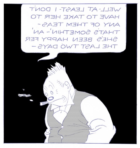
And then etch as per usual. My blue printing plate will now print something like this:

And we are starting to see how the magic is done.
What about the other colours? If we are doing four-colour comics (see Part 3) we still need yellow and red.
^^Table of Contents
COLOUR SEPARATION—THE (VERY) BASICS
If I was colouring this panel fully, in addition to my black and blue plates, I would need to make another plate for my red dots/lines/solid colour, and a fourth plate for my yellows.
Jiggs’s face would probably have red dots on it to make a pink.
That blue background I made above might also have red dots (or lines) on it, to make a purplish blue. Or it might have solid yellow in addition to the solid blue, making dark green.
Equally, Jiggs’s waistcoat could become a pale purple, by adding red dots to the red plate, and printing them with my blue dots. Or it could be a lime green, if I added solid yellow to it on the yellow plate.
Whichever of these I chose, the blue printing plate would be made just as I have shown above. Only the red or yellow plates would be different.
This is a very simple introduction to the idea of colour separation. I have written a bit about this before in the context of lithographic colour printing. During the printing process, the full-colour image has to be built up from just four colours. (In lithography there were typically nine or more). In making the printing plates, the colour separator must do the opposite—either mentally or with the help of sketches, break down the colour picture into its component blue, red and yellow parts.
Below is a chart showing just some of what you could do with Ben Bay, in mixing colours for letterpress. This was a 1927 ad, showing off the services of The Standard Photo-Engraving Company of Chicago. Note that by this time CMYK—Cyan (blue), Magenta (red), Yellow and blacK—is, if not universally standardised, at least approximately assumed by this company.)
The tints shown here are much finer than those used in the comics. The chart was printed on glossy paper, not newsprint. Newsprint could only take coarse tint screens, perhaps 55 or 65 dots per inch. The Standard Company was showing off what it could offer clients in glossy magazine advertising, maybe using up to 200 dpi. Hence the statement that they used copper plates—more expensive than zinc, and used for finer detail.
Apart from illustrating colour mixes very nicely, this chart also reveals how, by the 1920s, Ben Day tints had escaped from the newsprint world and into glossy illustration—including advertising. This was another very successful arena for our favourite dots.
Original image size 16 x 24 cm, 6.5 x 9.5 inches. The chart was probably made with real Ben Day, actual size.
Below the main picture I will explain it further. (Click to enlarge, natch.)

At the top, the ad shows the four solid colours and four tint gradations of each one—perhaps 75%, 50%, 25% and 10%, I don’t know exactly—see close-ups of blue and black boxes below. In the standardized comic book printing of the 1940s to the 1970s, only three percentages of each colour could be used—approximately 100%, 50% and 25%—solid colour, a middle tint and a pale tint.
In the early days of the Sunday comics, though engravers were limited to four colours, otherwise the rules hadn’t been written yet. Ben Day operators were in theory free to use many different patterns of dots, and any percentages they wanted. However, individual workshops would have settled into grooves of their own, using the patterns and shades they knew best.
You will notice that some of the tints below are regular dot patterns and some are lines. The Standard Co. doesn’t explain why it chose these different Ben Day patterns for different percentages. Perhaps it was just to demonstrate they could do either.

Here are a couple of the mixed colour boxes. The lower row on each one shows the two tints which have been mixed to make the main colour.

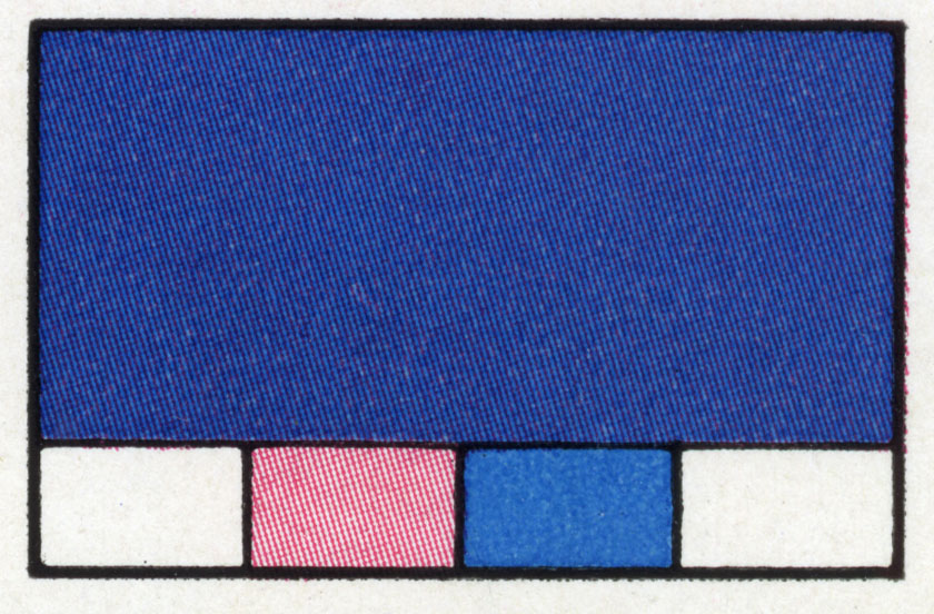
That’s the general principles of Ben Day in colour covered. I will look at some specific examples from The Yellow Kid below. But first, a question I said I’d come back to:
^^Table of Contents
DID THE EARLY SUNDAY FUNNIES USE BEN DAY FROM THE START?
The short answer is: probably yes.
But… after months of searching, I still can’t tell you when and where the first Ben Day dot was applied to a metal printing plate for letterpress printing. And I can’t say for sure that the first Sunday comics used Ben Day.
The aesthetic, creative, publishing and social histories of comics have been studied quite exhaustively over the past few decades. Technical aspects—like printing and colour separation—are less well documented. This is despite the fact that the dots and lines used to print the comics are widely seen as part of their aesthetic appeal.
It is occasionally assumed, if rarely mentioned, that the earliest New York Sunday colour sections—and therefore the earliest Sunday colour comics, in about 1894—were printed with Ben Day dots. Until high resolution scans or close-up photos of these early pages are published, this must be regarded as unproven. Other colouring methods, as we know, were available.
I have pages from the New York Herald, 1895, with illustrations coloured with transferred tint, others where transferred tint appears alongside Ben Day. From May 1896, I have a Herald section which uses only Ben Day.
The first regular Sunday “comics” character, i.e. the first to appear every week, was Richard F. Outcault’s Yellow Kid. He first appeared in small single panel cartoons of Hogan’s Alleyin Truth magazine (1894-5), which were reprinted in The New York World‘s Sunday section, first in B&W, then colour. The Kid went on to star in large half or full page colour illustrations, and from October 1896, a few actual comic strips.
Happily, we do know that the first appearance in colour of Hogan’s Alley, in May 1895, was coloured—at least partly—by Ben Day tints. (There had been earlier Sunday comic strips in colour, and this of course is not actually a comic strip itself, but a single-panel cartoon.) Bill Blackbeard’s splendid Centennial Celebration book of the Yellow Kid, 1995, has a large enough reprint of this cartoon that the dots and lines are visible—especially in the 1-inch wide details below. As these are scans from a photograph printed in a book, small halftone dots are visible as well as the original Ben Day dots and lines. The picture goes across the book’s gutter.

And yes, in this early version the Kid is dressed in pale blue, which is perhaps a good thing—if he was already sporting his famous yellow he wouldn’t have been dressed in Ben Day, would he? :0)

^^Table of Contents
YELLOW KID, RED DOTS, BLUE LINES—EARLY SUNDAY COMICS BEN DAY
In 1996, the U.S.A. officially celebrated the “100th anniversary of the comic strip.” The very first comic strip was supposedly The Yellow Kid and his New Phonograph—published in The New York Journal on October 25th 1896. (The Journal had hired Outcault away from the World by this point.)

Of course, we know that there had been many comic strips before this, but this is not the time to get into that subject.
Looking closely at Blackbeard’s book, I am fairly certain that these New York JournalYellow Kids were also coloured with Ben Day.
My own earliest Yellow Kid is from 1897. It isn’t by Outcault and it isn’t from the Journal. It’s by George Luks, who was hired by The New York World to continue Hogan’s Alley with the Yellow Kid, where it ran for about a year alongside Outcault’s own Journal version.
I am indebted to Paul Gravett, who very kindly gave me this page. http://www.paulgravett.com/
The Hogan’s Alley / Yellow Kid cartoon takes up half of a full broadsheet page. Original image size: 41.5 x 25 cm, 16.5 x 10 inches approx.

Here’s a close-up of the Kid which will give you more idea what the engravers were doing with the Ben Day. You will see lines as well as dots, and geometrically regular dots as well as stippled ones:

Also, it’s fairly clear from the image above that the World is not using a CMYK palette. Yes, it’s 4-colour printing, but the red is scarlet, not magenta. This seems to have been typical of the early Sundays. Here is a reminder for anyone who has forgotten Part 3 and CMYK.

In later 4-colour comics, with their standardized CMYK printing, scarlet would be a composite colour, made by printing magenta over yellow.
Here are a few close-ups, originally about 2cm across, which show some other features of the red tints. Firstly, note that both red lines and red stippled dots are used—blue lines too. This is very reminiscent of the lithographic printing seen previously on The Little-One’s Own Coloured Picture Paper:
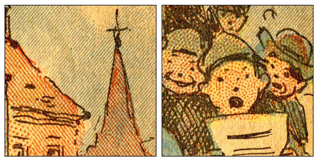
Next, looking at the wall on the left and the Kid’s face on the right, it is clear that at least two different patterns of regular red dots have been used. Regular grids of dots were far more rarely seen in lithography. The New York Sunday engravers seemed to have lost any former prejudice against these “unartistic”, “mechanical” dots. I think this was partly because they had been working with B&W halftone photos, with their precise dot grids, and come to appreciate them.

A super-close-up on the Kid’s face, below, shows two things of interest. Firstly, he has been given yellow dots as well as scarlet, to make his flesh tone more orangey.

Secondly, the Kid’s Ben Day pattern is different from the standardised 1960s comic book dots, which were in a square grid—i.e. one line of dots can be always be seen at 90 degrees to the other—see the Girls’ Romances panel in the Introduction, and the second picture below.
The pattern we see here is called “60-degree offset.” You can see vertical lines of dots but no horizontals. One direction of dots is in fact at 60 degrees to the vertical, and another at a further 60 from that one.

You will see no squares of dots in this grid, but hexagons and equilateral triangles.
Compare and contrast: below left is the standard 1964 DC comics magenta-dotted skin tone, rotated to show the square grid more clearly. On the right is a detail from a Roy Lichtenstein face. After a few early experiments with home-made stencils, Lichtenstein consistently painted his dots with 60-degree offset stencils, and his skin tone with scarlet. When he was “copying” a DC romance heroine or war hero, he never gave them their original skin tone, either in colour or in dot pattern.

A final red-tint detail from my 1897 Yellow Kid: Below are Alex and George, the twin Scrappy-Doos of George Luks’s Kid. It appears that something went wrong with the tinting of George’s face, and it ended up too dark. The engraver has performed one of their favourite tricks on the red printing plate—using a multi-pronged graving tool to cut lines into the metal, six at a time I think. This creates white lines across the red dotted areas, lightening the tint.

To some extent, this effect could be achieved at the gamboging stage—by painting on lines of gamboge which will mask the tint like this. But, from what I’ve read about engravers touching up halftone plates, I’m certain they treated Ben Dayed plates the same way. B&W halftones often lacked good white highlights, for example, which were added by scraping some dots right off the metal.
Some blue areas also show this effect—not correcting mistakes here, but deliberately used to break up blue lines on a window pane or patch of sky. The two squares below also show a feature which Benjamin Day Jnr explained way back in his original 1879 patent—by pressing harder on the back of the Ben Day screen, you could make your lines thicker in places:

And a final red-tint detail which isn’t seen in my 1897 Yellow Kid: the ruddy cheek effect. This was a favourite of the later Ben Day men—it’s a sure-fire indicator of Ben Day at work. If you’re not sure if a strip was coloured with Ben Day or by some other method, and you see ruddy cheeks like these… it’s Ben Day.
To illustrate this I’ve jumped ahead to 1931 and an Ella Cinders strip (written by Bill Conselman, drawn by Charles Plumb). The ruddy cheeks —and the deeper tint on Ella’s shirt—are made by pressing harder on the dots for the red plate, and/or making a doubled-up tint, by applying the Ben Day screen twice. Doubling or trebling up tints is where the adjustable frame is essential, as seen in Part 5. You might also notice that Ella, in 1931, is sporting plenty of magenta, not scarlet. CMYK has arrived!

^^Table of Contents
LETTERPRESS, BEN DAY & THE COMICS—MADE FOR EACH OTHER
I am fairly certain that Ben Day tints were first used in letterpress—etched onto relief line blocks—before the New York Sunday sections started up. For all that I’ve said about Paris not launching the colour Ben Day revolution, I think the French did do some limited Ben Day letterpress, and I’m also hoping to find some earlier examples from Britain, the U.S.A. or elsewhere.
But it seems that the New York Sunday papers provided a well-funded laboratory where a wholly new type of printing was developed:
- Letterpress printing
- On cheap newsprint paper
- With photomechanical line blocks
- And some photographs / halftone blocks in non-comics features
- Using limited colour, usually 4 colours or fewer
- Using Ben Day tints for colour
The New York papers had tried other subjects in their colour pages before the Funnies took over—e.g. “Cosmopolitan Sketches” at the Recorder, and reproductions of famous paintings at the World—but found that their new colour printing just wasn’t up to the job.
But this kind of printing suited the comics perfectly—or perhaps the comics suited it. After all, comics were:
- Relatively simple images, needing only a few colours
- Early on—crude, slapstick, even “vulgar” in subject matter and execution
- Seen as a “giveaway” and “throwaway” item—sophistication of artwork and printing neither expected nor required for popular success
- No expensive halftone screening needed, all done with cheap line blocks
- Black outlines on everything, so precise registration of colour plates was not essential—just as well, since it was rarely achieved.
As the Sunday newspaper acquired glossier magazine sections, the newsprint “funnies” section persisted for over a century—and, of course, spawned its smaller descendant, the comic book, around 1933, which achieved a longevity of its own.
But letterpress Ben Day did not stay confined to the Sunday newspapers. This kind of printing also provided magazine and book illustration, and the advertising industry in particular, with an affordable, widely used alternative to expensive halftone printing for decades to come. Often these images were printed on smoother whiter paper, and used much finer Ben Day tints, as we saw above.
Not all comic strip artwork was crude or vulgar, though.
in Part 6.1, I’m looking at the Tarzan Sunday pages of the early 1930s. Here the artwork of Rex Maxon and Hal Foster gets the “Ben Day men” working very hard on their colour effects. Surprisingly, they are using just one Ben Day tint, but getting a lot of different colour values out of it. Details here.

And much earlier, from 1905, Winsor McCay’s Little Nemo in Slumberland had laid down a new challenge to Ben Day operators everywhere…
^^Table of Contents
With Nemo, the American Sunday strip—and with it letterpress Ben Day—reached an early peak. This is well-documented elsewhere. I do not need to repeat the praises which have, deservedly, been heaped upon Nemo and his creator.
What I would like to suggest is that, having looked at exactly how Ben Day tints were used in colour printing, you might now have a new set of tools with which to appreciate a Nemopage in a fresh way.
For example, from the 1907 page below I have selected one panel, and from that, two 1-inch / 2.5 cm squares. Worth clicking to enlarge these if you can. The original is of course on a BIG broadsheet newspaper page. Image size of actual strip = 38 x 49 cm, 15 x 19.5 inches, approx.


On the right you can see that, no matter how good the “Ben Day men” were, plates were liable to slip during the fantastically fast printing of hundreds of thousands of Sunday pages, and poor registration could compromise the most beautiful of pages. (There is also a nasty blob on the newsprint paper.)
This is still a lovely page, though, and you can see the creative use of Ben Day. Dots have been doubled up to create darker blue areas, for example.
This is a good argument for buying original old Sunday sections or “tear sheets”—pages taken from old sections—the only way to appreciate fully the colours and printing technology of these pages. They are still reasonably affordable, though good Nemo pages may be more expensive than others.
Thankfully, as you may know, there are some great reprints of old Sundays now available. Peter Maresca’s Sunday Press books, for example, where he presents strips at their original size, with printing quality so good that you can make out the Ben Day dots and lines.
http://www.sundaypressbooks.com/
With a Sunday Press volume and a magnifying glass you, are well on your way to being a Ben Day detective! (Warning: can be addictive.)
Books on Nemo and many other strips are available, and the strips are augmented by scholarly essays. Society is Nix! in particular presents an amazing overview of the origin years of the Sunday strips.
^^Table of Contents
In a previous post I asked a question, and answered it, thusly:
“How did the Ben Day men get from this:

to this:

…in a few easy steps?
(Clue: there were quite a few steps, and it wasn’t easy.)”
I hope I have justified that answer in this post… and there is a lot more on this particular topic in Part 6.1.
To put it another way, here is another quote—this is from Weekly Newspaper Makeup and Typography, by Thomas Barnhart, 1949 (University of Minnesota Press). (Prof. Barnhart, BTW, is one of the few people at that time to remember that the correct name for “benday” still ought to be “Ben Day”):
Ben Day shading is costly, takes considerable time, can be done expertly at few plants, and also takes part of the creative work of illustrating out of the hands of the original artist. These combined conditions have resulted in considerable activity to find faster methods which would give the appearance of Ben Day effects.
He goes on to describe various ways artists can put tints onto their artwork directly; Craftint Duotone Board with its chemical developers, early versions of Zip-A-Tone that you cut out and stick down, etc..
Similar thoughts went through the minds of comics publishers in the 1940s and 1950s, but they weren’t looking at ways their artists could reproduce Ben Day-like tints on their drawings.
They were looking for faster, cheaper ways of getting colour tints onto their printing plates.
In Part 7 I will show you what they found. Fun and surprises lie ahead!
Before that, Part 6.2 will have more fun with registration, and Part 6.3 will look back at another 19th century Ben Day predecessor.
Eventually, I will also come full circle, to one of the questions I asked myself at the beginning of all this: did Roy Lichtenstein really paint Ben Day dots?
There shall come an answer. Possibly more than one!
Be seeing you.
Text and original images copyright © The Legion of Andy 2016
Ben Day Dots, Part 6.2: FUN WITH REGISTRATION

Captain America is copyright © 2016 Marvel, used for educational purposes, and under fair use.
See also:
- Part 1—Roy Lichtenstein—the man who didn’t paint Ben Day dots
- Part 2—Halftone dots, Polke dots, More Roy
- Part 3—CMYK / Four-colour comic book dots vs. RGB dots on screens
- Part 4—Pre-history, origins—Ben Day in the 19th century
- Part 5—Ben Day in lithography
- Part 5.5—French comic strips of the 1880s, & a forgotten Ben Day predecessor in letterpress
- Part 5.75—A Lithographic Protocomic (?) from 1885
- Part 6—Ben Day meets the Sunday Comics in the 1890s
- Part 6.1—Tarzan and the Ben Day Dots—secrets of 1930s comic strip colour
- Part 7—Ben Day Dots 1933 to 1937—the birth of the comic book
- Part 8 — 1930s to 1950s: The “Golden Age” of Comics — exit Ben Day, enter Craftint
- Part 9a — 1950 & 60s: The “Silver Age” of Comics, Part 1
- Part 9b — 1950 & 60s: The “Silver Age” of Comics, Part 2
guy.lawley@btinternet.com
~~~
The word register has at least six different meanings as a noun, according to the Concise Oxford English Dictionary—and another six as a verb.
And registration is defined as:
The action or process of registering or being registered.
Registration for voting, for example—that is, getting your name on the voting register (OED: “official list or record”)—has been in the news a lot recently.
The relevant meaning of the word register in printing, slightly adapted from the OED is this:
Noun: The exact correspondence of the position of colour components in a printed image.
Verb: To correspond exactly in position.
Or, in more everyday speech, “to line up precisely.”
The phrases in register and good registration are often used—as are out of register andbad registration (though, we might hope, not so often).
I touched on this in Part 3, showing some registration marks from a daily newspaper, like the CMYK mark below, and a poorly registered Captain America from a 1960s Marvel comic (top of page).

Original size of above image approx. 1cm square.
Following a further discussion of registration in Part 6.1, I thought I’d show you just how badly it could go wrong in 4-colour letterpress.
Below is the cover of the rare and desirable August 1952 comic, Diary Secrets no.13, as it should have looked—artwork reportedly by the highly esteemed Matt Baker.
(Click to enlarge an image, back button on your browser to return here.)

Below is the cover of the copy in my collection—after this message.
Trigger warning: if you are prone to migraines or epileptic seizures, or just of a nervous disposition, it might be better to skip the rest of this post.
These kittens will protect you from the horrors that are to come.

You might still want to put on your sunglasses…
Original size approx 18.7 X 25.6 cm, about 7.5 X 10 inches.

I don’t know if this copy was actually released into the wild, or whether perhaps someone rescued it from the waste bin. Maybe it only survived because a printer or a cleaner fancied a free read, or thought it was amusing.
Perhaps it was kept as a dire example to apprentice printers!
Here—if you can bear it—is a detail:

A classic dilemma for any young person, and it certainly looks pretty scary… but… was it love? Or was there some kind of psychedelic in that last ice cream float?
The back cover, of course, was printed at the same time, from the same plates—indeed was part of the same sheet of paper—and looked like this:

Mothers, housewives… are you feeling simply beside yourself? Well, looking at this won’t make you feel any better.
This detail below actually makes it easier to see what happened on the printing press:

The red (magenta) and black plates have remained in fairly good register with each other, and so have the yellow and blue (cyan) plates. But somehow the two pairs of plates have come adrift from one another, by about 16mm.
As I said in part 6.1, this kind of thing was generally not the fault of the people who made the printing plates—the Ben Day operatives (or the engravers who made plates using other methods after Ben Day went out of favour, which I will discuss in Part 7).
Assuming the engravers had done their job well—producing precisely matched metal plates for the four colours—good registration was matter of lining up the printing plates on the press properly. Poor registration mostly happened because the plates slipped out of position during the very fast, high pressure movements of the cylinders on the presses.
The inside pages of my copy Diary Secrets 13 are mostly in good register—at least, by comic book standards. Comic book covers were printed on more expensive coated—or glossy—paper, on separate presses from their newsprint interiors.
It’s just as well that publisher St John had a printer who generally got the inside pages right, since the following year, 1953, they would be producing the first 3-D comics—like Joe Kubert’s Tor, below.

This page may look like another nightmare of poor registration, but of course it was supposed to look like that. The 3-D process—a handmade form of anaglyph—was in a way a very precise use of mis-registration of colours.
Two images—one red, one blue (or green)—had been meticulously produced to print precisely that way. If the colours didn’t line up—or misalign!—pretty much the way Joe Kubert designed them to, the 3-D process wouldn’t have worked properly.
When viewing the page through special red and blue glasses, the brain was tricked into seeing one image, of a purple (or brown) colour, which seemed to have layers of depth.

Finally, a reasonably well-registered image from inside Diary Secrets 13.

This is actually another teaser for Part 7.
How so?
Well, if you’re familiar with romance comics books of the 1960s—like the ones Roy Lichtenstein based many of his paintings on—you’ll expect to find tints made up of coloured dots. And dots there are—but a close look at this 1952 image will reveal quite a few lines as well. (Click to enlarge, back button on your browser to return here.)
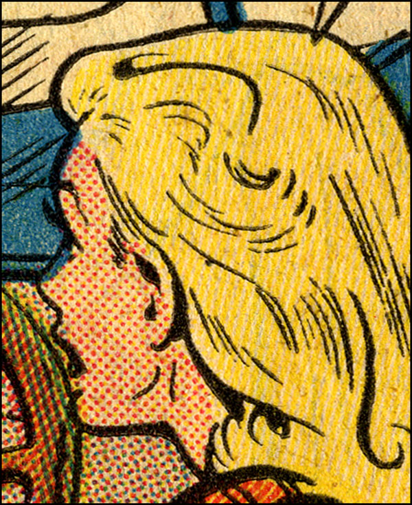
In Part 7, I will be looking at the reason why. Not quite the secret history of comic book printing, but pretty darn close.
Before that, Part 6.3 will look back at another (closely related) 19th century Ben Day predecessor.
Be seeing you.
legionofandy@btinternet.com
Text and original images copyright © The Legion of Andy 2016
The Platinum Age of Comics and the Dawn of the Golden Age — Ben Day was there.
All images should be clickable to enlarge. Use the back button on your browser to return here.

Contact: guy.lawley@btinternet.com
Original text copyright © 2016 Guy Lawley. If quoted, please give link and credit—thank you.
See also:
- Part 1—Roy Lichtenstein—the man who didn’t paint Ben Day dots
- Part 2—Halftone dots, Polke dots, more Roy
- Part 3—CMYK / Four-colour comic book dots vs. RGB dots on screens
- Part 4—Pre-history, origins—Ben Day in the 19th century
- Part 5—Ben Day in lithography
- Part 5.5—French comic strips of the 1880s. Coloured by relief aquatint.
- Part 5.75—A lithographic protocomic (?) from 1885
- Part 6—Ben Day meets the Sunday Comics in the 1890s
- Part 6.1—Tarzan and the Ben Day Dots—secrets of 1930s comic strip colour
- Part 6.2—Fun With (Mis-)Registration—when colour printing plates don’t line up
- Part 8 — 1930s to 1950s: The “Golden Age” of Comics — exit Ben Day, enter Craftint
- Part 9a — 1950 & 60s: The “Silver Age” of Comics, Part 1
- Part 9b — 1950 & 60s: The “Silver Age” of Comics, Part 2
~~~
- Introduction
- THE BIRTH OF THE COMIC BOOK
- COMIC BOOK PREHISTORY—The Platinum Age—1897-1937
- “COMIC BOOKS”—Books with comic strips in—Cupples & Leon etc.
- ORIGIN STORIES—New Forms Follow Old Functions
- 1. Early British Colour Comics—no Ben Day to be seen here
- 2. Early US Colour Comics—contains Ben Day
- COMIC BOOKS AS WE KNOW THEM
- 1. Promotional Giveaways—Funnies On Parade etc.
- 2. Comic Books Go On Sale—Famous Funnies, Series 1 & Famous Funnies no.1
- 3. Inside Famous Funnies—Pictures. We got ’em.
- COMIC BOOK SUCCESS, PART 1—The Distinguished Competition arrives
- BEN DAY IN THE EARLY COMICS
- Looking for Evidence (1)—reprints and modern editions
- Looking for Evidence (2)—back to the source
- EARLY COMICS—A CHILD FAN WRITES—the reminiscences of Jules Feiffer
- COMIC BOOK SUCCESS, PART 2—the Reign of the Supermen
- ONE LAST THING ABOUT JULES FEIFFER’S BOOK—two, actually
- NEXT ISSUE—To Be Continued…
I set out a while back to try and answer the question: when Pop artist Roy Lichtensteinpainted huge, transformed versions of comic book panels in the early 1960s, and said he was painting Ben Day dots… was he really?
This series has followed the Ben Day dot from its beginnings in lithographic printing (1879) through its comic strip ascendancy in letterpress (1890s) to the mature, complex Ben Day techniques used on the giant broadsheet US Sunday strips of the 1930s.
And it was in the 1930s that those same huge pages found themselves reprinted, but shrunk down into a new format—a mere quarter of the size they were made for. This was the birth of the comic book, and from humble beginnings it would go on to achieve great things.
In the beginning, the American comic book was full of Ben Day dots. But that wasn’t going to last. By the time Superman made his debut in 1938—bringing with him the Golden Age of comics—the new baby was finding its own new ways of doing things.

Colour separations needed to be faster (than a speeding bullet), simpler and cheaper. My next post will cover that ground.
This one is about the early years… the really early years…
^^Table of Contents
THE BIRTH OF THE COMIC BOOK
By the 1930s, most newspapers didn’t employ their own comic strip writers or artists. Instead they bought the rights to print Sunday and daily strips from a number of large-scale producers—like William Randolph Hearst’s King Features Syndicate (Blondie, Popeye) or the Chicago Tribune-New York News Syndicate (Little Orphan Annie, Dick Tracy).
During the 30s, entrepreneurs on the fringes of the newspaper printing business realised they could buy reprint rights to the Sunday strips fairly cheaply, and print them on reduced-size pages, using the same presses that made the Sunday sections—which stood idle for part of the week.
After a few false starts, this was how the Sunday comics section (a.k.a. “the Sunday Funnies”) spawned its stunted new offspring—the comic book.
COMIC BOOK PREHISTORY—THE “PLATINUM AGE”—1897-1937
“COMIC BOOKS”—AS IN, BOOKS WITH COMIC STRIPS IN
There had been colour reprints of newspaper strips before the 1930s, in book form—starting with a Yellow Kid compilation in 1897, followed by Foxy Grandpa (1900), then Happy Hooligan, The Katzenjammer Kids, and others from 1902.
Cupples & Leon started an enduring series of books in 1906 with Outcault’s Buster Brown, then Little Nemo in 1909. Once daily newspaper strips got under way in 1907, with Mutt & Jeff, Cupples & Leon moved on to black-&-white hardback books, about 10 inches (25 cm) square, reprinting dailies like Mutt & Jeff, Bringing Up Father and Little Orphan Annie.
(Keep on clicking to enlarge, won’t you? Back button should get you back here.)

Cupples & Leon, Gifford reports (The International Book of Comics, 1984), stopped publishing these books once the 10-cent comic book format took over—at a fraction of the price, and with many pages, if not all, in colour. 50-cent hardbacks in B&W, he says, apparently couldn’t compete.
In fact, Cupples & Leon’s standard format—52 pages—sold at 25 cents, and their larger 96-pagers at 60 cents. Also, it looks as if Cupples & Leon wound down their comic strip reprints during 1933 and published their last few in 1934.They might have been responding to other cheaper competition in book form—e.g. Whitman with their Big Little Books (from 1932)—rather than the new colour comic books, which, as we will see, were only just getting started in 1934.
Perhaps we shouldn’t blame the new “floppies” or pamphlet-style comic books for the demise of Cupples and Leon’s old hardback comic books. I’m grateful to comics historian Andy Bleck at konkykru.com for pointing out Gifford’s apparent error.
^^Table of Contents
ORIGIN STORIES—New Forms Follow Old Functions
Coloured—or part-coloured—weekly comics had been tried out in Britain on an occasional basis from 1896 (e.g. special issues of Comic Cuts) and regularly from 1898 (The Coloured Comic). (Pictures below scanned from photos in The International Book of Comics, by Denis Gifford, 1984.)

These pioneers met with little success, but Puck (1904)—no relation to the American humour magazine of the same name—was to last 36 years, and give rise to a host of imitators. (Puck 1’s cover from Comicvine.)

These British comics were larger in page size than later standard U.S. comics books, and unlike them, did not have covers printed on thicker glossy paper. (This newsprint-only format would last until the 1980s in the UK.)
From the examples I have seen in the British Library, these comics did not make their colour plates with Ben Day dots.
Like their predecessors, Le Petit Journal in Paris (1890) and The Million in London (1892), they used Transferred Tint Chromotypography. (See Part 6—also, more later.) They did so because this was the method which their letterpress printers, specifically the people doing the colour separations and making the colour plates, knew from before.
And the comics, to be economically viable, had to use the fast letterpress presses of the type developed in the early 1890s by Hippolyte Marinoni in Paris for his Petit Journalcolour supplement. The time had passed when a comic book-like format could be printed by lithography—using Ben Day dots—in 1885. (see Part 5-&-three-quarters.)
^^Table of Contents
In the U.S., by contrast, the earliest comic books did have colours printed using Ben Day—because they were printed on presses used for Sunday comics sections, again using printing plates produced in the same way as usual.
Modern architects had a catch-phrase, “form follows function”—the principle that a building’s look should reflect its purpose. For the new colour comics, in both Britain and America, it was a case of “new form follows old function”—and it was a matter of necessity, not artistic principle.
The new colour comics, tentative try-outs that they were, had to use the methods available close to hand.
In both Britain and the U.S., within a very few years, they would adapt to changing circumstances by adopting new methods—as we will shortly see.
The first experiment with newsprint-only, weekly “pamphlet” format in the U.S.—similar to the British model—was not a rousing success. The Funnies was launched in January 1929 by George T. Delacorte Jr‘s Dell Publishing Co..
Like many Sunday sections of the time, it was tabloid sized—twice as big as the later standard size for comic books. The early New York Sunday comics sections had been full-sized or “broadsheet” sized—twice as big as a tabloid—and set the majority trend for years to come. But the earliest Sunday newspaper colour section ever in the US had been tabloid sized, in the Chicago Inter Ocean (see Part 6). Other tabloid-sized Sunday sections had appeared throughout the decades—The Philadelphia North American was first to convert its broadsheet comics section to tabloid in 1913. They became more common in the 1930s. Allan Holtz at Stripper’s Guide, as so often, has the full information on this topic.
Cover of The Funnies No. One from John Adcock’s amazing blog, Yesterday’s Papers.

The strips in The Funnies were not reprints of Sunday or daily strips, but new material apparently previously intended for newspaper syndication. Like a tabloid Sunday section, its colour strips each ran for only one page each week. We might speculate that, like other strips in later comic books, these were try-outs which didn’t make the grade with the syndicates—Superman (1938) being the best-known, but not the only example.
Gifford (1984) reports that Gordon “Boody” Rogers, later of Sparky Watts fame, had a number of early strips in The Funnies.
Like its British forerunners, The Funnies mixed colour and B&W, comic strip and text pages. Gifford also tells us it had 4 colour pages upfront and four at the back, with 16 pages of B&W in the middle—mostly text stories and features with illustrations.
And, like the U.K. comics, it was sold to the public on newsstands or in stores. Gifford believes that children (or their parents) were not keen to spend 10 cents on a weaker version of something they got free with their newspaper every Sunday—so The Funniesstruggled. It became a monthly with no. 5, later reverting to weekly. Even a price cut to 5 cents couldn’t save the comic. It failed after 36 issues, in October 1930.
Delacorte very soon made his fortune from the humour magazine Ballyhoo (1931). He also returned to the comics, as we shall see below.
^^Table of Contents
COMIC BOOKS—As We Know Them
With an eye on the maxim that new form follows old function, consider this: The Funnieshad been printed by The Eastern Color Printing Company, of Waterbury Connecticut. Eastern printed both glossy covers for pulp magazines and Sunday sections for twenty or more north-eastern newspapers.
Later I will look for evidence that the first US comics used actual Ben Day dots. I haven’t yet laid eyes on original copies of these valuable items, or found pictures capable of proving this one way or the other.
The fact that Eastern Color’s main business was printing Sunday sections—which we know used the Ben Day method—is important indirect evidence in favour of Ben Day in the comic books. Eastern used the same presses to make The Funnies.
As we will see, they also went on to publish and/or print many other important comic books. It is hard to conceive of any colour-separating / platemaking method other than Ben Day being used on the first comic books. I will look at direct evidence from a 1937 comic below, and evidence from texts published in the 1940s and 1970s in Part 8.
In 1933, Eastern’s sales manager Harry Wildenberg produced a comic much like The Funnies for the Gulf chain of petrol (gasoline) stations—as a promotional giveaway. Gulf Comic Weekly changed its name to Gulf Funny Weekly with its fifth issue. (Details here.) At first it was just one single piece of broadsheet-sized newsprint paper (about 15 by 21 inches) folded in half, making a slim four-page tabloid-sized comic—each page about 10.5 x 15 inches.
Clearly this was not the first modern U.S. comic book in the format we know—with its 7.5 x 10.5 inch pages, and its glossy covers. However, Gulf Funny Weekly was hugely successful—claiming a circulation of 2,700,000 at its peak—presumably as kids up and down the land pestered their parents to get their petrol from a Gulf station. This paved the way for other promotional comics from the Eastern Color Printing Co.
And this was when the new half-tabloid-sized format was launched—very close to the modern comic book shape. Coulton Waugh‘s 1947 book The Comics says:
Eastern Color had printed some broadsides for the Philadelphia Ledger syndicate, which were reductions of the Ledger‘s Sunday comics. [Which included Hairbreadth Harry, Connieand Somebody’s Stenog.] These plates were seven by nine inches…
Ron Goulart, in Comic Book Culture: an Illustrated History, says that the reduced “broadside” pages were “made as a promotion” for the Ledger Syndicate.
I suspect “broadsides” could refer to landscape format comic sections, which looked like a comic book on its side—7.5 inches tall, 10.5 inches across, approx.. Some Sunday papers over the years have had two-part comic sections, often one broadsheet and one tabloid. A few of the smaller sections were in this small half-tabloid-size, sometimes aimed more explicitly at younger children—sometimes in the landscape format. Was this “broadside” an early example at the Ledger?
Below is a 1940 example—some years later of course, and its name showing that the term “comic book” was by 1940 well-established. This came printed on a large broadsheet-sized page, and had to be folded and cut to assemble it as a landscape comic book. (The kids had a new hobby as well as their own comic.)

Either way—Sunday section or promotional material—this picture at least serves to illustrate the likely format of the “broadside” Waugh refers to—a link in the chain that led to the comic book as we know it.
Someone at Eastern—maybe Wildenberg, maybe a colleague like Maxwell C. Gaines—thought of tweaking the smaller format in two ways. The landscape configuration became “portrait” and a glossy cover was added.
Eastern was clearly very well set up for this job, printing both newsprint Sunday comics and glossy covers for the pulps. New form followed two old functions.
The result was Funnies On Parade (1933) which closely resembles a modern comic book in format. Gifford says it had 32 pages, or 36 if the covers are included—just like a 1960s Marvel or DC comic book. It contained reprints of Mutt & Jeff, Joe Palooka, Hairbreadth Harry, Somebody’s Stenog, other Sunday strips, and eight pages of magic tricks.
Front cover from ComicConnect…

…and I made this view of the wraparound cover from two photos of a slabbed copy at icollector.com:

Funnies On Parade was given away as a promotional device or “premium” for Procter and Gamble, the famous soap manufacturer. (Their sponsorship of radio programs reportedly gave rise to the term “soap opera.”) Generally “premiums” were mailed out to anyone who sent in, for example, a number of packet tops from the company’s product.
Eastern Color’s second 32-page promotional comic of 1933, Famous Funnies: a Carnival of Comics, added Frank Godwin’s Connie and a few other strips into the mix. To get it, you had to mail in the top from a box of Wheatena, one of America’s original branded breakfast cereals.
Gifford (1984) reports an ad for Carnival of Comics in the Chicago Sunday Tribune‘s comics section, ending with the words: If you haven’t a Wheatena package in your home, ask your mother to get you one from her grocer the first thing tomorrow morning! A clear indication that the endeavour was mainly aimed at children, and an early example of pester power.

A third premium comic book was published by Eastern in the same format, but with 100 pages—hence the name, Century of Comics. Gifford reports it was used in promotions for Wheatena, Milk-O-Malt, Wanamaker’s toy stores and Kinney’s shoes.
Again, I’ve made this image of the wraparound cover from two photos, this time from liveauctioneers.com

Below is a very rare premium edition printed for Wanamaker’s, with a new Christmas cover (from GlobalGear1). As far as I can tell this is Century of Comics on the inside, though the cover uses artwork from Funnies On Parade.

^^Table of Contents
Famous Funnies has gone down in history as the first continuing American comic book in the modern format to be sold directly to the public. Famous Funnies no. 1 was published in July 1934—the first in a series that ran for 218 issues, lasting until 1955.
However it also had what today might be called an “issue zero” but is known as “Famous Funnies Series 1″—as its own cover states, and as it was listed by Gifford (1984, and American Comic Strip Collections, 1884-1939 (1990)).
This seems to have been a joint venture between Eastern Color and George Delacorte. Like the ongoing series which followed, the single published issue of Famous Funnies Series 1 was sold at 10 cents a copy—”one thin dime.”
It went on sale in February 1934, and was sold in chain stores rather on newsstands—because no newsstand distributor would take on this untried ne product. My image below comes from Jamie Coville’s TheComicBooks.com which has a lot of detail about this and all other early comics.

The new Famous Funnies had twice as many newsprint interior pages as its premium predecessors—64—plus 4 cover pages on glossy paper. Otherwise it was in the same format as the giveaways.
This established a standard size, and page count, for the original Golden Age comics. Paper shortages and economies meant 48-pagers (52 with covers) and even 32-pagers (36 with covers) were to come later. Multiples of 16 pages were dictated by the newspaper presses, set up to cut broadsheet-sized pages. One broadsheet, printed both sides and folded, made 4 full-sized newspaper pages, 8 tabloid pages, or 16 comic book pages.
The Series 1 comic did sell out its print run, and, as Jamie Coville reports:
The results were enough to convince publisher George Delacorte and printer Eastern Color Inc. to again attempt to bring a regular comic series to the newsstands. Again the newsstand distributors rejected the idea, remembering George’s first attempt in 1929 with The Funnies. Delacorte then sold his 50% of the partnership and the rights to the Famous Funnies name to Eastern Color. [My emphasis]
Clearly Famous Funnies might have gone no further… but if it hadn’t, the history of the comic book as we know it might have been very different—possibly even non-existent. But Eastern Color, it seems, was determined to keep trying with this new format.
To appreciate the difficulty Eastern had getting their new comic book onto the newsstands—of New York City and points beyond—it is necessary to think our way back in time to 1934. The newsstands of America were crowded with newspapers, the “glossy” higher tone magazines, and—at the bottom of the cultural pecking order—something like 150 different “pulps.” The pulps provided thrills, spills and derring-do in the fictional worlds of spicy detectives, alien planets, the exotic orient, romantic encounters and horrible evils. Most pulps were decidedly aimed at adult buyers—with plenty of appeal for the bolder teen, no doubt.
This photo below shows a Manhattan newsstand in 1935. Parenthetically, this shows some other things you could buy for a dime that year—or for half that much; 5 cents or “a nickel.”

The comic strips had their home in the Sunday papers, and bringing them onto the newsstands in an almost pocket-sized edition was an entirely untried proposition. A distribution company was needed to transport a product to thousands of points-of-sale, and collect money and unsold return copies.
Evidently, Eastern Color had tried and failed more than once to get a distributor to take on their comic, but they didn’t give up. Jamie Coville reports that Eastern eventually persuaded distribution company American News to take the comic for the newsstands, after the newspaper The New York Daily News reported how important its Comics Section was to its success.
John Adcock tells us that:
The 20th-century term ‘comic book’ originated… with Eastern Color which first described them in May 1934 in Patent Office records as “Comic Booklets Consisting of Comics, Comic Strips, Puzzles, Tricks of Magic, Etc., Published in a Series.” The first mention of ‘comic booklets’ by Eastern Color was on May 1, 1934, listed under Trademark Applicants.
Eastern Color must have thought the name “comic booklet” could catch on, but as with so many other things, the name with the fewest syllable won out pretty quickly.
I don’t know if Eastern’s trademark application was successful, but its timing clearly coincided with their ongoing plans to launch the first ever monthly series of American comic books/booklets in the modern format—Famous Funnies.
^^Table of Contents
The three pics of Famous Funnies no. 1 below—complete with water-damage and “show-through”—were scanned by movielover for Comic Book Plus. Here you can read this and many other out-of-copyright classics—free, or for a voluntary donation which helps support the site.
We must be grateful for the water-damage. It meant that movielover was prepared to scan the whole comic. If it had been pristine mint I doubt he/she would have done.
The scans don’t show the tints used to print the colours, but we can be fairly sure that Famous Funnies 1—covers and interior pages—would have used Ben Day dots.
Sol Harrison, DC Comic’s production chief, said in a 1975 interview that his first job was gamboging (masking) the plates for Ben Day tinting—at a company called Rex Engraving in New York. “The job was the first issue of Famous Funnies,” said Harrison. He didn’t say whether this was the newsstand No.1, rather than any of the giveaway Carnival of Comics or Series 1.
Anyone with high res scans or close-up photos, please do get in touch. I can be found at legionofandy@btinternet.com

Famous Funnies 1’s contents, as was the custom by now, were straight reprints from Sunday pages, including the one-tier “topper” strips which ran at the top or bottom of the page. Below is page 2, the inside front cover, printed on better, whiter paper than the interior pages. It also has the publishing details, confirming the July date and monthly publication schedule.

There were four pages of Toonerville Folks, and four of Connie, but scattered throughout the comic rather than in continuity. The same applies to the other features.

Even if you click to enlarge, you may find the lettering of Connie in particular—printed on newsprint, unlike the Toonerville page—a struggle to read. The strips were of course greatly reduced in size from their original broadsheet newspaper page size, word balloons and all. (A broadsheet page was twice as wide, twice as tall, and four times the area of a comic book page.)
It didn’t take long for Gaines and his colleagues to solve the legibility problem.
Gifford (1984) reports that from Famous Funnies no. 2 the balloons were re-lettered, but with unattractive results. Looking at Hairbreadth Harry below we might agree with him, though Dixie Dugan has emerged relatively unscathed. Perhaps only some strips were judged to need re-doing. Both toppers seem to have been left to their own devices!


Oh, and about that monthly schedule… Famous Funnies no. 2 was dated September 1934, two months after July’s no.1. Perhaps the need for new lettering held it up.
Eventually the practice of simply reprinting the strips as reduced copies was dropped, and they were repaginated—cut up into panels, pasted down with about six panels to a page. This way, each panel ended up a good bit larger—no re-lettering required.
^^Table of Contents
Famous Funnies struggled at first, and Eastern must have invested quite heavily in keeping it going. It only started to make money after its 7th issue.
Looking at the covers of no.6 and no.7 gives us a powerful clue as to why the seventh was the watershed issue:


You get the picture. Famous Funnies had started selling advertising. This was to be the secret of comic book profitability for a very long time to come.
Very specifically, Famous Funnies 7 was also the start of a long relationship between the comic books and Daisy air rifles. Guns for kids—got to love that.
George Delacorte had been unwilling to go on investing in comic books that could not be sold on the newsstands. Ian Gordon, in Comic Strips and Consumer Culture 1890-1945 (1998) also reports that Delacorte was not interested unless they could sell advertising in their pages. He was an experienced publisher of pulps and humour magazines, and knew the importance of the advertising dollar.
Dealcorte must have been sniffing around again by now, scenting profit in this new format at last. But Delacorte’s Dell company did not publish the first new comic to start up in the wake of Famous Funnies.
The first issue of New Fun was cover-dated Feb 1935, so it would probably have gone on sale in the December of 1934. New Fun didn’t directly imitate Famous Funnies‘ comic book format or its Sunday strip content. Pulp writer and entrepreneur Malcolm Wheeler-Nicholson tried out a tabloid with new strips, like Delacorte’s original The Funnies of 1929-30. It advertised itself as All New! All Original!… and Easy to Read!—an obvious dig at the shrunken artwork of Famous Funnies.
New Fun 1 was reportedly all black & white apart from its covers. No.2 certainly was, as seen here. Both contained advertising pages. Colour pages were introduced from no.3.

From its 7th issue New Fun became More Fun, and it shrank down to comic book size from no.9. It also picked up a companion title, New Comics, which was comic book sized from the beginning (December 1935).
More Fun and New Comics may not have sold very well on those crowded newsstands at first, but they hold two major distinctions in comics history. Firstly, they were the foundation of what was to become that huge, enduring edifice, DC Comics. By that time the comics were owned by Harry Donenfeld, printer and magazine distributor—whom the struggling Wheeler-Nicholson had taken into partnership because he owed him money—and Donenfeld’s accountant, Jack Liebowitz. This dynamic duo did very well out of DC in the long run.
Secondly, from New Fun no. 6 onwards, New Fun / More Fun started to publish the work of Jerry Siegel and Joe Shuster. This rather splendid page by the pseudonymous “Leger & Reuths” is from More Fun 13, and I found it here:

Once word got round that the comic book business was becoming lucrative, direct imitators sprang up fast during 1936:
- George Delacorte’s Dell, unsurprisingly, with Popular Comics and a new comic book version of The Funnies, this time actually reprinting Sunday “funnies”
- King Comics, with King Features Syndicate strips like Flash Gordon and Mandrake The Magician
- Tip Top Comics, with rival United Features characters like Tarzan and Li’l Abner.
From 1937, with success breeding even more comic books, some of these—like new Dell title The Comics—were mixing new material with the newspaper strip reprints. The syndicates were reportedly charging $10 a page for the reprints of established strips, so the comics looked for artists and writers who could produce pages more cheaply. “Shops”—groups of creators, often still in their teens, run by employers following a garment sweatshop model—sprang up to supply the new demand.
The new material was often a good deal more crude than the Sunday strips, but the kids still seemed to be lapping up the early comic books by the hundreds of thousands.
Were they getting plenty of Ben Day for their dime?
^^Table of Contents
BEN DAY IN THE EARLY COMIC BOOKS
Looking for Evidence (1):
There’s more to life than books, you know. But not much more.
For the Ben Day detective, until recently, there was no substitute for looking at the original pages of an old comic in its actual printed edition. But these are very valuable old comics, some fetching prices in the millions of dollars, so how often are we going to see them scanned at high enough resolution to analyse their colours?
Scans like the ones above are invaluable for understating the contents of the comics, tracing the work of individual creators etc.. This is of historical importance, and of no little aesthetic value. Web sites making such pages available are to be applauded and supported, in my view.
But I would argue that the material practices of colour separation and plate-making are also important aspects of comic book history. And indeed that “Ben Day dots”—whether real or misidentified—are themselves an intrinsic part of the comic book aesthetic. Only under a real or notional magnifying lens can this part of the comics story be followed through the timeline.
Some of the scans of Golden Age comics at Comic Book Plus are almost good enough to see the types of tint that the plate makers used.
Most of Famous Funnies no.1, as seen at Comic Book Plus, seems to be coloured with solid colours and pale simple dot tints. Very occasionally, as in the panel from Nipper, below, a darker tint made up of lines can be seen—is this a multiple application of Ben Day dots? Or something else—an actual line tint? Here it is the darker green (blue lines on solid yellow) seen amidst paler green (dot tint on solid yellow). With these scans it is hard to be sure—especially as, about this time, a different type of line tint was launching on the US market… which will be the subject of Part 8.
(Click to enlarge, back button etc.)

Thankfully, in recent years, several books have followed the example of Chip Kidd and Craig Yoe—pioneers of appreciating the comic book aesthetic, who showed very close-up views of comic book panels, and details of panels, in their books. Some of these illustrations, and whole strips or issues scanned straight from Golden Age comics, do allow Ben Day detectives to spot the Dot—or not. (“Not”, that is, after the phase-out.)
Titan’s series of Simon & Kirby books, are other key examples. Fantagraphics and PS Publishing have also produced numerous titles with similarly helpful close-up views.
Even here, though, the actual printed images use their own tiny CMYK dots to recreate the dots on the old comic pages. The 1.3 cm squares below are scanned from a Titan Simon & Kirby volume. You can see the dot tints, which is very helpful for historical investigations, but they are themselves dotted and somewhat fuzzy. (Click to enlarge; they won’t look any clearer.)

Places where you should not look to find authentic colour reproductions include:
- Reprints in comics from the 60s and 70s, e.g. Marvel’s Fantasy Masterpieces and DC’s dollar comics. These re-make the old strips using a different colour separation/platemaking method (see below).
- Marvel and DC’s hardback reprint books, like Marvel Masterworks and DC Archives, or their paperback equivalents. These have digitally-coloured versions often bearing little or no relation to the original pages.
- Any pages online which have been scanned from these comic or book reprints. Most of the time you won’t be told where the scans are from, or that the colours are not authentic.
- The new digital downloads which can be had, often at very reasonable prices, from the big companies. They too are recoloured, and they too will not inform you of the fact. To them it is irrelevant.
Also, while there are plenty of scans and photos online of the covers of Golden Age comic books, it is worth bearing in mind that the covers used very different printing methods from the interior pages. Indeed they were even printed on different presses. Glossy whiter paper allowed for more expensive printing techniques. Cover images are not representative of the inside pages.
There really is no substitute for the real thing. Thanks to the generosity of my friend Steven Fry—not the polymath television personality, but the Golden Age comic collector—I have been able to scan some fairly early comic books, and can report on my findings.
^^Table of Contents
Looking for Evidence (2):
The mother lode, the source, the real deal.
The comics themselves are really the only place to look, if you want the whole big picture.
When reprinting Sunday strips, the publishers had only black & white art to work from. B&W line art was kept by the syndicates as printed proofs and for re-use. It could be re-photographed, at reduced size if need be.
In the main, the separate colour tints for the Sunday strips only ever existed as inky Ben Day dots on metal plates, before etching—and after etching, as relief dots on the printing plates. After use, the printing plates were melted down, and the metal re-used. There were no printed proof copies of the colour separations which the comic book printers could make use of.
Even if there were, they would have had to reduce them in size, as they did the B&W line art, and etch new plates from them. The reduced dot size on the plates would have been even more of a problem than the barely-legible word balloons. Newsprint needed chunky 55 or 60 lines-per-inch dot screens. Halving the height of image would have doubled the dot frequency to 110 or 120—impossible to print in the comics.
No, the comic book publishers had to get their own Ben Dayed colour plates made—as simply, quickly and cheaply as possible. I will look into this a bit more in Part 8.
Consequently, the comic books used fewer of the “Ben Day special effects” which the Sunday strips had in their original incarnations. (See Part 6.1)
But it is the presence of some of these special effects which allow us to conclude, beyond any doubt, that a comic like Dell’s The Comics no.3, cover-dated May 1937, used Ben Day dots. The cover, a fairly atrocious Roy Crane rip-off, is shown for interest only. (It is Ben Dayed but with much finer dots than the inside pages, befitting its higher quality, whiter paper.)

The examples below are scanned from a reprinted Alley Oop newspaper strip by V.T. Hamlin, inside The Comics no. 3.

The skin tone is made of a simple red (magenta) dot screen, applied just once. The orange cave wall shows doubling up of red dots. The sky uses blue dots applied several times, merged into wobbly lines. The darker orange rocks have zig-zag red lines, similarly made up from several applications of the dot screen.

Like the newspaper strip reprints, the new material in early comic books was prepared as B&W line art, then colour-separated by the Ben Day method. Again, this followed the production methods of the Sunday strips closely, if generally keeping things fairly simple.
This is a panel from one of the western strips in The Comics no. 3. Artist unknown, but Denis Gifford (1984) reports that these newly-originated strips were packaged for Dell by Stephen Slesinger, who later developed the newspaper strips Red Ryder and King of the Royal Mounted.

1.3 cm square details again definitely show Ben Day dots in use. (Click to enlarge.) The fuzzy green areas are where “solid” blue is printed over “solid” yellow. Neither colour ends up truly solid or flat. This is another defining characteristic of the actual printed comic book aesthetic, and something lost in higher-quality reprints—of which, more later.

In terms of trying to imagine oneself back in the 1930s, and experiencing these strange new forms at first hand, I recommend a book called The Great Comic Book Heroes(1965) which I am about to quote at length…
^^Table of Contents
EARLY COMIC BOOKS—A CHILD FAN WRITES
Jules Feiffer, born in 1929—later assistant to Will Eisner on The Spirit, internationally acclaimed cartoonist, playwright, novelist and film writer—was one of millions of American kids whose dimes made the new comic books of the late 1930s a rip-roaring success.
Before the comic books arrived, he had both devoured and studied the newspaper strips. Early favourites were Roy Crane’s Wash Tubbs, featuring two-fisted adventurer Captain Easy—a major influence on Superman‘s Joe Shuster—Capp & Van Buren’s Abbie an’ Slats, and the huge broadsheet marvels that were Raymond’s Flash Gordon and Foster’s Prince Valiant.
In his seminal 1965 book, The Great Comic Book Heroes, Feiffer tells how he couldn’t often see Hearst papers because his father wouldn’t have them in the house, and continues:
It should have been a relief, then, when the first regularly scheduled comic book came out… Famous Funnies… in sixty-four pages of color, minutely reprinted many of my favourites from the enemy camp...
All elisions… [and interjections]… are not Feiffer’s, but mine. He goes on:
Instead my reaction was one of a [silent] movie purist when first confronted with sound: this was not the way it was done. This new form, so jumbled together, so erratically edited and badly colored, was demeaning… I read them, yes… Famous Funnies first, then Popular Comics, then King—but with always a sense of being cheated. I was not getting top performance for my dime.

Feiffer, like Gifford, notes how carelessly these anthology comics were thrown together—a problem dating back to the first comic strip reprints in hardback, which famously printed strips out of chronological order. The young Jules was also annoyed by the tiny size of the comic book reprints, and their bad colouring.
But changes were coming. Here’s Feiffer again:
I was not getting top performance for my dime. Not until March 1937, when the first issue of Detective Comics came out. Original material had previously been used in comic books, but almost all of it was in the shape and style of then existing newspaper strips.
Detective Comics was the first of the originals to be devoted to a single theme—crime fighting. And it looked different. Crime was fought in larger panels, fewer to a page. Most stories were complete in that issue (no more of the accursed “to be continued…”). A strange new world…
And it was soon to become stranger yet, when two new factors entered the comic book universe.
One was a new kind of colouring, which the comics would make their own.
The other was a refugee from a doomed and distant planet—an alien strong enough to kick what would later be called Golden Age of Comics into top gear.
^^Table of Contents
COMIC BOOK SUCCESS, PART 2—THE REIGN OF THE SUPERMEN
The problem in pre-super days, wrote Feiffer, was that, with few exceptions, heroes were not very interesting.
Most heroes, whatever magazine they came from, looked like members of one or two families: Pat [Terry and the Pirates] Ryan’s or Flash Gordon’s. Except for the magicians, all of whom looked like Mandrake. The three mythic archetypes.
Villains… were infinitely better equipped than those silly, hapless heroes. Not only comics, but life taught us that. Those of us raised in ghetto neighbourhoods were being asked to believe that crime didn’t pay? Tell that to the butcher! Nice guys finished last; landlords, first. Villains… were miles ahead.
It was not to be believed that any ordinary human could combat them. More was required… When Superman at last appeared he brought with him the deep satisfaction of all underground truths: our reaction was less “How original!” than “But, of course!”
This page of Superman no.3, by Jerry Siegel and Joe Shuster is taken from Feiffer’s book.

The superhero boom, with a little help from World War Two, was on a scale which put previous comic book successes in the shade.
At DC comics, Superman famously arrived in Action Comics no. 1, cover-dated June 1938—it would have gone on sale about two months earlier.
Precisely when The Golden Age of Comics ended is open to debate, but most comic collectors and historians agree that Action Comics 1 defines its beginning. Everything from 1897 to then, some would suggest, was The Platinum Age. (Cynics might suggest that “The Platinum Age” is more of a marketing concept—a way to shift antique books from dealers’ stockpiles—than a serious comics-historical notion. I couldn’t possibly comment.)
Superman had his own comic by Summer of 1939. Batman was first seen in Detective Comics no. 27 (May 1939), and got his own no.1 in Spring 1940. The Marvel heroes launched with Marvel Comics no.1 in October/November 1939, featuring the Sub-Marinerand the Human Torch. Captain America Comics no. 1 didn’t arrive until early 1941, cover-dated March (image below again from Feiffer, 1965).

Feiffer has a lot more to say about Superman, and the host of superheroes who came in his hugely profitable wake—Batman, Captain America, Captain Marvel, the Spirit—especially, the Spirit—and others. One half of The Great Comic Book Heroes is intelligent, witty, irreverent, highly personal commentary—read his remarks about Robin and Wonder Woman, for example!—the other half, a treasure trove of Golden Age superhero comic strips in (overly) bright colour. (Warning: the 2003 reprint from Fantagraphics is readily available, but contains only Feiffer’s text and a some B&W illos.)
And about those newsstands… by 1947, the superhero boom was in decline, and publishers were struggling to find other genres that would keep their sales figures up. But the comic books were a permanent and major feature of newsstand displays. Check out this girl—pulps to the left of her, pulps to the right, but she’s sat in the middle in a treasure cave of comic book ecstasy.

William Wordsworth understood. As he put it:
Bliss was it in that dawn to be alive,
But to be young was very heaven!
^^Table of Contents
Coda: A Couple of Last Things About Feiffer
Back to that Feiffer quote about “badly colored” comics, and one major problem with his book, which generally I would highly recommend for your shelf…
The Great Comic Book Heroes gives its pages of Golden Age artwork an overly brash look—a common problem with many “high quality” reprints. Unlike some reprints, the book deserves credit for recreating the CMYK colours very nearly as they originally appeared in the comics.
But those original colours were shoddily applied to pulpy, creamy-yellow, absorbent comic book newsprint. In Feiffer’s book, the C, the M the Y and the K are (nearly) all in the right percentage tints in the right places. But they are much too well-printed to be authentic, too uniformly flat and bright. The paper they are printed on is similarly overly white and overly bright.
But there is another very specific issue with the colouring. The Great Comic Book Heroes presents its Golden Age reprints with their colours remade and remodelled using the same methods as 1965 comic books—completely different from Golden Age colour separations, as we will see in a later post.
These details from Feiffer’s pages below simply do not have the kind of tints you would see in most Golden Age superhero comics. In particular, the darker blue and magenta tints—the backgrounds of the first three squares, the orange chimneys, the lower part of the wave in the fourth—would have been made up of lines. The Nancy panel at the bottom of my post shows this in close-up. And you will see a lot more in Part 8. And you can click to enlarge, of course.

Feiffer’s publisher, Dial Press, really had no choice. To photograph comic book pages, to show them as they were actually published in the 30s and 40s, would have been prohibitively expensive at the time.
(A Smithsonian Book of Comic-Book Comics, 1981, did photograph Golden Age comic books and printed the photos (as Feiffer’s book did) close to their original size. In most cases, the dots and lines merged into flat colour, so cannot be usefully studied—more in a later post. Direct reprints—scanned, rather than photographed—are now much more affordable for publishers, and hence more common.)
In my view the text of The Great Comic Book Heroes really should have mentioned this issue. Dial Press presumably thought it simply didn’t matter.
The Great Comic Book Heroes, then, must join the list of sources which can potentially mislead the Ben Day detective—as mentioned above—60s and 70s comic book reprints of Golden Age stories, recoloured hardback Marvel Masterworks & DC Archives, and digital downloads of old comics.
In fact, I believe Feiffer’s, splendid though it is, may have done a kind of harm by suggesting that Golden Age books used the same dots as 1960s comics. I will discuss this more fully in another post.
And then, almost as serious… the issue of Bucky’s green right boot on the Captain America page above. I’m sure you spotted that unforgivable error. How can one trust a book that does something like that?
:O)
^^Table of Contents

Next time, in Part 8:
- More about the Ben Day dots in early US comic books
- The faster, cheaper method which replaced Ben Day—Craftint Multicolor—the most important comics colouring method you’ve never heard of. Probably.
- Best-kept secrets of the Golden Age of Comics revealed for the first time.
Click Nancy—from Tip Top no. 107, 1945—to enlarge, and… be seeing you.

Superman copyright © DC Comics. Captain America © Marvel Characters Inc. Nancy © United Features Syndicate. Used for educational purposes and under fair use.
Falam os itens 8, 9a, 9b
