INÍCIO

10 julho 2020

POEMAS DE ALTINO CAIXETA


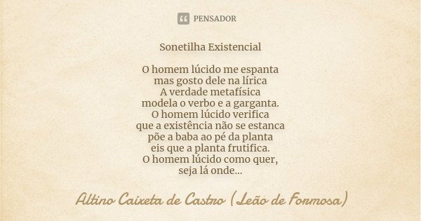
Sonetilha Existencial O homem lúcido me espanta mas gosto dele na lírica A verdade metafísica modela o verbo e a garganta. O homem lúcido verifica que a existên... Frase de Altino Caixeta de Castro (Leão de Formosa).


Anti-Soneto da Não-Materia

Na não-matéria agora estou, e existo
O pensamento pensa o pensamento
A ostra pensa a pérola por dentro
Sou meu reverso espelho e me contristo.
Na não-matéria, muitas vezes, tento
Em ser matéria pura, ou ser um misto
Na não-matéria não consigo isto,
e já que não consigo, falo, invento.
E finjo ser figura e sombra e luz
E finjo pro meu povo que sou pus,
que sou um resto puro de alvorada.
Na não-matéria não se loga, é triste!
E a gente fica sendo, porque existe,
Vaga ilusão de ser, não sendo nada.


Bilbiografia 

OS DEMÔNIOS ESTÃO A SOLTA NO BRASIL


O INFERNO EXISTE E ESTÁ VAZIO. 

OS DEMÔNIOS VIERAM TODOS PARA O BRASIL 


Os demônios listados a seguir, deixaram seu assento nos infernos e vieram todos para o Brasil. Eles almejam destruir tudo de bom que o progressismo construiu. Almejam tornar esse lugar onde moramos num covil, numa fossa onde seus senhores e amos moram. 
O demônio
do preconceito 
do totalitarismo
da ignorância 
da preguiça 
da exclusão 
do fascismo 
da intolerância
do capitalismo 
do neoliberalismo 
do machismo 
da homofobia 
da misoginia 
da xenofobia 
da aporofobia
do conservadorismo 
do escravidão
da arrogância
do patrimonialismo 
do servilismo

estão todos soltos no Brasil, e o que é pior se intitulam "cidadãos de bem".
Eles não tem ideia que são uns pobres coitados, iludidos pela lábia vil e venenosa de falsos "profetas", que na realidades são pobres diabos do fim do mundo, do fim do amor, do fim do perdão, do fim da paz.
Seus corpos são vasos cheios de iniquidade e ódio, transbordam do que estão repletos. Seu conteúdo venenoso é como um sepulcro caiado, por fora são reconhecíveis, mas por dentro são bestas pestilentas e pútridas. 
Esses "cidadãos de bem", discriminam seus semelhantes, pessoas que na ótica distorcida deles, são inferiores. Mal sabem eles que eles próprios são vermes desprezíveis e amaldiçoados. 
Seu mal é momentâneo, mas estão aí para se encontrarem com os outros que saíram de fendas e esgotos, de fossas infernais, mas que julgam serem mansões devido suas posses. 
Há muito eles deixaram de ser humanos, só restou sua carcaça que destila ódio e impropérios quando vem alguém a quem discriminam e que acham que não deveria existir. Eles que não fazem falta no mundo. Tentando se passar pela elite de Mammon, são apenas uns pobre diabos sem nenhuma consciência de classe ou ou sem razão, pois a perderam ao deixar os diabos ocupar seus corpos. 
Eles servem aos príncipes dos infernos, os quais já possui sua alma, destruída e pestilenta. 
Eles servem aos sete príncipes do Inferno, os quais não param de sussurrar em suas mentes que eles são os melhores, eles tem título de engenharia, são graduados nisto ou naquilo, que "eles não são qualquer um"...
Suas ações são desprezíveis, seu hálito é podre, pestilencial. 
Seus desejos são vícios 
Seu olhar diabólico e vazio de vida
Eles se tornaram sementes da morte e a levam a todo lugar que pisam com seus pés degenerados. 

Eis os príncipes aos quais servem  Asmodeus  demônio da luxúria, Azazel, o impulsionador da ira, Belphegor, o diabo da preguiça, Belzebub, associado à gula, Leviathã, o asqueroso diabo da inveja, Lúcifer, associado à soberba e Mammon ligado à ganância.

Assim, deixo aqui a sistemática e a taxonomia dos demônios para que, você, leitor atento, encontre outros e os associe a estes cidadão de bem que hoje anda orgulhoso pelas ruas com seu dentes cheios de ira e veneno. Destilando intriga e dissabores, tentando até jogar nossa constituição no lixo. Eles sim que serão jogados no lixo da história, ninguém os lembrará, seu túmulo será uma cloaca e ninguém mais pronunciará seu deméritos pois um dia chegará, que todos se encontrarão na inclusão, na sabedoria, na não discriminação, na tolerância, na paz e empatia. E nesse mundo não há lugar para esses demônios fascistas sem valor. (10/VII/2020)


CLASSIFICAÇÃO DOS DEMÔNIOS


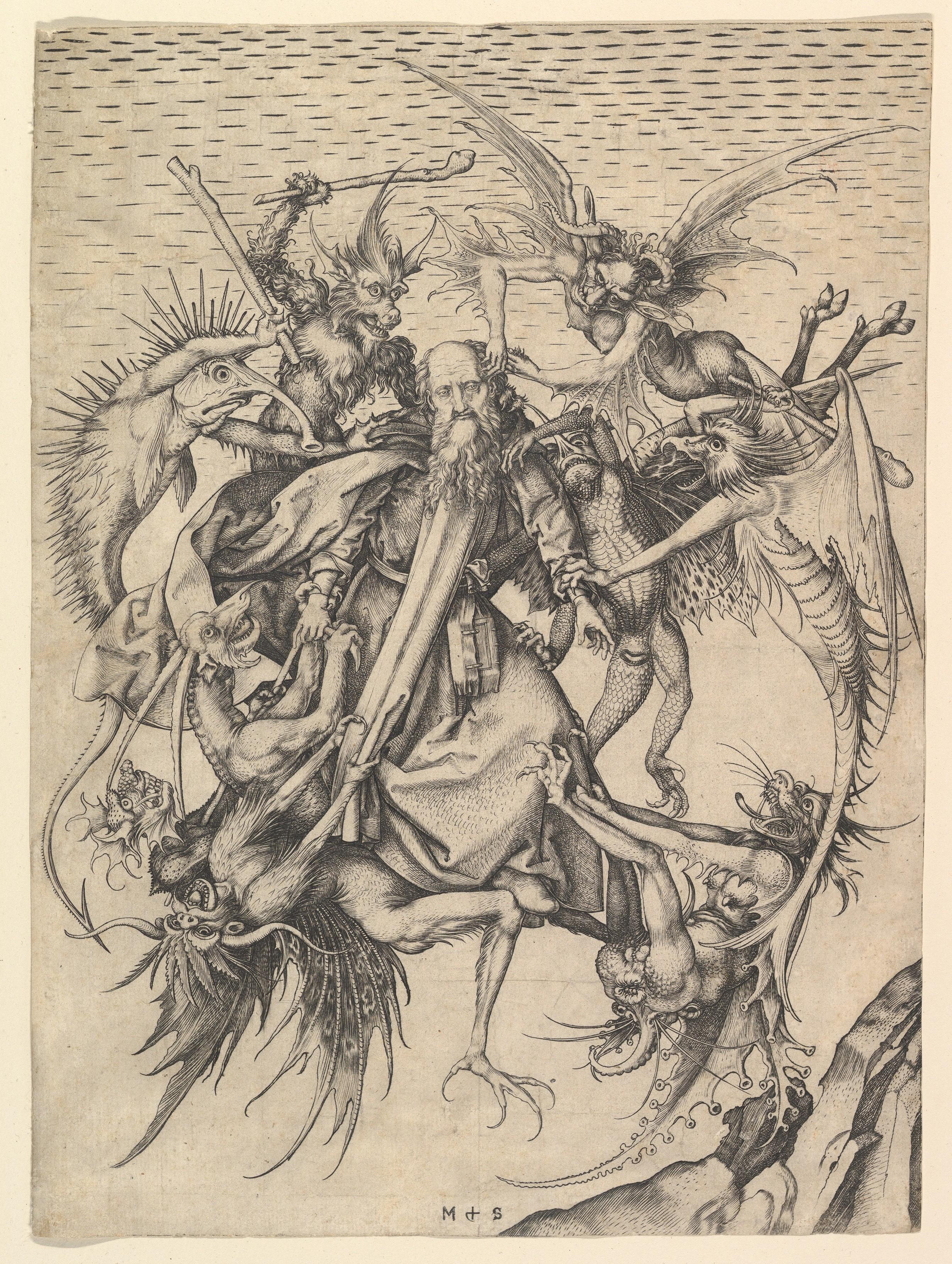
The Torment of Saint Anthony 
(or The Temptation of Saint Anthony, c. 1487–88) 
Atribuído a Michelangelo Buonarroti


O Tormento de Santo Antônio (ou A Tentação de Santo Antônio, c. 1487-1488) é a mais antiga pintura conhecida de Michelangelo, pintada como uma cópia aproximada da famosa gravura de Martin Schongauer (de cerca de 1470–1475) quando ele tinha apenas 12 ou 13 anos de idade. Está agora no Kimbell Art Museum em Fort Worth, Texas. Mostra um assunto medieval comum, incluído na Golden legend = Legenda aurea ou Legenda sanctorum (Lenda Dourada ou Lenda dos Santos, que é uma coleção de hagiografias de Jacobus de Varagine que era amplamente lida na Europa no final da idade média. Mais de mil manuscritos do texto sobreviveram. Provavelmente foi compilado por volta dos anos de 1259 a 1266, embora o texto tenha sido adicionado ao longo dos séculos.) e outras fontes, de Santo Antônio (251 - 356 d.C.) sendo atacado no deserto por demônios, cujas tentações ele resistiu. 
A Tentação de Santo Antônio (ou "Julgamento") é o nome mais comum desse assunto. Mas essa composição aparentemente mostra um episódio posterior, onde Santo Antônio, normalmente voando sobre o deserto apoiado por anjos, foi emboscado no ar por demônios. 


Inicialmente intitulado Legenda sanctorum (Leituras dos Santos), ganhou popularidade sob o título pelo qual é mais conhecido. Ultrapassou e eclipsou compilações anteriores de legendaria abreviada, a Abbreviatio in gestis et miraculis sanctorum atribuída ao cronista dominicano Jean de Mailly e o Epilogus in gestis sanctorum do pregador dominicano Bartolomeu de Trento. 
Quando a impressão foi inventada na década de 1450, as edições apareceram rapidamente, não apenas em latim, mas também em quase todos os principais idiomas europeus. Entre os incunábulos, impressos antes de 1501, a Legenda aurea foi impressa em mais edições que a Bíblia e foi um dos livros mais amplamente publicados da Idade Média. 
Durante o auge de sua popularidade, o livro era tão conhecido que o termo "Lenda Dourada" às vezes era geralmente usado para se referir a qualquer coleção de histórias sobre os santos. 
Foi um dos primeiros livros que William Caxton imprimiu no idioma inglês. 
A versão de Caxton apareceu em 1483 e sua tradução foi reimpressa, chegando à nona edição em 1527. Escrito em latim simples e legível, o livro foi lido em seus dias por suas histórias. Cada capítulo é sobre um santo ou Festa cristã (celebração do santo do dia) diferente. O livro é considerado a coisa mais próxima de uma enciclopédia da tradição medieval que sobrevive hoje; como tal, é inestimável para historiadores da arte e medievalistas que procuram identificar os santos retratados na arte por seus atos e atributos. Sua natureza repetitiva é explicada se Jacobus da Varagine pretendia escrever um compêndio de histórias sagradas para sermões e pregações, não uma obra de entretenimento popular.


ALGUMAS CLASSIFICAÇÕES 

Os Sete Príncipes do Inferno é uma expressão popularizada que indica o 

resumo feito pelo teólogo e bispo alemão Peter Binsfeld, no século XVI, no qual ele associou um demônio específico à cada um dos sete pecados capitais. 


Os sete príncipes do inferno então seriam, segundo Binsfeld

Asmodeus  associado a luxúria
Azazel, associado a ira
Belphegor, associado a preguiça
Belzebub, associado à gula
Leviathã, associado à inveja 
Lúcifer, associado à soberba 
Mammon associado à ganância


Classificação dos demônios por Psellus 

Michael Psellus preparou uma classificação de demônios no século 11, o que foi uma inspiração para a classificação que Francesco Maria Guazzo preparou mais tarde. 
Psellus dividiu os demônios em Empírio (Ardente), Aéreo, Subterrâneo, Lucifugoso (Heliofóbico), Aquoso e Terreno (Terrestre).


Michael Psellus prepared a classification of demons in the 11th century, which was an inspiration for the classification Francesco Maria Guazzo prepared later. Psellus divided demons into Empyreal (Fiery), Aerial, Subterranean, Lucifugous (Heliophobic), Aqueous, and Terrene (Terrestrial)


In De occulta philosophia (1509-1510), Cornelius Agrippa proposed several classifications for demons. One is based in the number four and the cardinal points, with the ruling demons being Oriens (East), Paymon (west), Egyn (North) and Amaymon (South). 

The same four demons appear in the Semiphoras and Schemhamforas. Another classification, based in the number nine, has the following orders of demons: 

False spirits, Spirits of lying, Vessels of iniquity, Avengers of wickedness, Jugglers, Airy powers, Furies sowing mischief, Sifters or triers, Tempters or ensnarers. 
(See Barrett's classification below).


Classificação de demônios por Agripa 

Em De occulta philosophia (1509-1510), Cornelius Agrippa propôs várias classificações para demônios. Um é baseado no número quatro e nos pontos cardeais, com os demônios dominantes sendo Oriens (leste), Paymon (oeste), Egyn (norte) e Amaymon (sul). 

Os mesmos quatro demônios aparecem nas Semiphoras e Schemhamforas.  Outra classificação, baseada no número nove, tem as seguintes ordens de demônios: 

Espíritos falsos, 
Espíritos da mentira, 
Vasos de iniqüidade, 
Vingadores da iniqüidade (maldade), 
Malabaristas, 
Poderes aéreos, 
Fúrias semeando travessuras, 
Peneiras ou triers, 
Tentadores ou escravos 


A classificação dos demônios por Michaelis.

 Em 1613, Sebastien Michaelis escreveu um livro, História Admirável, que incluía uma classificação de demônios, conforme lhe foi dito pelo demônio Berith quando ele exorcizava uma freira, segundo o autor. 

Essa classificação é baseada nas hierarquias pseudo-dionisíacas, de acordo com os pecados que o diabo tenta cometer e inclui os adversários dos demônios (que sofreram essa tentação sem cair). 
Observe que os nomes de muitos demônios são exclusivamente franceses ou desconhecidos em outros catálogos. 
São João Batista e São João Evangelista são os dois São João a quem Michaelis se refere. Os outros santos são citados apenas pelo nome, sem deixar claro, isto é, que Francisco é mencionado (de Assis?). 

Primeira hierarquia 
A primeira hierarquia inclui anjos que eram serafins, querubins e tronos. 

Belzebub era um príncipe dos serafins, logo abaixo de Lúcifer. Belzebu, juntamente com Lúcifer e Leviatã, foram os três primeiros anjos a cair.
Ele tenta os homens com orgulho e é contra São Francisco de Assis. 
Leviathan também era um príncipe dos serafins, que tenta as pessoas a ceder à heresia, e é contra São Pedro. 
Asmodeus também era um príncipe dos serafins, ardendo com o desejo de tentar os homens em devassidão. Ele é contestado por São João Batista. 
Berith era um príncipe dos querubins. Ele tenta os homens a cometerem homicídios e a serem briguentos, contenciosos e blasfemos. Ele é contestado por São Barnabé. 
Astaroth era um príncipe de Tronos, que tenta os homens serem preguiçosos e é contra São Bartolomeu. 
Verrine também era um príncipe dos tronos, logo abaixo de Astaroth. Ele tenta os homens com impaciência e é contra São Domingos. 
Gressil foi o terceiro príncipe de Tronos, que tenta os homens com impureza e é contestado por São Bernardo. 
Soneillon foi o quarto príncipe de Tronos, que tenta os homens a odiar e se opõe a Santo Estêvão.


A segunda hierarquia
Inclui poderes, domínios e virtudes. 

Carreau: era um príncipe dos poderes. Ele tenta os homens com dureza de coração e é contra São Vicente e Vincent Ferrer. 
Carnivale: também era um príncipe dos poderes. Ele tenta os homens à obscenidade e vergonha, e é contestado por João Evangelista. 
Oeillet: era um príncipe de Domínios. Ele tenta os homens a quebrar o voto de pobreza e é contra St. Martin. 
Rosier: foi o segundo na ordem de Domínios. Ele tenta os homens contra a pureza sexual e é contra São Basílio. 
Belias: era o príncipe das virtudes. Ele tenta homens com arrogância e mulheres a serem vaidosas, criar filhos devassos e fofocar durante a missa. Ele é contestado por São Francisco de Paulo.


Terceira hierarquia
A terceira hierarquia inclui Principados, Arcanjos e Anjos. 

Verrier: era o príncipe dos Principados. Ele tenta os homens contra o voto de obediência e é contestado por São Bernardo. 
Olivier: era o príncipe dos arcanjos. Ele tenta os homens com crueldade e impiedade com os pobres e é contra São Lourenço. 
Luvart: era príncipe dos anjos. Na época em que Michaelis escrevia, acreditava-se que Luvart estava no corpo de uma irmã Madeleine. Muitos dos nomes e fileiras desses demônios aparecem nas litanias do sábado das bruxas, de acordo com o Histoire de la magie de Jules Garinet na França e o Dictionnaire Infernal de Collin De Plancy.


Francis Barrett, em seu livro The magus (1801), ofereceu essa classificação de demônios, tornando-os príncipes de alguma atitude, pessoa ou coisa má.

Belzebub: deuses falsos - idólatras 
Pytho: espíritos da mentira - mentirosos 
Belial: Vessels of Iniquity - inventores de coisas más 
Asmodeus: Os Vingadores da Iniquidade 
Satanás: imitadores de milagres - bruxas más e feiticeiros 
Merihem: Poderes aéreos - fornecedores de pestilência 
Abaddon: Furies - semeadores da discórdia 
Astaroth: Caluniadores - inquisidores e acusadores fraudulentos 
Mammon: Maligenii - tentadores e bajuladores

Em 1409-1410, The Lanterne of Light (um trecho inglês anônimo de Lollard frequentemente atribuído a John Wycliffe) forneceu um sistema de classificação baseado nos Sete Pecados Capitais, estabelecendo que cada um dos demônios mencionados tentava as pessoas por meio de um daqueles pecados. Esta lista foi usada mais tarde nos trabalhos de John Taylor, o poeta da água.  (Os termos entre parênteses são os encontrados no texto)

1. Lúcifer: Orgulho 
2. Belzebu: Inveja 
3. Satanás (Sathanas): Ira 
4. Abaddon: Preguiça (lento) 
5. Mammon: ganância 
6. Belphegor: Gula 
7. Asmodeus: Luxúria 

Mastema, Mesetēma é um anjo que persegue o mal no Livro dos Jubileus. Ele realiza punições a Deus, além de tentar os humanos e testar sua fé. Nos fragmentos zadoquitas e nos pergaminhos do mar morto, ele é o anjo do desastre, o pai de todo o mal e um bajulador de Deus. Dizem que ele se tornou um anjo caído. Ele aparece pela primeira vez na literatura do Período do Segundo Templo como uma personificação da palavra hebraica mastemah (מַשְׂטֵמָה), que significa "ódio", "hostilidade", "inimizade" ou "perseguição".


Bibliografia 


09 julho 2020

LAUDA, SION, SALVATOREM I

LAUDA, SION, SLAVATOREM 
THOMAS AQUINAS


Lauda Sion verses 1-2 JPEG

Lauda Sion verses 3-4 JPEG

Lauda Sion verses 5-6 JPEG

Lauda Sion verses 11-12 JPEG
Lauda Sion verses 13-14 JPEG

Lauda Sion verses 15-16 JPEG

Lauda Sion verses 17-18 JPEG

Lauda Sion verses 19-20 JPEG

Lauda Sion verses 21-22 JPEG

Lauda Sion verses 23-24 JPEG


Lauda Sion - YouTube


Lauda Sion Salvatorem (Sequenza per il Corpus Domini) » LaParola.it


ComunicativaViva: Lauda Sion Salvatorem testo colmo di dottrina e ...

Lauda, Sion, Salvatorem, 
Lauda ducem et pastorem 
In hymnis et canticis. 
Quantum potes, tantum aude, 
Quia maior omni laude, 
Nec laudare sufficis. 
Laudis thema specialis, 
Panis vivus et vitalis 
Hodie proponitur. 
Quem in sacrae mensa coenae 
Turbae fratrum duodenae 
Datum non ambigitur. 
Sit laus plena, sit sonora ; 
Sit iucunda, sit decora 
Mentis iubilatio. 
Dies enim solemnis agitur 
In qua mensae prima recolitur
 Huius institutio. 
In hac mensa novi Regis, 
Novum pascha novae legis 
Phase vetus terminat. 
Vetustatem novitas, 
Umbram fugat veritas, 
Noctem lux eliminat. 
Quod in coena Christus gessit 
Faciendum hoc expressit 
In sui memoriam. 
Docti sacris institutis, 
Panem, vinum in salutis 
Consecramus hostiam. 
Dogma datur christianis 
Quod in carnem transit panis 
Et vinum in sanguinem. 
Quod non capis, quod non vides 
Animosa firmat fides 
Praeter rerum ordinem. 
Sub diversis speciebus, 
Signis tantum et non rebus, 
Latent res eximiae. 
Caro cibus, sanguis potus, 
Manet tamen Christus totus 
Sub utraque specie. 
A sumente non concisus, 
Non confractus, non divisus, 
Integer accipitur. 
Sumit unus, sumunt mille, 
Quantum isti tantum ille, 
Nec sumptus consumitur. 
Sumunt boni, sumunt mali, 
Sorte tamen inaequali 
Vitae vel interitus. 
Mors est malis, vita bonis : 
Vide paris sumptionis 
Quam sit dispar exitus. 
Fracto demum Sacramento, 
Ne vacilles, sed memento 
Tantum esse sub fragmento 
Quantum toto tegitur. 
Nulla rei fit scissura, 
Signi tantum fit fractura 
Qua nec status nec statura 
Signati minuitur. 
Ecce panis angelorum 
Factus cibus viatorum, 
Vere panis filiorum 
Non mittendus canibus. 
In figuris praesignatur, 
Cum Isaac immolatur, 
Agnus paschae deputatur, 
Datur manna patribus. 
Bone Pastor, panis vere, 
Jesu nostri miserere, 
Tu nos pasce, nos tuere, 
Tu nos bona fac videre 
In terra viventium. 
Tu qui cuncta scis et vales 
Qui nos pascis hic mortales, 
Tuos ibi commensales, 
Coheredes et sodales 
Fac sanctorum civium. 
Amen. 

Santa Juliana de Cornillon e a festa de Corpus Christi | Arautos ...


Pin de Rosimar em Pentecostes | Imagem do santissimo sacramento ...

Tradução portuguesa 

Sião, exulta de alegria, louva teu pastor e guia com teus hinos, tua voz! 
Tanto possas, tanto ouses, em louvá-lo não repouses: sempre excede o teu louvor! 
Hoje a Igreja te convida: ao pão vivo que dá vida vem com ela celebrar! 
Este Pão, que o mundo creia! por Jesus, na Santa Ceia, foi entregue aos que escolheu. 
Nosso júbilo cantemos, nosso amor manifestemos, pois transborda o coração! 
Quão solene a festa, o dia, que da santa Eucaristia nos recorda a instituição! 
Novo Rei e nova mesa, nova Páscoa e realeza, foi-se a Páscoa dos judeus. 
Era sombra o antigo povo, o que é velho cede ao novo: foge a noite, chega a luz. 
O que o Cristo fez na ceia, manda à Igreja que o rodeia repeti-lo até voltar. 
Seu preceito conhecemos: pão e vinho consagremos para nossa salvação. 
Deve-o crer todo cristão: faz-se carne o pão de trigo, faz-se sangue o vinho amigo. 
Se não vês nem compreendes, gosto e vista tu transcendes, elevado pela fé. 
Pão e vinho, eis o que vemos; mas ao Cristo é que nós temos em tão ínfimos sinais. 
Alimento verdadeiro, permanece o Cristo inteiro quer no vinho, quer no pão. 
É por todos recebido, não em parte ou dividido, pois inteiro é que se da! 
Um ou mil comungam dele, tanto este quanto aquele: multiplica-se o Senhor. 
Eis a hóstia dividida… Quem hesita, quem duvida? Como é toda o autor da vida, a partícula também. 
Jesus não é atingido: o sinal que é partido: mas não é diminuído, nem se muda o que contém. 
Eis o pão que os anjos comem, transformado em pão do homem; só os filhos o consomem: não será lançado aos cães! 
Em sinais prefigurado, por Abrão foi imolado, no cordeiro aos pais foi dado, no deserto foi maná… 
Bom Pastor, pão de verdade, piedade, Jesus, piedade, conservai-nos na unidade, extingui nossa orfandade, transportai-nos para o Pai! 
Aos mortais dando comida, dais também o pão da vida; que a família assim nutrida seja um dia reunida aos convivas lá do céu! Amém! Aleluia! 

Duas composições antagônicas para uma mesma festa litúrgica 


Ao nos aproximarmos da solenidade de Corpus Christi, veio-nos à mente a importância desta grande festa e a grande estima da Igreja por tudo aquilo que serve para ornar o Santo Sacrifício da Missa. 

No ano de 1264, pela bula Transiturus de hoc mundo, o papa Urbano IV instituiu a festa de Corpus Christi; nesse mesmo ano convocou uma seleção de mestres em teologia para que compusessem o Ofício para a festa, bem como o Próprio da Missa. 
Entre os convocados estavam São Boaventura e São Tomás de Aquino, dois dos maiores expoentes da Igreja naquele momento, seja pela inteligência e pureza de doutrina, seja pelas virtudes que praticavam. 

São Tomás foi o primeiro a expor os textos compostos, iniciando pela sequência Lauda Sion Salvatorem. Após a recitação da sequência, São Boaventura rasgou suas composições, e em seguida todos os demais presentes imitaram-no. 
A composição de São Tomás, um primor de beleza literária e pureza doutrinal, foi rezada, cantada e meditada durante séculos por todos os católicos, infundindo em clérigos e fiéis a certeza da presença real de Jesus Cristo sob as espécies do pão e do vinho. 

Ficheiro:Messa di bolsena 01.jpg – Wikipédia, a enciclopédia livre

Antes de tecermos alguns comentários sobre o canto litúrgico, um dos principais elementos embelezadores da liturgia, citaremos Pio XII na encíclica Mediator Dei: “Todo o conjunto do culto que a Igreja rende a Deus deve ser interno e externo. 
É externo porque o exige a natureza do homem composto de corpo e alma; porque Deus dispõe que "pelo conhecimento das coisas visíveis sejamos atraídos ao amor das invisíveis" (Missal Rom., Prefácio da Natividade); porque tudo o que vem da alma é naturalmente expresso pelos sentidos; e ainda porque o culto divino pertence não somente ao particular mas também à coletividade humana e consequentemente é necessário que seja social, o que é impossível, no âmbito religioso, sem vínculos e manifestações exteriores; e, enfim, porque é um meio que põe particularmente em evidência a unidade do corpo místico, acrescenta-lhe santos entusiasmos, consolida-lhe as forças, intensifica-lhe a ação: "se bem que, com efeito, as cerimônias, em si mesmas, não contenham nenhuma perfeição e santidade, são todavia atos externos de religião que, como sinais, estimulam a alma à veneração das coisas sagradas, elevam a mente à realidade sobrenatural, nutrem a piedade, fomentam a caridade, aumentam a fé, robustecem a devoção, instruem os simples, ornam o culto de Deus, conservam a religião e distinguem os verdadeiros dos falsos cristãos e dos heterodoxos.(I. Card. Bona, De divina psalmodia, c 19, § 3,1.)” [1] 
Em vista disso, podemos concluir a importância de se empregar aquilo que é mais belo na liturgia, de modo que esta seja ainda mais dignificada e possa edificar aquelas pessoas que a presenciam. 

Em nosso infeliz tempo, em que a dita Missa “Ordinária” predomina nas dioceses, temos uma triste realidade: aquele ornamento, o canto gregoriano, que foi cantado durante mais de 700 anos é desprezado e substituído por composições de extrema pobreza musical. 

Tivemos acesso a uma seleção de músicas para a Missa de Corpus Christi através do site “Cantos para Missas” [2]. Escutá-las nos causou grande decepção e uma profunda tristeza ao constatarmos a pobreza artística de tais composições e o desprezo por tudo aquilo que a Igreja sempre cantou. 

Compararemos a sequência “Terra, exulta de alegria”, que consta no Lecionário Dominical, obviamente com letra em português, e musicada pela Ir. Míria T. Kolling [2] com a sequência Lauda Sion Salvatorem, composta por São Tomás. 

O arranjo de “Terra, exulta de alegria” foi feito em compasso ternário, resultando em uma valsa, ritmo musical já condenado pela Igreja devido ao modo como é dançado. Infelizmente, em nossos dias, a valsa não passa de uma dança inocente quando comparada com outras. Porém, na época de sua criação, servindo como música para bailes, foi fortemente condenada por seu forte apelo sensual e por corromper os costumes da sociedade [3]. Seu apelo rítmico, induzindo o ouvinte ao movimento dançante [4], em nada favorece a oração, essa tão necessária para o progresso espiritual dos fiéis. Acompanha a execução, além dos instrumentos de harmonia, uma flauta transversal, executando uma linha melódica bastante distinta da melodia principal. Essa característica da peça, somada ao fato de as duas linhas melódicas serem executadas em paralelo, provoca uma distração no ouvinte, fator também bastante prejudicial. Além disso podemos acrescentar o sentimento de nostalgia trazido pela melodia executada, bastante romântica por sinal. 

Por outro lado, a sequência composta por São Tomás expressa em seu texto um vasto conteúdo doutrinário e devocional. Toda a análise exposta neste artigo foi extraída do excelente trabalho do músico Thiago Plaça Teixeira, autor da dissertação intitulada “Música e Beleza em São Tomás de Aquino” [5]. A sequência Lauda Sion Salvatorem está estrutura do seguinte modo [6]: 
i) Os versos 1 a 15 ordenam-se ao louvor do Santíssimo Sacramento; 
ii) Nos versos 16 a 30 demonstra-se por que razão sua instituição é comemorada; 
iii) Nos versos 31 a 62 há um detalhamento da doutrina católica sobre o Santíssimo Sacramento; iv) Com os versos 63 a 70 mostra-se o cumprimento das diversas figuras do Antigo testamento; 
v) Por fim, com os versos 71 a 80, pede-se a Cristo que nos alimente, nos guarde e nos torne participantes do banquete Eterno. Com relação à estrutura métrica presente nos versos temos o seguinte o esquema [7]: 

A partir da análise do conteúdo e da estrutura métrica da sequência Lauda Sion Salvatorem, chega-se a algumas conclusões: 

- O conteúdo doutrinário está organizado de modo bastante conveniente ao entendimento daquele que o acessa pois responde de modo ordenado às principais questões que envolvem a Eucaristia: o que ela é, porque deve ser adorada e sua relação com as figuras do Antigo Testamento. 
Adicionalmente temos a exposição da doutrina católica sobre o tema e súplicas a Jesus, o Bom Pastor das almas. 

- Além de as palavras escolhidas expressarem o conteúdo doutrinal e devocional desejado, há inúmeras relações de semelhança ao longo dos versos, demonstrando um esforço de São Tomás para que a composição também expressasse uma ordem interna consoante suas próprias conclusões acerca do conceito de beleza. Tais relações de semelhança se dão em termos de duração temporal e de intensidade, através do número de sílabas e da repetição dos padrões de acentuação, respectivamente. 

- Conforme exposto, há um certo padrão no número de sílabas, de versos e de rimas, que repetem-se praticamente ao longo de toda a peça, somente ocorrendo alterações propositais desse padrão em momentos específicos. Para justificar essa afirmação podemos citar como exemplo o que ocorre na estrofe 6, quando há um aumento no número de sílabas dos versos (10-10-7) e uma mudança na direção melódica até então predominante. Nessa estrofe há uma referência direta à festa de Corpus Christi: Dies enim solémnis ágitur, in qua mensae prima recólitur, hujus institútio (É hoje a solene festa, que nos recorda o que atesta a sagrada instituição). 
Em vista disso fica patente o motivo dessas mudanças, que é realçar a importância do verso e dar-lhe um tom mais solene - expresso aí principalmente pelas notas mais graves. 

Com relação ao aspecto melódico temos ainda outras considerações, entre as quais: 

- Utilização de intervalos consonantes (4a justa, 5a justa e 8a justa), em especial nos saltos ascendentes, nos pontos de conclusão das frases e nas passagens entre a última nota de uma estrofe para a primeira da estrofe seguinte. 

- Semelhança e repetição de alguns motivos musicais, contribuindo para uma fácil identificação das recorrências existentes. Exemplo: intervalo de tom inteiro em todos os finais de estrofe (Fá-Sol ou Lá-Sol). 

Diante de todas essas observações tão bem feitas e presentes no trabalho consultado para a redação deste artigo [5], verificamos a existência de um grande desnível entre uma composição gregoriana e uma composição que normalmente é executada nas missas celebradas na maior parte de nossas paróquias. 

Causa-nos grande tristeza ver a liturgia católica tão vilipendiada e, em alguns casos, até mesmo ultrajada por composições em ritmos de samba, rock, sertanejo etc. 

Rezemos a Nossa Senhora pedindo que não desanimemos em nossa batalha pela Missa de Sempre e pela dignidade na celebração Santo Sacrifício da Missa. 

Rezemos especialmente pelos padres para que, a exemplo de Nosso Senhor, tenham aquele ardente zelo pela casa de Deus, tão bem expresso pelo salmista: O zelo da tua casa me consome (Sl 68,10).
 

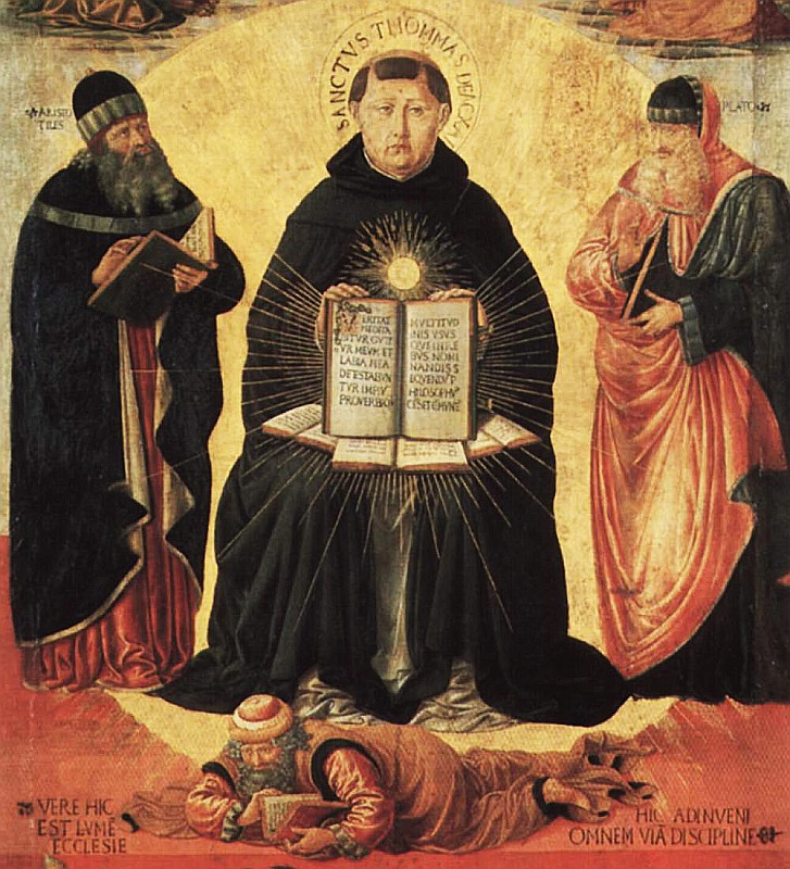
File:Benozzo Gozzoli 004a.jpg - Wikipedia


Fonte

[1] Pio XII. Encíclica “Mediator Dei”. Disponível em http://www.vatican.va/holy_father/pius_xii/encyclicals/documents/hf_p-xii_enc_20111947_mediator-dei_po.html. Acessado em 15 de junho de 2015 às 23:18.
[2] Sequência “Terra, exulta de alegria”. Disponível em http://cantosparamissas.wordpress.com/2013/05/27/cantos-para-a-solenidade-de-corpus-christi-3052013-cifras-e-musicas/. Acessado em 15 de junho de 2015 às 23:33.
[3] Monteiro, Ricardo. A Música como Reflexo da Sociedade: História da Música ou Música da História? Universidade Anhembi Morumbi. (s. d.)
[4] Knowles, M. The wicked waltz and other scandalous dances: Outrage at couple dancing in the 19th and early 20th centuries. McFarland. 2009.
[5] Teixeira, Thiago Plaça. Música e Beleza em São Tomás de Aquino. Universidade Federal do Paraná. 2012.
[6] http://www.newadvent.org/cathen/09036b.htm. Acessado em 01 de junho de 2015 às 18:50.
[7] Liber Usualis, 1961, Sequência Lauda Sion Salvatorem, p. 945-949.

http://gregorian-chant-hymns.com/hymns-2/lauda-sion.html


"Lauda Sion Salvatorem: Canto Sacro, Beleza e Conteúdo Doutrinário". MONTFORT Associação Cultural.


Online, 09/07/2020 às 22:22h

Lauda Sion Salvatorem – Wikipedia, wolna encyklopedia

08 julho 2020

DESENHOS NA PANDEMIA

ANDRO PANDEMICUS


Hoje é dia 08 de julho de 2020 
e eu ainda estou vivo...
Há pessoas morrendo 
no mundo todo. 
Acharemos
A vacina? 


...
"Eis o pão que os anjos comem, 
transformado em pão do homem; 
só os filhos o consomem: 
não será lançado aos cães!"
...


Black Lives Matter Protest lead by Teens4Equality in Nashville, TN
04/Jul/2020


Quero viver para amar 


05 julho 2020

CORITA KENT ARTE POP ENGAJADA

A ARTE ENGAJADA DE MARY CORITA KENT 


CORITA KENT E A LINGUAGEM DO POP


“Uma obra de arte o deixa alerta para o que você não percebeu nas coisas comuns, de modo que a distinção se estreita entre o que é comum e o que é extraordinário.”

“A work of art makes you alert to what you haven’t noticed in the ordinary things, so that the distinction narrows between what is ordinary and what is extraordinary.”

https://youtu.be/OsXi9ZSZL7k

https://youtu.be/E8WyOmA4Q3k

https://youtu.be/hsdDAiBKR8A
CORITA LECTURE

https://youtu.be/tivdlh2mhIU
Corita Kent 2016 AIGA Medalist

https://youtu.be/3x4HgonSW6k
BECOMEA MICROSCOPE (excerpt)

https://youtu.be/EaOWOULeH-0
BECOMEA MICROSCOPE
(23min 39seg)
By Aaron Rose

IRMÃ CORITA KENT UMA MISTURA FEBRIL DE TEXTO, IMAGEM E SIMBOLISMO 

Sister Corita Kent A febrile mix of text, 
image and symbolism


Corita Kent (1918 – 1986) foi freira, artista e ativista cujas belas gravuras reúnem espiritualidade e simbolismo.

Nascida em Iowa, sua família mudou-se mais tarde para a Califórnia e Corita (nascida Frances) ingressou na ordem religiosa Imaculado Coração de Maria em Los Angeles quando tinha 18 anos. Esta era uma comunidade progressista e voltada para o exterior que atraiu pesos pesados ​​criativos como Alfred Hitchcock, Saul Bass e os Eames.

Depois de ser incentivada a começar a lecionar, ela aprendeu sozinha a serigrafia em um kit DIY. Ela começou a fazer trabalhos figurativos até que preocupações levantadas por alguns de seus colegas religiosos direcionaram seu trabalho para uma direção mais pop art.

O seu trabalho é uma mistura febril de texto, imagem e simbolismo que aborda os maiores problemas que a América enfrenta – a pobreza, o racismo e a Guerra do Vietname. Em 1968, ano decisivo em que os anos 60 pareciam estar em ebulição, ela deixou as ordens religiosas, mas ainda assim a narrativa da freira-artista persiste.

“Embora ela fosse muito ativa no mundo da arte de sua época, como freira, Irmã Corita Kent estava imersa em um tipo diferente de comunidade”, diz Cynthia Burlingham, diretora do Centro Grunwald de Artes Gráficas, que agora abriga os arquivos de Corita.

“Também acho provável que ela tenha sido ofuscada porque era uma gravadora em uma época em que as impressões contemporâneas de maior destaque eram feitas por pintores conhecidos que trabalhavam com editoras de impressão proeminentes, como Gemini G.E.L. em Los Angeles e U.L.A.E. Em Nova Iórque."

Mas se ela foi ofuscada ou subestimada no seu próprio tempo, desde a sua morte tem havido uma apreciação renovada tanto pelos seus talentos estéticos como pela sua ambição pela arte como meio de abordar questões grandes e complexas. Cynthia pensa que isto “definitivamente” assume uma ressonância particular em 2017, quando os criativos (especialmente nos EUA) parecem mais atentos do que nunca às questões sociais e políticas.

O Grunwald Center (parte do Hammer Museum da UCLA) possui 1.400 objetos em sua coleção Corita Kent, desde serigrafias publicadas a desenhos, estudos de cores e até recortes de revistas. Juntos, eles fornecem uma visão fascinante sobre a maneira como Corita Kent trabalhava.

Analisando os vários objetos em preparação para o recente lançamento do arquivo online, Cynthia e a sua equipa ficaram impressionados com a dedicação de Corita ao ofício específico da gravura.

“Uma das coisas que acho mais interessante em seu trabalho é o quanto ela estava comprometida com a gravura como forma de comunicar seus ideais progressistas e democráticos.

“Ela fez um grande número de gravuras, geralmente não em edições limitadas, como forma de disponibilizá-las a todos. Quando ela doou o arquivo pela primeira vez em 1986, ficamos todos encantados ao descobrir que ele continha todo o seu arquivo pessoal de gravuras, praticamente todas as gravuras que ela já criou, bem como muitos trabalhos preparatórios desconhecidos e inéditos.

“Foi um gesto tão profundo confiar este arquivo a um museu e a uma universidade também comprometidos com os ideais democráticos e com a quebra de barreiras no acesso à arte, e nos esforçamos para homenagear seu dom e contribuição hoje.”


Corita Kent (1918 – 1986) was a nun, an artist and an activist whose beautiful prints bring together spirituality and symbolism. Born in Iowa, her family later moved to California and Corita (born Frances) joined the religious order Immaculate Heart of Mary in Los Angeles when she was 18. This was a progressive and outward-looking community which attracted creative heavyweights such as Alfred Hitchcock, Saul Bass and the Eames.
After being encouraged to move into teaching, she taught herself silkscreen printing on a DIY kit. She started off making figurative work until concerns raised by some of her religious colleagues steered her work in more of a Pop Art direction.
Her work is a febrile mix of text, image and symbolism that took on the biggest issues facing America – poverty, racism and the Vietnam War. In 1968, the watershed year when the 60s seemed to come to the boil, she left religious orders but still the narrative of the artist-nun persists.
“Though she was very active in the art world of her day, as a nun Sister Corita Kent was immersed in a different kind of community,” says Cynthia Burlingham, director of the Grunwald Center for the Graphic Arts which now houses Corita’s archives.
“I also think it’s likely that she was overshadowed because she was a printmaker in an era when the highest profile contemporary prints were being made by well-known painters working with prominent print publishers such as Gemini G.E.L. in Los Angeles and U.L.A.E. in New York.”
But if she was overshadowed or under-appreciated in her own time, since her death there has been a renewed appreciation for both her aesthetic talents and her ambition for art as a means of tackling big, complex issues. Cynthia thinks this “definitely” takes on particular resonance in 2017 when creatives (especially in the US) seem as alive as ever to social and political issues.
The Grunwald Center (part of the UCLA’s Hammer Museum) has 1,400 objects in its Corita Kent collection, from published silkscreens to drawings, color studies and even magazine clippings. Together it provides a fascinating insight into the way Corita Kent worked.
Going through the various objects in preparation for the recent launch of the online archive, Cynthia and her team were struck by Corita’s dedication to the particular craft of printmaking.
“One of the things I find most interesting about her work is how committed she was to the medium of printmaking as a way of communicating her progressive and democratic ideals.
“She made large numbers of prints, generally not in limited editions, as a way of making them available to all. When she originally donated the archive in 1986, we were all delighted to discover it contained her entire personal archive of prints, virtually every print she ever created, as well as many unknown and unpublished preparatory works.
“It was such a profound gesture to entrust this archive to a museum and a university also committed to democratic ideals and breaking down barriers to accessing art, and we strive to honor her gift and contribution today.”


Fonte


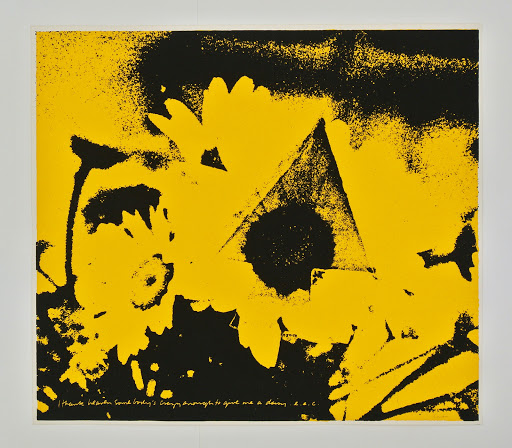
Sister Mary Corita Kent (1918-1986 American) ''Dancing Star'

The Political Pop Art of Sister Corita Kent

Sister Corita~nun and graphic artist of the 1960's

Corita Kent's Joyous Art--Blog Post at Artifactual History® Appraisal

Corita, Immaculate Heart College Art Department, Los Angeles, 1957. | Courtesy of the Corita Art Center, Los Angeles.


Corita Kent
Life is a Complicated Business, 1967
Screenprint on paper
54 × 58.4 cm

Sister Corita
 Wide Open, 1964
serigraph on paper
Circle Culture Gallery
and Corita Art Center.

Sister Corita, 1966
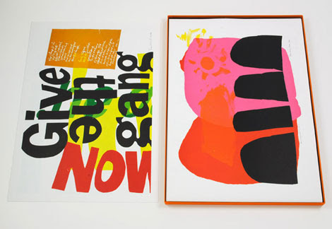
Give The Gang Our Best
serigraph on pellon,

Corita kent
Let the sun shine in, 1968
Screenprint on paper

Corita Kent
Jesus never fails, 1967
Screenprit on paper

Corita Kent
Crocus series, 1980

Corita kent
green fingers, 1969
Screenprinto on paper

Corita Kent
Pieta, 1969
Screenprint on paper

Corita Kent
I'm glad I cam feel pain, 1969
Screenprint on paper

Corita kent
The stamp of Thureau, 1969
Screenprint on paper

Corita Kent
The cry that will be heard, 1969
Serigraph paper

Corita Kent
A passion for the possible, 1969
Screenprint on paper

Corita Kent
American sampler, 1969
Screenprint on paper

Corita Kent
Love your brother, 1969
Screenprint on paper

CoritaKent
Road signs (two parts)
Screenprint on paper

CoritaKent
Road signs (two parts)
Screenprint on paper

CoritaKent
Road signs (two parts side by side)
Screenprint on paper

Corita Kent
King's dream, 1969
screenprint on paper

Corita Kent
Third eye, 1969
Screenprent on paper

Corita Kent
Manflower, 1969
Screenprint on paper

Corita Kent
Love at the end, 1969
Screenprint on paper

Corita Kent
A breath of fresh air, 1969
Screenprint on paper

Corita Kent
 If I, 1969
Screenprint on paper

Corita Kent


Corita Kent
Sacred heart
Screenprint on paper

Corita Kent
Christy, 1969
Screenprint on paper

Corita Kent
Chavez, 1969
Screenprint on paper

Corita Kent
It can be said of them, 1969
screeenprint oon paper

Corita Kent
Only you and I (part I and II) 
God is alinve (part I and II)


Corita kent
News on the week, 1969
Screenprint on paper


Corita Kent 
the lord is with thee, 1952 
serigraph on paper


Corita Kent 
come alive, 1967
 Serigraph on paper


Corita Kent
Circus, 1980
Screenprint on paper


1960s Vintage Sister Mary Corita Kent "Song With an Apple" Pop Art Abstract Print

Corita Kent – Melanie Mowinski

The Corita Art Center, a project of the Immaculate Heart Community, preserves and promotes Corita Kent's art, teaching, and passion for social justice.

Collection | Corita.org

70-08 | a small brown bird | Corita.org

Collection | Corita.org
Corita kent
Phil and Dan, 1969
Screenprint on paper

Collection | Corita.org

let him easter in us #2

Collection | Corita.org


queen of apostles


Jesus never fails, 1967
Screenprint on paper


Corita kent 
News on the week, 1969
Screenprint on paper


Uma artista que vê a santidade no pão maravilhoso.
Corita Kent, gravadora e freira de Los Angeles, pode finalmente estar recebendo o devido. 

Co-published with Zócalo public square.

The retrospective exhibition Someday is Now, currently on view at the Pasadena Museum of California Art, has brought a lot of attention back to Southern California artist Corita Kent. It’s a focus that hasn’t existed in the nearly three decades since her death. While many of her contemporaries have become household names—including friends and influences John Cage and Charles and Ray Eames—Corita Kent hasn’t achieved a posthumous level of fame on par with her artistic achievements.

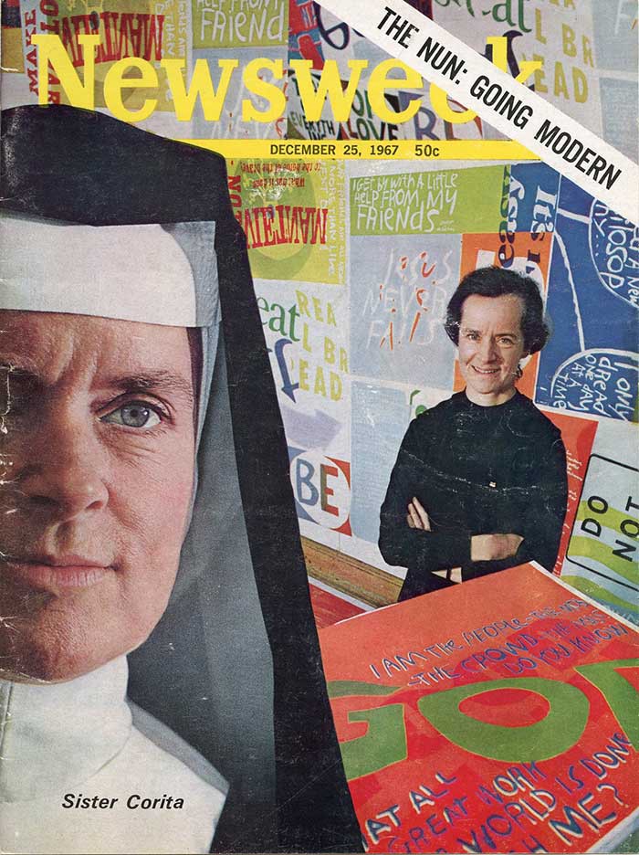
By the late 1960s, Corita had exhibited work in over 230 shows across the country. She had appeared on the cover of Newsweek and in hundreds of magazine and newspaper stories. She was named a woman of the year in 1966 by the Los Angeles Times, invited to join a White House conference on education, and completed commissions for the World’s Fair, IBM, and Westinghouse. Her work was already in prestigious collections like those of the Los Angeles County Museum of Art, the Metropolitan Museum of Art, and the Museum of Modern Art. And yet, you’ll find her largely unmentioned in art history texts.

The canon of art history undergoes constant revision, and we are more concerned now with who is included and excluded than we were in the middle of the 20th century. Still, Corita seems to have been victim of some discrimination. She was discounted as a woman (and a nun for much of her life) who was based in Los Angeles and not New York; and perhaps also because of her medium—silkscreen. Ironically, one of the most appealing aspects of her art, its availability, was probably a barrier to her being treated as a serious 20th century “artist,” even today.

Corita began screen-printing in the early 1950s and continued with the medium as an art professor at Immaculate Heart College in Los Angeles. Her aesthetic was very different from that of religious art of the 1950s. Figures were typically, clean, white, wearing flowing robes, and in a pastel palette. But Corita’s dark, primitive, abstracted figures were heavily influenced by medieval art, and later—as they grew brighter and incorporated populist imagery—by the rise of contemporary abstract expressionist art.

In 1954, Corita began illustrating text from the Bible and literature she liked. One of her earliest and strongest influences was e.e. cummings. Verses of his poem “be of love (a little)” appear in her work over a dozen times. A line from one of Cummings’ lectures, “damn everything but the circus,” was incorporated into several works and even inspired an entire series of alphabet prints. Her choice of sources for text was very broad. From literature, she also cited Rilke, Gertrude Stein, Ugo Betti, Walt Whitman, Anaïs Nin, Lewis Carroll, Lorraine Hansberry, and others. She quoted the Beatles, Simon & Garfunkel, and the Doors, as well as popular advertising campaigns, her brother Mark, her students, the Bhagavad-Gita, traditional Native American blessings, and finally, her own words.

In the late 1960s, Corita was exhausted by the adulation and criticism that her work inspired and by the pressures of simultaneously creating work, exhibiting, teaching, and being the face of the Catholic reformation movement. In 1968, she left the Immaculate Heart of Mary order and Los Angeles, her home for for over three decades. She moved to Boston, where she continued to work until her death in 1986.

As the director of the Corita Art Center in Los Angeles, I think that one of the reasons for renewed interest in Corita’s work is the multifaceted appeal it holds to our 21st-century, split-second attention span. She took words and graphics meant to be read and understood instantly and tricked you into looking at them longer. She did this by both re-contextualizing common messages and manipulating familiar imagery.

For example, a print from 1964 reads, “makes meatbal[ls] sing” in bold white letters across a red background. While you’re trying to place that slogan (for Del Monte tomato sauce), you notice another message, almost white on white, contained in the word “sing.” It’s a passage from the Psalms about the oceans, rivers, and mountains exalting the arrival of God. Writing about this piece in 1966, Corita said, “If mountains can shout and rivers can clap their hands, then meatballs can sing.” Whether you are drawn into the bright colors, popular source material, or scrawled messages, the depth of Corita’s work holds your attention beyond whatever first caught your eye.

While her good friend Mickey Myers assures me that Corita would be “tickled” by the exhibitions of her work around the world, she never wanted to be a celebrity artist like Andy Warhol or Jeff Koons. People who knew her have repeatedly told me that, as a friend and teacher, she focused her full attention on whoever was in her presence. She incorporated her “happenings”—where participants were given props and instructions about how to interact with the people around them–into her speaking engagements. She did this, I think in part, to draw attention away from herself. This is even evidenced in her infamous massive class assignments. If your teacher asks you to make 200 drawings or stare at your arm for three hours and draw it without looking at your paper, you can’t very well pay much attention to her; you need to focus on the task at hand.

Much of Corita’s art was motivated by her commitment to messages and reaching people, but in a way that fit with her reluctance to be in the spotlight. When she was asked to speak about her activism, she mentioned her friends Dan and Phil Berrigan, who let their own blood in protest of nuclear weapons, made their own napalm to burn draft cards, and spent time in jail for both those acts and more. Corita said she wasn’t brave enough for those things, but would say what she wanted with her art.

The most important thing to understand about Corita’s work is how responsive she was as an artist to the world around her. The reforms of Vatican II, which strongly influenced Corita and her fellow sisters at IHC, were about meeting people where they were and Corita chose the symbols in her art to do that, as well. Using images people saw at the grocery store or songs they heard on the radio, her art revealed spirituality in the everyday.

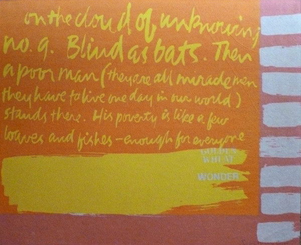
Corita said that ads and billboards were the carriers of man’s loves, hopes, and beliefs, and that she was restoring life to words by taking them back from advertising. For Corita, “the big G” wasn’t General Mills, it was God; the dots on the Wonder Bread wrapper weren’t a decorative element, they were hosts. But her work was not a commentary or criticism of mass-market commercialism, as some may read it today. Her work was about joy and, she said, giving people an idea of what harmony might look like.

In 1967, Corita said to Newsweek that “Los Angeles remains marvelously unfinished,” something that’s still true in many ways. As L.A. comes into its own as a creative city, a re-examination of its roots is warranted. Corita’s work is part of that re-examination, along with that of Mary Corse, Noah Purifoy, Carrie Mae Weems, and other artists who waited too long to receive their due.

If she were alive today, I’m sure Corita would still be an advocate for social justice and creating work with a message. I’m sure she would be delighted to communicate with people all over the world through social media. For Corita, looking was a spiritual act and she would invite you to do that: just look.

Someday is Now: The Art of Corita Kent is on view through November 1, 2015, at the Pasadena Museum of California Art. 

Fonte


“The grandmother of socially active art”: the generous work of Sister Corita Kent.


There are many ways I could begin to explain the life and work of Corita Kent, from an artist and educator to a nun and social activist. But what describes her best and most valuably, is the way that people who knew her tend to: “An A+ person,” for instance, and the fact "she saw possibilities in you you didn’t know about yet”. Or simply in their description of her kind attention, because “when she talked to you she made you feel like you were the only person there”.

Born Frances Elizabeth Kent, Corita became a nun aged 18 joining the Immaculate Heart of Mary order in 1936, a Catholic teaching institute where she was also educated. She embarked on a career of unique teaching techniques, becoming the chair of the art department in 1964. Her classes were all-encompassing. School trips would vary from visiting Charles Eames’ studio, to going to the local supermarket to observe people and packaging. Students from other departments would see their peers outside blindfolded, drawing, and upon asking what they were up to, the response was “homework”.

Fame soon followed, first within the church as clergy members were sent from across the US to be taught by her. As the world grew increasingly turbulent during the 1960s Corita’s work leaned towards the political, growing her audience but irritating the archdiocese. Exhausted from a schedule longer than hours in the day, she took a sabbatical in 1968 and decided to renounce her vows with the Immaculate Heart of Mary. At this point Corita was aged 50 and had to start afresh, she couldn’t drive, couldn’t cook and had never lived out of the schedule of religious life. A career as a prolific artist filled the last 18 years of her life.

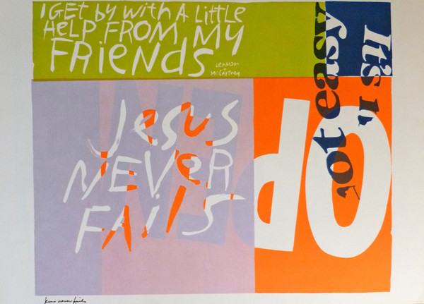
Corita’s artwork has a profound effect on people. Its vibrancy, enthusiasm and hopefulness has the ability to touch anyone, art lover or not. By using screen printing her work appeals to both the art world, graphic designers and literary fanatics in its use of text, re-contextualising snippets of popular culture such as “wonder bread” or lyrics like “I get by with a little help from my friends”. The texts expand to her own musings, particularly: “Love is hard work”, her most recognised piece designed for a postage stamp. Corita’s work has the ability to hit you instantly and over time in a way that Dr. Ray Smith, the director of Corita Art Centre, describes as “a Magic 8-Ball quality”. Ray admits she herself has walked past pieces hundreds of times a day, “and then for some reason a part of it will just pop out at you, it has this almost mystical ability to reach people,” she says. “I’ve never seen an artist that people have connected to so really intensely and enthusiastically.”

Despite this, in her career Corita Kent never really managed to settle under one artistic description or group. Even now, Ray still thinks of her as “on the periphery in a lot of ways,” she tells It’s Nice That. “Even though it didn’t look like what religious art was at the time — it looked more like pop art — she really thought of it as religious. It was about conveying spiritual messages, she thought of it as the same as the psalms, it was about reaching people and connecting with them deeply. That made it difficult because pop art was exactly the opposite of that, so even though her work looked similar it didn’t fit contextually in the critical or vapid consumer way that pop art was critiquing.”

Corita first saw a piece by Andy Warhol in 1962 and created her first “pop” print that year. However due to her belief, “that art enhances people’s lives and that people needed to be able to see it, own it and possess it,” her pieces took shape as screen prints, affordable ones too. In turn, her work wasn’t high art, it wasn’t religious in aesthetics and it wasn’t pop in context. Corita’s place at the edge of the art world is also arguably because of her gender, as Ray points out: “Even now we still have a lot of challenges in recognising women artists for their contribution, in the mid 20th Century it was ten times that. I think even if she hadn’t been a nun in habit, or her art hadn’t been necessarily spiritual, she still of would have been under-recognised in my opinion.”

As a nun, sisterhood was undoubtedly a large part of Corita’s everyday life. Taught by nuns herself, two of her siblings additionally joined the church and the Catholic community was “such an ingrained part of her life that I don’t know how fully she articulated that,” Ray describes. “It seems as if, even after she left the order, she was close with the community and never really broke those ties. I think also when things were really difficult for her when she was still in habit, her community was a real source of support that she was drawing from.” While she may not have spoken about it openly, the way the order shaped her life is evident in her work’s liberality. An example of this is her ‘happenings,’ events where everyone was included, welcomed and given different gifts. “There would be confetti, balloons and a poem you would have to whisper in someone’s ear,” Ray explains. “Everyone would get one of these bags and she’d make people stand up, tell you to turn around and look the person behind you in the eye, put a crown on their head, all of this stuff. It was her art in person. Loud, joyful and colourful things happened.”

The artist’s generosity is the key element the Corita Art Centre now tries to preserve. Describing her as “the grandmother of socially activated art,” Ray’s directorship sees it implement a socialist attitude whereas other similar foundations shut their doors. The centre prides itself on being an open lender so that Corita’s pieces can be seen by all, working hard “to preserve the integrity of the collection, but we also see it is as fulfilling Corita’s wishes that it’s widely available,” she explains. “Corita didn’t really see a difference between craft and art, high art and low art, it’s apparent in her work to some extent, but also in the way she managed her career as an artist. You might find her prints in a church basement bookstore or one of the big galleries in New York City.”

The centre is also small because due to only being fully an artist in the later years of her life, Corita “left a really rich artistic estate, but not a very large monetary one, so there are some challenges around that,” Ray explains. Impressively, through just the work of two and a half people, the centre works at promoting and preserving Corita’s work and attempting to elevate it to “the place we feel she should be held in”.

Over the past five years Ray’s working life has been dedicated to Corita’s cause. Looking towards the future, in the year that would celebrate the 100th birthday of the artist, the centre’s big dream is “to have a proper gallery space, and a classroom really,” says Ray. “The thing on the horizon that I would really like to make happen is to develop a programme, an educational programme, that uses her teaching methods with kids or adults. That’s what we’re eyeing in the far-off distance. That’s the dream.”

Understandably, in working so closely with just one artist’s collection Ray feels like she almost knows Corita personally. Of course there are also many questions she wishes she could ask, from pieces of work that keep cropping up, to reading archived letters Corita received but never being able to read her responses, or just a longing to enquire about the real meaning of a piece of work. I ask Ray if there’s anything Corita has taught her through her work and she points me in the direction of her ‘rules’ titled, Learning by Heart: Teachings to Free Creative Spirit. Although intended to be advice for her students at Immaculate Heart College, the rules also offer valuable life encouragement: “Find a place you trust and then try trusting it for a while,” for instance, or “Be happy whenever you can manage it. Enjoy yourself. It’s lighter than you think”. Helpful hints follow suit as an add on at the end of her rules, and are quotes you can’t forget once hearing: “Always be around. Come or go to everything. Always go to classes. Read anything you can get your hands on. Look at movies carefully, often. Save everything — it might come in handy later.”

Corita’s inclusiveness, her willingness and want to help displayed in these rules, Ray describes as “breaking down any kind of barrier. It’s about being flexible, acceptable…That’s the biggest thing for me, flexibility that comes from not being so rigid about what things are, or what they have to be, or how they have to work. Corita rolled with the punches, and I try to think like that.”

Come Alive! The Spirited Art of Sister Corita is available via Four Corner Books and an exhibition of her work will open at Ditching Museum of Art and Craft from 5 May — 14 October 2018.


Fonte 


How a tank sitting on a mud flat 
in Dorchester became a pop icon
By James Hobin
Out. 08/2015


From the bog to the Fogg: A replica of Corita Kent’s “Rainbow Swash,” preserved inside a vitrine as part of the exhibition, “Corita Kent and the Language of Pop,” on view at the Harvard University Fogg Museum until Jan. 3, 2016. James Hobin photo
One Saturday morning last month, I took the train to Harvard Square and headed for the Fogg Museum and an art exhibition entitled, “Corita Kent and the Language of Pop.” Corita Kent, a onetime Roman Catholic nun, was the artist who painted six giant stripes over the top and sides of the Boston Gas tank on Morrissey Boulevard back in 1971.

As I made my way past the tourists bustling about Harvard Yard, I recalled the first time that I had seen the tank’s stripes and heard about the woman who had put them there. Those messy brushstrokes were a challenge to my sense of order, and the fact that a former nun was responsible added a layer of complexity that was beyond my understanding. It turns out that this was my first encounter with modern art.

As a parochial school student, I knew nuns to be strict and fastidious, so I expected that a nun, even a former one, would stay “in the lines” while painting, but this tank looked as if it had been crayoned by a naughty child. I was in the fifth grade at the time, and though already wearing bell bottom pants, I was still too young to know that the tank’s design was a novelty of the swinging sixties, the decade when lots of people, including some nuns, were letting it all hang out.

The tank is located at Commercial Point, on a spit of land at the end of Victory Road. The gas company has a history on this shoreline, which has been almost entirely reclaimed by landfill, beginning in the late 1870’s, when the Boston Gas Light Company filled in the northeast tip of the point. In 1907, the state deepened the channel to the wharves on the north side of Freeport Street, depositing dredged material onto the gas company’s property. In 1917, the property expanded again, with the filling of Tenean Creek.

I remember the old tank, a great hulk nicknamed “the Gray Lady.” It rose and fell as the content was pumped in and out, moving like a giant balloon. That tank was demolished around 1970, and replaced with two smaller tanks. The first tank was branded with the Boston Gas logo, the second tank was covered with Corita’s stripes.
“View from Savin Hill, 1992” showing Dorchester Bay with two gas tanks on Morrissey Boulevard near the Southeast Expressway. Lithograph by James Hobin

“View from Savin Hill, 1992” showing Dorchester Bay with two gas tanks on Morrissey Boulevard near the Southeast Expressway. Lithograph by James HobinTwenty years later, only one tank was needed, and Corita’s tank was slated for destruction. The demolition crew attempted to remove the roof in the manner of peeling the lid off a tin can, but the weight of the roof was too much and it caved in, making an explosion of noise that rattled everybody within hearing distance. Nevertheless, the removal was completed, and the stripes were re-painted on the one remaining tank. With the tank’s height at 150 feet, Corita’s design, entitled, “Rainbow Swash,” is the largest copyrighted work of art in the world.

I once saw a television program about the paint job that showed men in white overalls perched on swing staging, plying enormous brushes. As a reference, they each held a small-scale model of the tank, complete with Corita’s stripes and signature. It’s amazing how accurate they were in reproducing every nuance of the original design, including the blue stripe, made famous for being seen as a facsimile of the profile of Ho Chi Minh. Or is it Ho Chi Minh? Corita’s answer to this question is not on record.

Corita was born Frances Elizabeth Kent in Iowa in 1918. In 1936, she moved to Los Angeles and entered the order of the Sisters of the Immaculate Heart of Mary, taking the name Sister Mary Corita. At Immaculate Heart College, as dean of the art department, she was known to attract the avant-garde, including students such as Alfred Hitchcock, Buckminster Fuller, and John Cage.

In 1962, Corita saw an exhibition of Campbell’s soup cans by Andy Warhol and decided to change her style. She abandoned standard religious subject matter and adopted the pop art idiom, using only abstract shapes and commercial media imagery. Her specialty became brightly colored silkscreen prints, in which broad, gestural brushwork is juxtaposed with layers of printed text.

At the Fogg exhibition, Corita’s screenprints are displayed side by side with Warhol’s soup can and other exemplars of pop art. Pop artists wanted to elevate everyday objects to a level of the sublime. Corita may have employed pop art’s strategies, but she wasn’t considered a full-fledged pop artist. In the selection of her prints on display, done between 1964 and 1969, what is most evident is her devotion to her own religious values. One series of prints was inspired by samples of food packaging available at the supermarket. For instance, she used the Wonder Bread package design as a resource for images based on the theme of the Eucharist.

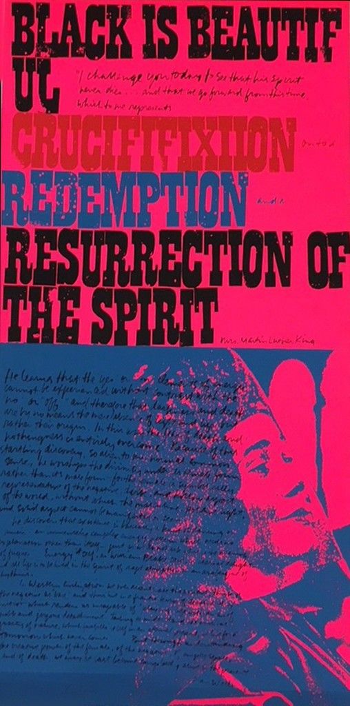
Corita’s credentials as an activist are established by another series of prints that focuses on civil rights, poverty, and the Vietnam War. She committed her time and artistic skills to create propaganda posters for political causes and the anti-war movement. These prints are emblazoned with phrases like “Black is Beautiful, “Stop the Bombing,” and “Love your Brother.”

The Second Vatican Council may have helped direct Corita’s move toward radicalism. The council brought major reforms to the church, including allowing nuns to wear secular clothes. But kicking the habit was not enough, it seems that Corita’s mission demanded more. In 1968, she left the order and moved to Boston.

Three years later, Corita accepted a commission for a design on the new Boston Gas tank, and now we can’t conceive of Dorchester without it. Whoever thought that an artist could make people fall in love with a gas tank? The genius of the design is that she alters our sense of scale, making the tank appear to be smaller in contrast to the proportionally oversized brushstrokes.

There may be other reasons why people are attracted to her artwork. At the Fogg, Corita’s original painted scale-model tank is preserved inside a vitrine; the attached text includes this sentence: ‘The tank’s rainbow motif offers a secular take on a passage from Genesis, in which God vows to “put a bow in the sky” as a symbol of the covenant with humanity.’


Fonte 


Sister Mary Corita Kent

(1918-1986)

Sister Mary Corita Kent was the perfect embodiment of the New Nun, whose life, faith, and art reflected the reforming spirit of the Second Vatican Council, convened in the early 1960s to guide the Roman Catholic Church into the modern era. During a period of turbulent social change, she found a way to be in the world but not of the world, engaging divisive social and moral issues of her day like the Civil Rights Movement and the War in Vietnam through the medium of faith-inspired printmaking. The artist-nun combined the contemporary graphic design of billboards, product packaging, and protest placards with the words of poetry, advertising jingles, the Beatles, and the Bible to create brightly-colored, pop-art prints, proclaiming a message of love, peace, and social justice. It proved to be an explosion of creative energy, which could not be contained in the strict confines of a religious order.

Born Frances Elizabeth Kent in Dodge City, Iowa, the artist entered the Order of the Immaculate Heart of Mary in Los Angeles, aged 18, taking the name of Sister Mary Corita. After graduating from Immaculate Heart College in 1941, she taught elementary school in British Columbia, returning to her alma mater five years later to join the faculty of the art department. Sister Mary Corita spent the next two decades there as a teacher in tune with changing times. She involved her students in creating disposable public art installations from cardboard boxes and turned the college's staid Mary's Day procession into a 1960s culture "happening." Between semesters in the month of August, the artist-nun devoted herself fulltime to making silk-screen, serigraph prints, the versatile medium she had chosen to produce multiple images at a lower cost. Sister Mary Corita Kent created over 800 graphic designs during her lifetime, moving away from specifically religious imagery toward text-oriented, pop art.

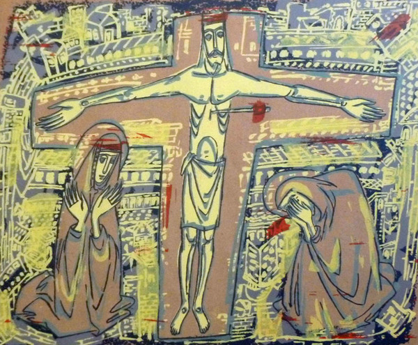
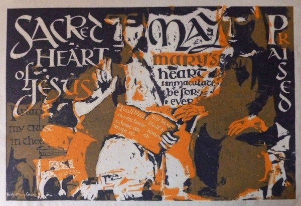
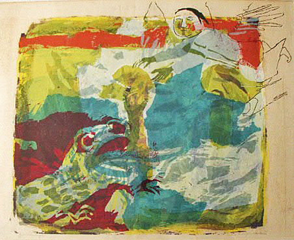
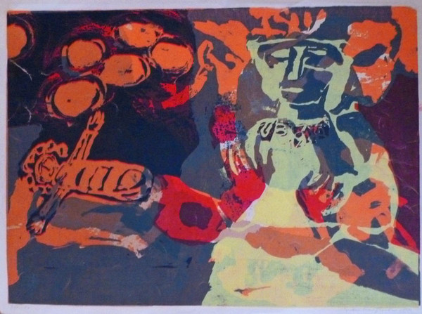
Sister Mary Corita’s first prints from the 1950s present traditional religious subjects in an abstract figurative style, coming out of her work with medieval sculpture as a graduate student at the University of Southern California. A good example in the Sacred Art Pilgrim Collection is Christ Suffering Over Jerusalem (1951). Text is already present in Christ and Mary (1954), where script functions as a key visual element in this Cubist variation on an illuminated manuscript page. Guardian Angel (1955) and Nativity (1956) also depict two time-honored sacred themes in a "neo-Gothic" idiom, while Sea of Galilee (1960) suggests oriental graphic design in its repeated use of decorative motifs and its emphasis on negative space. This was cutting-edged religious art in the American Catholic Church of the 1950s. The new openness in the Vatican in the following decade encouraged Sister Mary Corita to go further afield and seek inspiration in popular American culture.

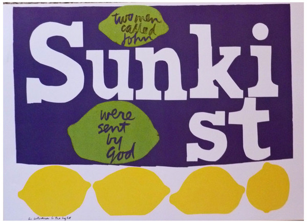
Three months before Pope John XXIII opened the Second Vatican Council in Rome in October 1962, a commercial illustrator named Andy Warhol took the art scene by storm with his 32 Campbell’s Soup Cans installation in a Los Angeles gallery, transforming the humble soup can label overnight into an icon of modern art. In prints from the 1960s, Sister Mary Corita eagerly embraced the new pop art style, seeing, as she put it, “signs as signs.” Moving away from figurative to textual art, she delighted in uncovering spiritual double meanings in product labels like Wonder Bread, which suggested the Eucharist. The Sunkist citrus fruit logo was the inspiration for the serigraph, As Witnesses to the Light, in homage to Pope John and John F. Kennedy, where the text reads: “Two men called John were sent by God.” In a 1968 essay, the artist-nun even provided a line by line spiritual explication of a Hunt’s tomato catsup advertisement!

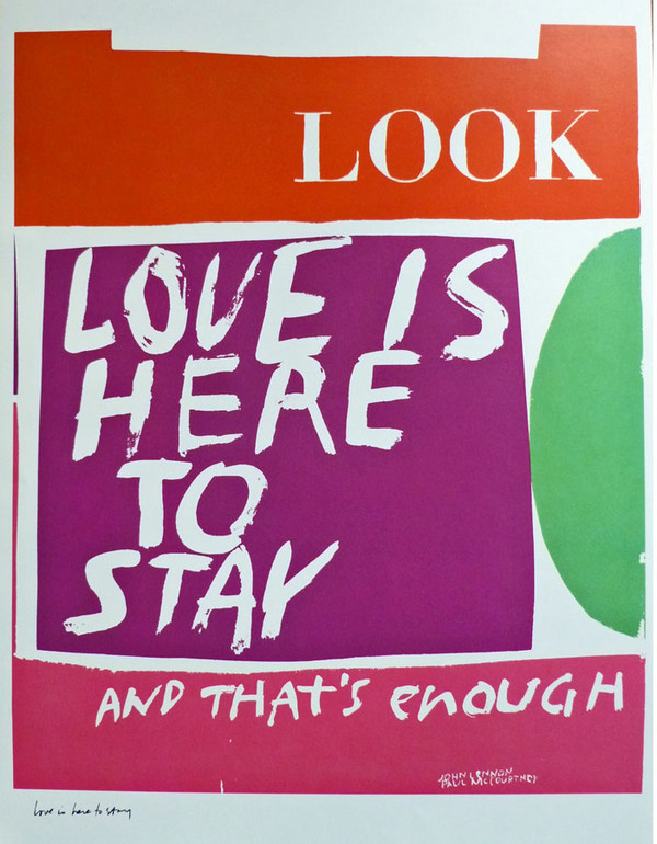
Sister Mary Corita often mixed and matched words and quotations in provocative ways to tease out new truths. In the serigraph, Love is Here to Stay (1965), hand-lettered lyrics from the Beatles' song,"Things We Said Today," appear under the eye-catching Look magazine logo. Two years later, she borrowed from the Beatles again for the serigraph, Jesus Never Fails, where the line, “I get by with a little help from my friends” is juxtaposed with the much-loved hymn refrain of the title. Sometimes, the artist-nun simply scrawled quotable quotes across a background of multi-colored abstract shapes. One example in the Sacred Art Pilgrim Collection is Enough for Everyone (1965), a tangerine-and-pink toned serigraph with text from Activist American Priest Daniel Berrigan. It was all part of what the printmaker’s friend, Protestant Theologian Harvey Cox, called her “festive involvement with the world.”

The conservative Catholic Archdiocese in Los Angeles took a different view of what Sister Mary Corita's detractors called her “strange and weird” imagery. Cardinal James Francis MacIntyre was particularly incensed at the 1964 serigraph, The Juiciest Tomato of them All, where this paraphrase of a Del Monte product slogan was used in praise of the Virgin Mary. He banned the image from public display. In 1968, Sister Mary Corita left the Immaculate Heart of Mary Order to devote herself fulltime to art making. Two years later, some 90% of the sisters asked for the dispensation of their vows rather than submit to an archdiocesan ultimatum to rein in proposed reforms. The dissident nuns set up the Immaculate Heart Community, an independent, ecumenical group, now affiliated with the Corita Art Center, a gallery-archive promoting the art and the educational programs of Sister Mary Corita Kent.

The former Sister Mary Corita assumed the name, Corita Kent, and settled in Boston. During this time of transition, she created the "Heroes and Sheroes" series of documentary-styled prints in psychedelic colors, recombining texts and images from the mass media to comment on current events. In Pieta 1969, a statement from Rose Kennedy about the 1968 assassination of her son, Bobby, (accompanied by a lengthy student commentary on those words) appear under a purple and orange colored icon of the Lamentation of Christ. Kent continued to make art supporting Latino Labor Activist Cesar Chavez, the 1972 Democratic Presidential Candidate George McGovern, and other liberal causes close to her heart, but much of her time out in the secular world was taken up with commercial commisions for magazine covers, greeting cards, wrapping paper designs, and an ad campaign for Group W (the Westinghouse Broadcasting Company).

The art of Corita Kent often suffers by comparison with Sister Mary Corita's stylish, experimental graphic pieces from the 1960s, but whether inside or outside the church, she never seemed to be far from controversy. When Kent created the now famous Rainbow Swash design for a 140-ft. high Boston Gas Company storage tank, visible from the city’s Southeast Expressway, critics were quick to claim the peace activist artist had incorporated a profile of Vietnamese Leader Ho Chi Minh into its blue stripe. Kent completed her last “public works” project a year before her death from cancer in 1986. It was a stamp design for the U.S. Postal Service with another rainbow swash and the single word: LOVE.

Texts in Sister Mary Corita Kent serigraphs:

Christ and Mary (1954): Sacred Heart of Jesus, May Mary’s Heart Immaculate be forever praised. I place my trust in thee. I will bless every home where an image of my heart shall be honored.

Enough for Everyone (1965) On the Cloud of Unknowing no. 9. Blind as bats. Then a poor man (they are all miracle men, they have to live one day in our world) stands there. His poverty is like a few loaves and fishes--enough for everyone. (Daniel Berrigan)

Pieta 1969 (1969) We shall know him not with useless mourning and vain regrets for the past, but with firm and indomitable resolutions for the future: acting now to relieve the starvation of people in this country, working now to aid the disadvantaged and those helpless, inarticulate masses for whom he worked long hours, night as well as day (Rose Kennedy)…It’s me again. I’ve learned a really great thing. It’s something you told me before, but I couldn’t really feel that way then. But tonight I was listening to Sen. Kennedy’s mother on TV, and she was talking about her son’s love of living, but it was in such a great human way, so unpretentious that it helped me see that one of the great qualities of the Kennedys was that they were so reachable. In the middle of destruction was this great creative force always there and always an honest statement of a really human responsive entity who wasn’t hiding behind a bureaucracy or a static position. Then I started thinking about how many times I walk around and people talk to me, but I am not there. I’m not honestly responding. I want to try to develop some of the Kennedy quality. It is so easy to fall apart when surrounded by destruction. Now I can see what you meant when you said we have to create. It’s the only thing we can do. I read a book, The Spinster, by Silvia Baton Warner. You’re probably familiar with it. What impressed me so much about it was that Sylvia helped the children find channels to express their aggressions in a creative rather than a destructive way. That’s what we have to do. We have to revolutionize the dead lump called the present educational system from Dick & Jane into an alive process not a product. And help other people learn to be creative rather than destructive. With this we could change the world. One person can do a lot. Two people can do even more. Since I listened to Mrs. Kennedy I have faith. This in the first time for many years that I really do have faith. Now when I consider and feel what have been mere words that once seemed idiotically ideal and illusory--faith, hope, and charity--these words become my essence. They become the whole. When life is so absurd you have to make a choice about living--yes or no--and if it’s no, then, end your life, but if it is yes, throw yourself right into it and say yes to every second and yes to any one second is yes to the whole of existence. This is what you and Mrs. Kennedy have helped me learn. Love, (A student)

Fonte


Sister
Sister Mary Corita Kent

https://youtu.be/bI3QVsW30j0
WHERE HAVE ALL THE FLOWERS GONE 
(The Kinsgston Trio)


Leia também